Adrants reader Dresden directs our attention to the super-classy Draft FCB congrats ad to all the winners from last summer's Cannes ad festival.
Dresden wryly notes, "Perhaps they should be the first to receive the 'Neal French Award' for non-creative, derivative, tacky work trying to pass as advertising..."
Ooh, that burns going down. Bottoms up to Draft. - Contributed by Angela Natividad
Here's a good Saatchi & Saatchi campaign in which Racism becomes a cosmetic in a little jar that turns its users into human ogres, as demonstrated by the images and the slogan: "The more you apply it, the uglier you become."
Racism is cosmetic when you think about it, so the comparison is apt. Check out the female variant and one of ambiguous gender. - Contributed by Angela Natividad
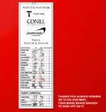
In just two short sentences, "Thanks for always pushing us to do our best. Then being brave enough to sign off on it," Saatchi says so much about the strength of a good agency/client relationship. At least until the client picks a new agency. The sentences appeared in an ad congratulating Toyota on being named Advertising Age's 2006 Marketer of the Year.
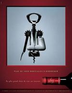
Here's a series of print ads that merits some attention just because we had to stare at them for awhile in order to understand what was going on. The caption reads "More than 5,000 bottles to open." The images are bottle openers in various states of injury (and one suicide) presumably after trying to unscrew that number. Variations on the ad are available here and here.
The series is for 1855, a Paris-based internet wine purveyor. Damn, French-speaking countries just love their wine distributor ads. Nobody else seems to bother. - Contributed by Angela Natividad
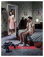
Altoids' "Oh, the Shame!" campaign compares a boy's first encounter with the curiously strong mints to his first encounter with, well, puberty. "The young have been taught to be wary of all things curious," writer Desmond Lavelle tells Ad Critic. "Be it drugs, sex or the mysterious appearance of hair, they will eventually have to experience such things for themselves. Altoids are no different."
We kind of see the connection there but discussing Altoids and genitalia together in too direct a manner is kind of painful. - Contributed by Angela Natividad
Apparently tissue is experiencing a comeback and Kleenex wants in on hipsters: Our New Oval is a promo for their new oval-shaped tissue dispenser.
Kleenex has been long wedded to the ho-hum quadrilateral silhouette so here's a half-hearted kudos for thinking out of the box. Though their decision to go oval made us recall the logo ovulation critique Hurty Elbow posed about brands who somehow fall under the misguided impression that oval saves sinking ships.
Check out other promo ads here. And since no hipster campaign is complete without one, take the personality test too. If you're curious about Adrants' personality, we are into yoga and wise beyond our years. We don't know about all that om business but that last goes without saying, yeah? - Contributed by Angela Natividad
Who says ski resort ads should all feature generic slopers in big jackets sliding down a sweeping powdery slope?
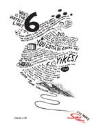
Stowe gets a little creative, crafting mountains out of whimsical text that's something between a ski bunny's stream of thought and coutourier philosophy. A single splash of color illustrates the Stowe logo. We like. Yes, even if attempts to read the text hurts our necks. Check out more prints here and here. - Contributed by Angela Natividad
Here's a heart warming and well crafted campaign for Canada's Salvation Army that asks us to open up our eyes and notice those who are in need of our help. Called "Invisible," the campaign includes print and TV and illustrates who it's way too easy for us to let those in need slip into the background and be ignored. The campiagn was created by Toronto-based ACLC. Nice work.
Though you may think Adrants is the only entity that writes about sex in advertising, we'd like to correct that myth by pointing you to the Silly Girl who seems to enjoy focusing on the "sex sells" aspect of advertising even more than we do. In no less than two stories, we're treated to an exhibition called Diversity held at Milk Studio Gallery in New York on November 21 to celebrate the U.S. launch of S Magazine, a publication that enjoys crossing the line between mainstream fashion and, well the inevitable conclusion that never seems to be completely fulfilled in most fashion advertising.
Then we're slapped upside the head (or ass, as it were) with oh so shocking ass kicking S&M images all in the name of promoting Umbro footwear. Hmm...we like this Silly Girl.
- If your nose explodes it's because you've just opened the upcoming special holiday issue of People magazine which contain no less than five smell-o-rama ads from Kraft. Oh, and all the rest of the ads in the issue are from Kraft as well. Wear your nose plugs.
- Cynopsis reports "NBC Universal has begun layoffs based on its NBCU 2.0 plan designed to tighten budgets in every department which will increase efficiency company-wide. The broadcast TV side will absorb much of the 700 expected layoffs, with the NBC News division taking the bulk of the hits. In this first round of layoffs, at least 17 employees affiliated with Dateline NBC will lose their jobs."
- This idea is so not new but no there's company formalizing advertising on nightclub wrist bands.
- The poor guys over at Agency.com just can't catch a break.
- Obligatory "hot babes promote TV show" link.
- Somebody likes golf balls.
- Obligatory S & M food promotion link.

|


