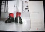
We're not really sure what Royal Elastics is trying to say in its current Andy Warhol print series. We know it's for their Warhol line of shoes. But what's with the banana? Bananas, shoes, bananas, shoes, elastics. There's a shaft joke just waiting to be made here but we can't do it without feeling inappropriately grimy after reviewing Match.com's chaste new ad approach.
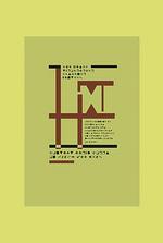
London-based Lunar BBDO doesn't just want to find a typographist, they want to find the typographist. To prove worthy of this destiny, the right candidate needed to decode a want ad cryptically written in Webdings, Zapf Dingbats and Wingdings - picture fonts that appear in everybody's Word program for reasons we never understood. We also suspect they're the language of preference for the makers of crop circles.
Copy reads, "Mac-based typographer/designer wanted. Award-winning ad agency seeks help with its Mac/design output. West End space provided in exchange for negotiable hours of work. Contact Daryl Corps on 07802 499 658." The ad was disseminated at art colleges and typography mags. And apparently it really did nail a hire.
Kudos to Lunar for being far cleverer than we, because when we need new hires we get drunk and try releasing smoke signals in the shape of martinis from our backyards. This has yet to yield interest outside of the local police force, and the occasional cat.
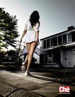
Ah,yes. The wonderfully sexist attitude of those Europeans. Oops, we mean sexually liberated. Where else can you find a campaign that so openly fantasizes about how life would be if a man designed it? Oh wait, everywhere, but just go with us on this one. You know you'd never see a milk maid like this from Hood or Garelick or any other milk make in America. Maybe that's because this ad isn't for milk but for the Belgian men's magazine Che.
Not that anyone actually gets their milk delivered to their house anymore but thank God we can at least fantasize about it vicariously through an ad campaign. Thanks, Che. Oops, thanks Duval Guillaume. They created the ad.
What exactly is this ad saying? I have breasts so I'm not smart enough to read The Economist? I show a lot of cleavage so I don't have to be smart to get what I want? I wear a Wonderbra so every man is at my beck and call? I'm a stupid female that thinks my breasts are more powerful than my brain? OK, maybe that last one's kinda true for some but still. Perhaps Linda Foster is just so cool for wearing a Wonderbra that intelligence like The Economist are just beneath her. Maybe the Wonderbra is so effective it makes her breasts so huge see can't see over them to read the magazine. Please. Explain this ad to us.
Copyranter points us to Joel Spolsky, a self-professed geek, who was miffed by a recent Traveler's Insurance ad that was headlined, "To catch a geek, you have to think like a geek" and went on to say, "Fashion sense aside, today's high-tech criminals are evolving constantly... Give your independent agent a call, and spend your time taking your business to the next level. Instead of worrying about a crook in ill-fitting pants."
Joel argues it's wrong for Traveler's to view geeks as some sort of security-related insurance risk and the whole geek versus non-geek thing is so high school. He continues by questioning whether insurance agents are really any more capable than geeks to protect a company's security and that the ad attacks the very people whose job it is to implement sais protection.
more »
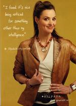
Now here's an ad that made Adrants reader Stacy initially go, "Huh?" The headline reads, "I found it's nice being noticed for something other than my intelligence," which caused Stacy to ask, "What the f#@??!!" While there was concern for a moment that advertising had returned to the classic days of woman-as-homemaker-in-front-of-the-refrigerator, a visit to the web address (screen shot) in the ad explained the woman was simply happy to be noticed for something other than her less-than-glamorous nursing scrubs look when she wore a Silpada necklace to work one day and then decided to sell the stuff, resulting in her quitting her job and making tons of money. The moral of the story? "Get noticed for your brains and your beauty." Oh, and sell lots of Silpada jewelry too.
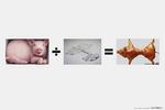
Following its belief that exposing oneself to great ads from other advertising professionals will better one's own creativity, Ad of the World, with help from JWT Bangkok, has launched a promotional campaign that highlights how copying...uh...acknowledging others great creative will results in great creative of one's own.
To be fair, inspiration is a powerful motivator that fuels creativity. knowing what others have done and why helps align one's own creative thinking and, ideally, fosters new, original creativity along the way. The campaign visually illustrates how exposure to, and mashup of, great creative can produce interesting results. We're not sure about that twisted pig, though. See the entire campaign here.
If memory serves, after 9/11, wasn't it the French who sort of dragged their feet and made things difficult for the countries trying to tally together against Bin Laden? If so, that might explain this ad for French tree hugger site Defi Pour La Terre which thought it would be witty to transform the image of two trees into the twin towers burning on that fateful day. All to somehow equate the value of a tree to the value of a human life.
We not sure any amount of time passed makes this sort of thing OK. Then again, we're American. We knew people on Flight 93. The French? Well, perhaps they didn't know anyone who died that day or just feel Americans can't keep their hands out of other countries' issues. While the latter may be true, mocking a world event such as 9/11, at least for now, is still in very bad taste. And the French are supposed to know about taste, right?
- Google command over the ad industry may increase even further with the purchase in-game ad company Adscape Media.
- Time Inc. is not having a good time these days as automaker cut $100 million in ad spend across the publisher's titles.
- It would appear the Saatchi 17 are now wishing they never left in the first place haviing just been axed by Interpublic.
Instead of harping a self-righteous "smoking kills" or "quitting can improve your quality of life" message with some skipping in the flowers imagery, NicodermCQ takes a different tack: it hawks its nicotine patch as an age lifter and clarifier.
Clever. We all know what the detriments associated with smoking are; the only problem is that tools for quitting just aren't as cute as the sultry puff-puff. Considering some women already use a patch for birth control, looking upon a nicotine patch as a beauty tool may be just what the doctor ordered.

|
|


