This Dubai, UAE campaign for Sony Micro Vault -- created by Promoseven -- is, to say the least, a bit weird. However, we like it. A lot. It's nice when a campaign highlights what the product actually does. In this case, the ability of the Sony Micro Vault to store impossibly large, in comparison, objects. Or data as it were.
A nice touch to the work is the happy grin the rat, frog and squid display as if swallowing something 500 times their size is no big deal. And there's no boring copy. Although plenty of people out there would argue good copy can be just as powerful as a good visual.
To promote its hot new Ariake running shoe, K-Swiss enlisted the face of Sebastien Foucan, the founder of free running. ("Free running" is when you go jogging and, instead of hauling ass around an obstacle, you do an impressive Ranma-style aerial flip over it. Seriously.)
The print ads are very Zen. There's no copy, just images of Foucan being Foucan and a small K-Swiss logo at bottom. They were put together by Perfect Fools which is based in Sweden and the US. The ads will be accompanied by a wannabe-viral (which we haven't yet seen) and a website.
See Foucan variant. We're not really sure whether people will put two and two together and go, "Okay, Ariake = running! Got it." Because we were all, "Acrobatic skater gear?"
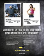
After March 1, which is when this site goes live, it may well be the case that finding your match was never easier. (If your match happens to be a two-ton 4 x 4 in gun barrel gray.)
TruckMatch.com is where truck buyers and sellers can find happy harmony with low transaction rates. To generate some love, Kelly/Russell Advertising put together a few B2B spots that draw a parallel between finding mates online -- a tricky business -- and finding the perfect pickup. Here are two more:
o "As with online dating, when it comes to truck buying, it's what isn't revealed that should worry you."
o "Finding the right match online can be tough. Until now, finding the right truck wasn't any easier."
We dig it.
Maybe it's just us but we're not sure we'd stick around the entire two minutes just to find out this commercial is for the launch of French GQ. Aside from the fact we did stick around (after all, that's what we do here) and we knew it was for GQ going in (because we were told). Now, we get that some brands like to do the tease/lead-up-to-the-joke thing but this commercial just goes on and one and on and on and one...and on...with the same joke over and over and over and...well, you get the point.
more »
Arg! Get a load of this print ad for the Travel Channel.
And gross! Watch the spot with the cow heart vending machine.
The funny thing is, something about the slogan -- "One man's weird is another man's wonderful" -- makes us hungry.
The spots were composed by the very weird, slightly wonderful Moroch.
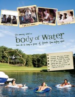
Perhaps inspired by The Sisterhood of the Traveling Pants, Hoffman|Lewis sent us this creative for the Missouri Division of Tourism.
Cheesy tag: "It's amazing what a body of water can do to keep a group of friends from drifting apart."
Alternatively: "It's feeding time for the Fishpersons!"
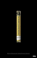
This is one of those well-tempered print ads that forces you to really look before you know what's going on. Most people will probably miss the point while rushing by on the subway, but those that catch it might go, "Hrm" and bring it up in random bar conversation. (That's totally okay though, because MTV will probably catch the speed racers with this.)
Put together by TDA Advertising & Design out of Boulder for Hillel Colorado, the ad promotes Holocaust Awareness Week (which is NOW!). It features a copy of The Diary of Anne Frank, marked "Fiction" with a library label. The copy: "Millions of Americans don't believe there was a Holocaust."
Alternatively, maybe a few library aids just never read Anne Frank. (In which case, they can't have grown up in the western public school system. Anne's plight -- in print and as a Fox 20th Century Studio Classic -- was resolutely hammered into our 10-year-old minds and souls).
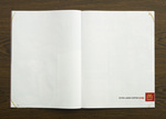
We're a big fan of white space. We hate ads that cram so much shit into available space under the misguided belief people will actually read the shit. Car dealers ads immediately come to mind as do many billboards whose creators seem to believe every one is a speed reader and blessed with binoculars for eyes.
So whenever we see an ad that gleefully makes use of white space, we can't help but love it. Especially when it actually serves the intended message as does this Swedish McDonald's ad which promotes the chains ginormous coffee. Thank you, DDB Stockholm for giving us our fix.
The primaries for Ohio and Texas are fast approaching. Tensions are high between Hillary and Obama. Unless Hillary scores these last two states, she's pretty much ether.
So after Hillary went all Exorcist on Obama about some slanted flyers his campaign disseminated -- pretty normal fare in a political death match -- we were like, Okay, the girl has snapped. It's over.
Then this picture of Obama wearing Somali garb surfaces. And instead of going "Uh, yeah, Obama's dad was African -- is that a problem?", camp Obama goes apeshit and accuses camp Hillary of smearing their Fearless Leader in the last dregs of this doomed pissing contest.
more »
...is a Renault Scenic with a built-in PSP.
Our eyes hurt and we probably have brain damage. See more reasons why here and here. Oh, and here's some compulsive steering behaviour. (Please tell us the unit's in the back seat; why's it being marketed to drivers?)
The agency: Publicis, Rome.

|
|


