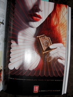
Or it's spec for Tom Tykwer's Perfume Deux: Redhead's Revenge. Dude on the chocolate bit looks kinda like Grenouille -- but really he's Le Petit Ecolier, a wee schoolboy who's served as the face of this snack since 1850.
For Lu Biscuits, which is currently having a chic little identity crisis. Okay, not really, but I seriously LOL'ed when the website started blasting ambient music. Because come on, all this for a biscuit. A saucy biscuit, sure. Even with a turn-on of a tea to pair them with, biscuits are still like less sexy cookies (NSFW).
Remember The Wolf, the cool operative summoned in Pulp Fiction to clean up the remains of a guy who had his brains blown out in a moving car?
UK-based cleanup firm Clearway riffs off that unseemly scenario with the ad at left -- "No job too big, no job too awful" -- depicting bloody furniture and a distinctly man-shaped stain. Among other things.
The ad was banned for obvious (read: "excessively graphic, offensive and distressing") reasons. Obtusely defensive, Clearway insists the piece is "an accurate portrayal of the work they undertook on a daily basis."
Which I guess is one way of saying Guy Ritchie and Quentin Tarantino -- or their gun-and-butcher's-knife-swinging muses -- get open tab when they're in town.
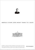
It merits saying that there are plenty of countries where people don't get as nuts as we do when ads zero in on race. But I still felt an "arrrg" rise to my throat when I saw these pieces for ChromaWhite TRX Skin Brightener, Dermalogica India.
The text at left reads "America's future looks bright, thanks to a black." Above the caption is the bust of a suspiciously white-washed Obama.
Thanks for the unsolicited commentary on our election, but what the fuck, guys? How does news of the States blackwashing the White House promote your skin whitening product?
Variant: "There are times when black can go to white." Okay, I'm not even touching that one.
Put together by the politically earnest cats at IBD Brands, India.
UPDATE: After this article had been live for a few hours, the guy who sent us this work apologized for any cultural misunderstanding and claimed the creative was just spec. And having sent us the material in the first place, he even tried insisting his agency didn't do it. (The creative credits appeared right below the work in the original email.) In separate IMs, he went on to say he doesn't work for the agency at all, and a mystery person from IBD sent it to him.
Dear IBD Brands Dude: We're typically really nice about this kind of thing, but you've done this more than once. If this was an honest mistake, here's a tip: don't get cocky and send us material your client hasn't approved.
If you simply can't take flak for doing a sub-par job, get the hell out of this business.
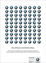
For Park Shore BMW, agency concerto conjured up a sneaky way to get people staring at rows and rows of BMW logos for a long, long ... long ... time. See variants 2 and 3.
"One of these is not like the others," the copy reads. "Find it and we'll not only offer you an incredibly low interest rate, we'll pay your 10% down payment on any 2008 model you want. You have until October 31st. So Go!"
The campaign ran briefly in Vancouver last month, after which Park Shore BMW was asked to pull the ads because they "contravene branding standards."
Wait. There are standards? Guess that sets Vancouver ahead of the pack. $10 and a warm cookie to whoever can score us Van City's Hallowed Book on Logo Etiquette.
Adrants reader Martha pointed us to this Nutrecan senior dog food ad by Gomez Chica/EURO RSCG out of Medellin, Colombia. Playing on the "senior" bit, caption reads "Adults only."
Gawker put it best:
Sex sells fruit. Sex sells condoms. Sex sells magazines. Sex sells charity. Sex sells cheap clothes and pseudocool clothes. Even child sex sells cosmetics. So people are pretty cool with sex, and its selling implications. But does dog sex sell? We can only hope.
Uncute. Come on, Gomez/EURO. Sex may sell coffins and cheese, but you gotta draw the line somewhere. Last I read, the job description for "man's best friend" didn't include a deep-throat clause.
In what I guess can be called a witty effort to explain the Collins reinsurance ad at left, a rep at Yamamoto Moss Mackenzie wrote us an email that began, "If you were going to do an ad for reinsurance brokerage, of course you'd think facial tattoos."
We were all, "Wait ... what?!"
Then we read the first line in the ad copy: "Everyone feels covered when we place reinsurance." And it was like, "Ohhhh."
Tagline follows: "Collins: predictability for a random world."
The Curse of the Bluefin Tuna Industry. Cringe. See variants in The Economist (really?) and last week's European Voice. The people named on each poster are villainous Fisheries Ministers that failed to better regulate Mediterranean bluefin tuna. God help us.
Moved by a conviction stronger than yourself? Send angsty pro-tuna letters to Fisheries Ministers for Italy, France and Spain.
The UK's Gay Times recruited agencies and students to tackle an ambitious project: promoting the gay lifestyle to straight men.
James and Joe, two young creatives from Leeds, competed with Kings Arms Creative, Leo Burnett and iris, among other contenders, to accomplish the task in the manner most sassy. At left is what they came up with: a single dude making a distinctly vaggie shape with his mouth. (The grizzle helps.) Caption: "Anything she can do..."
Nice work. We're about 50% sold. Now let's see a chick make a shaft.
Like a sledgehammer, this Duval Guillaume-created ad for Belgium's Organ Donor Foundation bluntly deflates mens' egos and, like a reality slap upside the head, manipulates them into realizing the rigid organ they have in hand isn't the one which will do this woman the most good.
As Adland writes, "thanks for that lesson in truth in advertising Duval Guillaume."
And as we'd say, Cruel, cruel and more cruel!"
But we'd also say," Simply brilliant."
There were three images that accompanied the release that prompted this story. We're going to spare you from two of them because, well, they're all hairy seventies-style and what with everyone shaving every last hair off their bodies today, seventies-style hairiness is, well, just gross.
So, for Asheville (oh wait, they're still into the seventies there, right?) hot tub retailer Willow Creek Hearth & Liesure (damn., even that word is soooo seventies), Atlanta-based BRUNNER created a campaign that's an ode to the hariy seventies and the supposed seductive qualities of the hot tub.
With headlines such as "Because you can only fit one woman in a Porsche," "Spice up your marriage with someone else's marriage," and "Lowers sperm count to the average male range (as opposed to what...a seventies porn star?)," the campaign intends to set the retailer apart from the usually mundane ads seen in the category which depict impossibly perfect, cliched family scenarios.
more »

|
|


