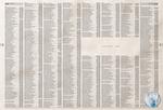
There are many ways to sell mouthwash and, believe us, we've seen them all. Except for this new piece of work for Oral-B from Leo Burnett Brazil. No one likes to be near a person with bad breath so why should it be any different with telephone listings?
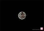
Frederik Samuel brought our attention to this piece (at left) for The Pink Line, in which we're actually staring through the receiver holes of a telephone, at the woman on the floor. "Help is close," the ad coaxes.
We kind of liked the esophagus concept better.
Abuse hotlines or help centers are always trying to magnify the moment you're left bleeding on the floor. Like children gone numb to the act itself, this repetitive stance is getting tiresome - and focusing on the traumatic moment may actually miss the point.
Why can't they make like your standard ad and put the spotlight on the vast improvement that takes place after taking action? Granted, healing is less interesting than stained linoleum, but it's a stance that may stick out.
This Terra News print campaign by DM9, Brazil has apparently confused readers with its use of strings, says AdPunch. The logic was to suggest that behind every action lie a series of events that led up to it, and the hope is that the user infers this series of events will be clarified on Terra News.
Campaign text reads, "And suddenly you start seeing the world more clearly." They probably would have sparked less confusion with a more direct caption like, "Every string has its source," or maybe that's more confusing. It's hard to tell from here; hindsight's always 20/20, isn't it?
Variation here, yo. (Be forewarned: That one has a ton more strings, which probably didn't help clarify matters. Really. It kind of looks like a loom. Like, if we had yarn right now, we'd totally cut out the ad and make a blanket. A really, really small blanket.)
IFAW further develops its "Will Only Words Remain?" campaign with animal-shaped letters in print ads and street stamps that actually have explanations -- something the initial guerilla-style campaign appeared to be lacking.
The added words describe the travails each spelled-out animal faces, along with a call-to-action that invites those inclined to the IFAW website. Neato. Hope they save some elephants, and maybe a dolphin, too, and while they're at it, hopefully a whale.
Our first reaction to this Turkish CNN ad by DDB&Co., Istanbul, was "Hey, they're staring at us." Our second reaction was, "...Hey, that's mean." (See variations uno and dos.)
Consequent two-second bummed feeling aside, we thought the in-the-box effect was mighty clever. But one could probably argue CNN more distracts than informs, because while the watchers idly admire us looking doe-eyed and confused, their houses are being robbed/hit by helicopters/scorched.
Slogan: "Be the first to know." Right, so you don't find out during 15 minutes of consequent lame, post-disaster.
The United Colors of Who? Oh, Benetton. Sorry. It's just been years since we've seen anything from the clothier. In fact, we figured they went out of business but no. They are back and this time they are taking on the cause of domestic violence. Each ad stylishly coordinates their clothing line's colors with the bruises on women's faces to drive home the message. Damn. Did we just say "drive home the message?" Sorry, we thought we left that in the conference room years ago after realizing a message can't actually be driven and that saying stuff like that makes one appear to be an idiot. OK so maybe mobile billboards are an exception but we digress.
Benetton is back and they have a message. And as a bonus, maybe the campaign itself will deliver its own version of violence in the form of a slap upside the head of fashionistas who are more concerned with how they look than the plight of women around the world. Damn, that was bitchy.
UPDATE: Surprise, surprise. They're fake. Yawn.
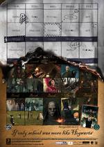
For EA's Harry Potter and the Order of the Phoenix video game, Wieden+Kennedy, Amsterdam remind school kids why lives of fantasy can be way better than everyday education.
See another variant on the print campaign here.
We remember grade school. It was hard enough to drag our asses to class without having to deal with moving stairs, talking pictures and breaks in which we may actually be, well, broken.
Otherwise, the print images speak a thousand favourable words for the quality of the game.
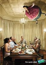
Looks like someone watched a Harry Potter movie right before concepting this ad campaign for Mylanta. Just as Harry blew up his aunt until she floated away in the second (I think) Harry Potter movie, Colenso BBDO, who, we're told, created the campiagn, has people blowing up with gastrointestinal gas and floating away. Mylanta, of course, is there to rescue. See all the ads here.
- The City Desk examines the 60 year history of the Richman Spectacles rich Man iconic neon sign that sits atop the Deputy Tyrone Campbell Building on Pearl Street. The area was once called Squint Alley due to the overwhelming brilliance and quantity of neon signs that once graced the area.
- Virgin Atlantic Airways has put its account in review. Crispin Porter + Bogusky has had the account since 2003 and will not defend.
Catch Seinfeld promoting Bee Movie by jumping off an eight story building in Cannes.
- Oddcast is having fun with its Baby Mail.
- Cynopsis reports, "The CW is planning on not selling traditional commercials in the new trend-watching series CW Now on Sunday nights. Instead, the network will integrate marketers into the show as sponsors for specific segments such as fashion, beauty or music. This fall, The CW will also sell five-second spots called "cwickies" to advertisers, in particular movie studios, three times throughout a show or during the course of a night, followed by a longer-form commercial, like a trailer. "
- Apparently, new research suggest young adults read more magazines, not less.
- Check out the Creativity Award winners.
Vlan! points us to some ads for the Smart car, a vehicle that, however practical, looks just as awkward as the expressions crystallized in these winning moments for icons like Saddam and Bush.
Awkward.
Smart's slogan: "Open your mind."
We wonder who they're talking to. We're pretty sure none of these foiblers suffered from lack of imagination - they all did some zany things that ended up upsetting most everybody in the world.
Could it be that we're supposed to identify with them? If that's so, the tags on the ads aren't deeply encouraging. For example, the line just above Clinton's frowny face reads, "Interns and cigars. Not smart." No shit, Sherlock.

|
|


