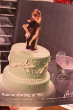
You'd have the best of two depraved worlds: a gaudy lustfest and some seriously decadent cake. Kind of like the ad at left, which was ganked out of last month's Travel and Leisure magazine.
Tagline: "Everything's sexier in Paris Las Vegas." I don't know about sexy, but it's sort of pretty after a few Pernods, and David Hasselhoff makes the occasional cameo. Plus, who can beat rooms starting at $89? Okay, okay, besides Circus Circus.
The freakish looking transgenger queen Amanda Lepore -- who had her first cosmetic surgery at age 15, decided to have a sex change in high school, led a failed suburban housewife life and then hit New York for fame and fortune -- appeared in a Jawbone ad in this week's New Yorker.
Having already fronted M.A.C., Armani, MTV, and Swatch campaigns, Lepore appears in one half of a spread. The other half features what appears to be a plastic surgeon with a somewhat dumbfounded look on his face, possibly in reaction to the overly "worked-on" Lepore.
One always aims to be a bit eye-catching in advertising. This ad certainly accomplishes that.
ANPE, the National Agency for Employment in France, tapped TBWA\Corporate to preach its gospel to disheartened work force rejects. What TBWA came up with is respectful of ANPE's traditionally risk-averse style, but also playful in a Where's Waldo? sorta way.
The prints are detail-rich and do a nice job of connecting the online world, which is big but can seem solitary, with the bustling offline world. The ad at left features a city intersection flooded with people. It reads, "700,000 CVs online to find your next business partner."
See variants:
o 300,000 offers online everyday to locate your future office.
o 400,000 people log on anpe.fr everyday to save time.
What fun. It would be great to see these, larger than life, in a Metro somewhere.
This ad works on a couple of levels. First, and quite obviously, it states simply the name of the advertiser and provides a URL to the advertiser's site. Second, it ever so perfectly winks at the likely reaction many will have to the ad with their attention drawn not to anything mobile but to a couple of things global bulging outward threatening to escape their tenuous confines.
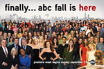
Who knew people still read TV Guide? Apparently enough still do to make it worthwhile for ABC to buy out all the ad space in the August 25 issue in advance of the upcoming fall television season. The network will buy 21 pages in the issue and insert a DVD for New York and Los Angeles subscribers and newsstand sales.
This new spot for Nissan (:30 and :60) immediately piqued interest: one car circulates a vinyl album. Interesting retro tones punctuate the background. The camera pans out, revealing many vehicles circulating many vinyls. It's an image that brings Warhol to mind.
What's going on? What'll happen next? Will Nissan pull a Dell?
Nah. One jalapeno-red maverick races off its track (cut to big Nissan logo!), encouraging others to do the same. (A vaguely familiar idea. Got a quote for me, Mazda?) They briefly fall in line, a tactic car advertisers seem to love, then park with a screech in haphazard fashion.
The 350Z, arguably Nissan's sexiest model, pulls abruptly into the foreground. The tagline follows: "Escape the pattern. Nissan."
Bleh.
more »
Apparently asterisks are bad.* In a campaign called "Don't be an Asterisk," the US Olympic Committee and the Ad Council associate them with steroids and inauthenticity.**
Witness as a high school jock repulses once-loving classmates when an asterisk starts forming on his forehead. (Apt, I guess, since steroids are supposed to make you break out like whoa.)
But here I was, all this time, thinking the teen angst market was reserved exclusively for the zit zappers. Speaking of which, J&J -- parent company of Neutrogena! -- funded this effort, which was put together by TBWA/Chiat/Day/NY.
more »
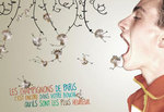
- At left: a French mushroom ad! OMG cute. Caption: "Paris mushrooms: it's when they're in your mouth that they're the happiest." Go make them happy. Our resident expat PT Ford isn't so amused.
- Nothing starts the day off better than a kung fu drink ad.
- Dario at Invoke sent us this shot of the Newfoundland-based Hits 99.1 FM van.
- Worthless but interesting tag cloud tool. This one lets you pick fonts and colors. Pop in a URL, see what your homepage mentions most. (Adrants loves itself some Leigh.)
- Public School Intelligentsia learns us a new word: frumputante. Think cash-money bag ladies in Juicy Couture sweats. Streaky hair a plus. Ugh.
more »
One thing I love about Benetton: it never knows when to leave well enough alone. "Victims," the current issue of its company magazine Colors, uses the tragedy of the SouthWest China earthquake to try mending the China/Tibetan conflict.
The issue includes 30 shots of quake victims integrated with 30 prayers written for them by Tibetan monks. An accompanying Benetton ad displays a Tibetan monk and a Chinese soldier bowing toward each other, possibly in greeting, apology or shared grief. Readers can send their own prayers over for inclusion in a campaign exhibition.
Provocative as always, but I generally have trouble hating on Benetton (except when they fired Toscani). The "Victims" ad campaign is running in Italian newspapers and in French daily Le Monde.
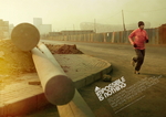
To supplement its "Impossible is Nothing" spots for the Beijing Olympics, Adidas busts out with a slightly retro set of prints titled "Gold is Not a Given."
Each piece features an Olympic athlete, training in Beijing six months before the game "in sub-zero temperatures." There's also some Nike-esque pontificating on the meaning of "gold." An example from the ad at left (featuring Haile Gebrselassie):
Gold is more than a colour. It's a dream to keep chasing. It's a dream to keep you going. It's a dream that sometimes gets put on hold. Gold is never a given.
Also see:
o Tyson Gay -- Gold can be lost in a flash. (1, 2)
o Allyson Felix -- Gold is not into predictions. (1, 2)
o Veronica Campbell-Brown -- Gold makes you wait. (1, 2)
o Jeremy Wariner -- Gold is the language of fastest. (1, 2)
o Yelena Isinbayeva -- Gold doesn't play favourites. (1, 2)
Totally different style from the Chinese ads, but in keeping with the grit-and-glory feel. Put together by Amsterdam (180\TBWA).

|
|


