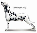
This dalmation standing at graceful attention poses with a price tag - like a handbag or fancy gloves - because 80 percent of people who become pet parents do it on a whim, according to the Foundation for the Adoption, Patronage and Defense of Animals.
Thus armed, Contrapunto Barcelona created a set of fashion spreads that included well-matched pups to air both the vacuity of such life-changing impulses and the seriousness of consequent pet abandonment cases. The awareness ads were then run in fashion magazines for the most devastating effect.
A clever way to make a point. It could probably be used for, you know, other types of irresponsible impulses.
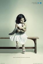
The unlikely ingenues at Ogilvy put together a moving set of prints that sweetly admonish, "Adopt. You will receive more than you can ever give."
The campaign is for the Indian Association for Promotion of Adoption and Child Welfare. We love it, we really do, but we wonder whether it doesn't ever so softly whisper, "Adopt. For love."
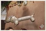
For its client the Skill Language School, Leo Burnett, Sao Paulo puts together an interesting trio of prints involving animal-shaped balloons with wince-worthy getting-to-know-you dialogue on the bodies.
The balloon animals they selected made us LOL in real life: choose from a dog (at left), an ass and a snail. All that's missing, really, is a douche, but that would probably be hard to define in balloon-animal language.
The tagline: "Don't risk sounding ridiculous in [English/Spanish]. Skill Language School." Straightforward. We like it.
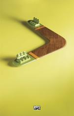
Rethink, Canada put together these clever little ads on behalf of Play Land. In addition to lending new perspective on mundane everyday stuff, the series reminds us of what it was like to be so small that you actually crawl into household items and pretend you were airborne.
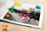
DDB, Milan orchestrated this neat campaign for Play-Doh. The copy reads "The world needs children's dreams." Advertising for Peanuts has more images along the same vein.
We happen to like this campaign a lot because we did something similar with our own Play-Doh. The only difference is, we only had the colour green and were later fined by the library for defacing public property. See, that kind of stuff doesn't happen in the sanctioned world of ads.
Here's a pearl of wisdom that strippers have been leveraging for as long as they've existed. The most current issue of Wired invites enterprising voyeurs to take a peek at radical transparency -- new buzz for an old strategy that, every few years, gets re-toted as the Grail.
Open up to rivals? Get honest with customers? Admit failures? Who does this stuff? Wired says smart businesses do and it's "sweeping boardrooms across the nation"! That may be true, and blogs and wikis may dramatically contribute to the eye-opener, but it's hardly a new game. Warren Buffett's been doing it forever (ever read his love letters to the shareholders?) and Santa from Miracle on 34th St. (circa 1947) did it too, to Macy's chagrin. Oh, and then there were strippers. Don't forget the strippers.
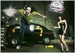
Some print campaigns are just so odd they make you stop and look. This Killer Jeans effort is one such campaign. Touting its Immortal Jeans line, we've got a Disney Test Track/crash test dummy-style approach with the required auto babe. We've got the hipster base jumper and we've got a mine sweeper crew. Get it? Dangerous situations? Killer Jeans? Good. We didn't want to have to spell it out for you.
Bates Enterprise Mumbai created the campaign.
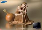
To push its line of full HD LCD televisions, Samsung launches a Bordeaux print campaign on how the device can convert soap operas, soccer games and even the weather report into works of art.
The captions read "Even a [soap opera/soccer game/weather forecast] looks like a work of art."
Pretty but perhaps misguided. It's not often we've sought docile masterpieces for hours of mindless entertainment, though Vogue may beg to differ.
Props to AdPunch for the lead.
In lieu of your typical "Got Milk?" stint, Promolac ties milk to everyday passions. Who'd have guessed the stuff of cow udders could be sexy? Not us. Then again, sex and dairy aren't strangers, and it's definitely less "eh?" than this.
Put together by Eva of Santiago, Chile, the copy reads "I drink." Adpunch has more from the same campaign. The others aren't sexy, but they're pretty to look at, and we were getting tired of that bland family sitcom humour-type stuff people are always pulling to push milk.
The Economist was a 2006 Print Ad winner at the London International Awards for this sparing scratcher. The agency responsible is Ogilvy & Mather, Singapore which, judging by the Levi's Copper programming-throwback microsite they did, has a flair for the basics.
We dig a sparing and direct message and thought of tossing in an insinuation of nostalgia-laced laziness just for kicks, but decided we'd hate to be buzzkills for this method. Advertising could use more of it. Plus, the bold red block is growing increasingly synonymous with The Economist, which can't hurt them any.
Though if we were an ad firm working for The Communist, we'd be kind of pissed.

|
