Clearex acne treatment gel works a lot like Clearasil acne treatment cream (or your fluoride-rich toothpaste of choice): you rub it onto your pimples at night, then pray they're dry enough to pop or scratch off by morning.
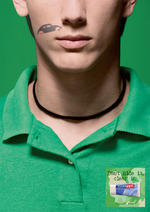
Grasping for a clever way to market the stuff, which you either do or don't have in your cabinet, agency Shalmor Avnon Amichay/Tel Aviv dreamed up this print campaign.
Each piece is an uncomfortably close close-up of a blemished individual. The offending red dots are camouflaged, age-five-at-the-boardwalk!-style, with festive but decidedly unsexy face art. Okay, the Pacman one was kinda rawkin'.
Tagline: "Don't hide it, clear it." Inelegant but straightforward.
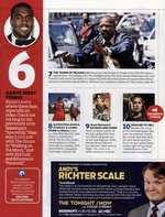
Hopping right on the "we'll do anything to increase ad revenue" bus, Entertainment Weekly is out with Andy's Richter Scale, an advertorial on the magazine's Must List page pimping the Conan O'Brien show, Andy Richter himself and HBO's True Blood. Wait, what's this ad for again?
Whatever the ad may be for, we love the riff on vampires which ends with, "And have you ever noticed that their real-life fans are ust renaissance fair types with substance abuse problems?"
As advertorials go, it's a good one. So good, it took us three days to realize it wasn't just an editorial sidebar to the Must List. But one wonders. Is that a good thing or a bad thing?
We're all for diversity but not when it becomes forced efforts both in real life and in Photoshop hack jobs like this cover of Toronto-based Fun Guide. You can't fake diversity which is exactly what the magazine did when it chop shopped a perfectly decent, racially-nebulous photograph of a family for its cover.
Nope. We need a black man, stat!
more »
Fresh out the Harry Potter franchise, Emma Watson returns to earth on behalf of Burberry, which managed to score her in full postpubescent splendour.
She's clearly not the geeky kid witch we all took her for -- although this Mary Poppins-esque carpet bag leaves us with the sense she may have a few tricks yet. Or maybe she's just hiding an oversized umbrella that conjures the east wind when she needs to make life-changing nanny trips.
Brought to us by the incomparable Jeremy Dante.
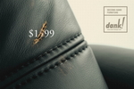
Here's a clever little campaign for Dank! Second Hand Furniture. Each print zeroes in on a piece of furniture; whatever defect mars it visually also mars the ostentatious price that made the item unattainable.
Also see Table and Chair. By the clever visual acrobats at DDB&Co./Istanbul; via.
This print effort for Gain could probably have done with better execution. I had to read the tagline -- "It smells that good" -- and even then I had to look hard. And it was like, "Oh, it would appear that there's a person stuck to that other person."
But it isn't immediately clear that they're trapped there because they're smelling, and not because, oh, they got sat on and taken-with when their host got up again.
Variants include Gallery and Airport. Work by Leo Burnett/Toronto.
...when you've got a bra that turns your mammaries into superclamps? And consider this: if women had more paws for shopping bags, they'd probably be a lot less depressed. For the next eight minutes, anyway.
Just another support-illustrating gem by Wonderbra (via y via).
Previous efforts to break the mold with basoomas have included the glass-breaking bus shelter ad, the extra caution line at metros, and the, uh, "we hold big boulders" approach.
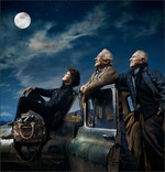
Sally Ride, Jim Lovell and Buzz Aldrin bring stargazer's wonder to this piece by Louis Vuitton. Shot by Annie Leibovitz, the astronauts will grace July issues just in time to commemorate the 40th anniversary of the Apollo 11 mission to the moon.
Antoine Arnaut, head of communications at LV in France, says each spacewalker donated a "significant" portion of their modeling fees to Al Gore's Climate Project. As for the bag at left, it's the Vuitton Icare -- an elbow ornament named after Icarus, an icon of Greek myth who dies after flying too close to the sun, losing his wings and plummeting back to earth.
Not the bag I'd've chosen to feature with survivors of a successful sky-bound mission, but hey, I suppose it's nice that Icarus, Aldrin, Lovel and Ride all have something in common: a lust for that final frontier.
Oh, yeah. You may have noticed Neil Armstrong is missing. This wasn't an oversight on LV's part; after an entreaty or two, "he thought it probably wasn't the right thing to do," Arnault admits.
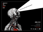
Much the way the Vitruvian Man did. There's something about great film that slips under your skin, gets into the meat of you; and few film makers will argue there isn't a deeply physical urge that finds satisfaction in producing such work.
For the Independent Film Festival Boston, agency ISM/Boston manages to peg that perfectly. Tagline at left reads, simply, "Vision lives on both side of the projector."
See equally compelling variant: "Blood, sweat and tears meet lights, camera, action."
You have to be impressed by the efficiency, don't you? It seizes the eye and drives the point home, nice and clean, like a sandpapered stake.
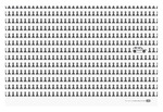
For the print component of the Kia Soul campaign, David & Goliath go an eye-catching, if tired, route: See pawns. See Soul. A new way to roll.
At first glance, we involuntarily thought, "Kia: synonymous with pawns." It took a few slow neuron-firings for us to be all, "Oh, wait. Kia: the break from the norm." And even then, we were like, "...nah."
Not super thrilling work. Then again, when was the last time a Kia got you hot? Variants include Sheep and Fish.

|
|


