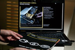
The New England Aquarium's "See Turtles" campaign is an appealing exception to the no-pun rule. (Also, we like an effort that doubles as justification to take hallucinogens.)
Variants include Droplet, Water Tower and Rooftop, which will appear in magazines and newspapers.
Online banner ads -- which are also cute, if a little Clip-Arty -- include Snowman, Cocoa and Car. (Forgive us if these links break; they're hosted by Mullen.) These are slightly different from their print counterparts: in them, ordinary things take the shape of turtles over time, taking advantage of the 'net's ability to seize roving eyes. Frankly, the print stuff is better.
Work by Mullen/Wenham, MA. There's also radio material, which we didn't get to hear.
After setting up its first-ever 4G wireless broadband network in Portland, Clearwire tapped Secret Weapon Marketing to promote its merits: better internet speeds, broader coverage.
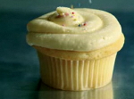
The result was a series of irreverent prints -- and "Sprinkles," a TV ad that compares wireless coverage to cupcake sprinkles. (Rivals are represented by a stingy sprinkling; meanwhile, Clearwire's coverage deluges the bakery with diabetes-inducing hail.)
"Welcome to the future," the narrator says smugly.
more »
The industrial pollutants in the World Wildlife Federation's "Light Bulb" ad are only tired toys. But these miniatures -- small things we can easily control -- still convey the helplessness environmentalists feel when faced with oversized, eco-negligent businesses.
"Light Bulb" concludes with a male doll holding an energy-efficient light bulb. "You're doing your part," the ad assures us. "It's our job to help government & industry do theirs."
This message of gentle aggression is fast replaced by the image of a panda, an animal known to unfailingly melt hearts -- or in extreme conditions, cause brain explosions.
more »
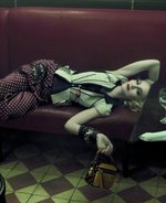
Jeremy Dante -- a human repository of unbearably fashionable things -- sent us more imagery from the ongoing Madonna for Marc Jacobs/Louis Vuitton campaign.
These shots are decidedly more burlesque and pushy than the last ones, which pushed the aesthetic envelope but still maintained a semblance of cool grace and timeless decadence, yada-yada.
Hear me out. Madonna rocks hard and all, but she's past the point where we're willing to see her deep-throat lollies or -- heaven forbid! -- give us a youthfully woozy crotch shot in her Diamond Dog undyroos.
Diggin' this naughty spread of her draped over the chairs, though. It's so Virgin meets the New Wave.
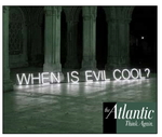
Operating under the premise that "there are too many rote answers and not enough good questions," The Atlantic launched Think Again, for which rhetorical questions are posed in neon lights, foregrounding deserted industrial spaces.
Right now these ads are all over Internets. Videos, blog posts and photo variants are available on the site.
We like it -- it's a simple, but still eye-catching and occasionally even witty. Some we've seen:
o Should women settle?
o Why do presidents lie?
o Is the doughnut doomed?
Lately ad land is all about the rhetorical questions. (Maybe it's the economy.) See Google's T-Mobile G1 spot or those weire Ask.com pieces.
Speaking of Ask, it recently ran a banner ad campaign that posed questions, then invited people to click for the answer. The act brought them to Ask.com, where the answer appeared with a prominent heading and image.
That's one tactic that would've made The Atlantic's campaign better: if you could click on the banners and find news articles directly related to the question, maybe addressing it from multiple sides. As it is, the ads only bring you to the Think Again subsite.
Volkswagen looks to the Surrealists to promote its Polo BlueMotion's "absurdly low consumption." A Magritte-inspired print is at left; here's another in the style of Dali.
Fuel plays a big part in both pieces, and I like how neither ad outrightly says it's inspired by this or that artist. People that know will get a nice cuddly feeling in their tummies (or maybe rant and rave about the flagrant commercialism of art). And people that don't can still ravish the visuals with their eyes.
Work by DDB/Berlin.
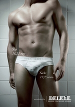
In a world where bigger is better, size matters...and socks have multiple uses, Belgian retailer Deleye Fashion is out with an ad that majestically embraces the world's obsession with size.
Created by DDB Belgium, the ad is a nod to the world's collective inferiority complex but let's not be negative here. Is there really anything wrong with striving to be bigger, better, stronger and more intelligent? OK, that last one is stretching it a bit. After all, this is an underwear ad. How intelligent can it possibly be?
Because even the baby Jesus had to suckle from a mammary, and where there's an iconic boob in the open air, there's a photographer just waiting! to pounce.
And you thought sex and religion couldn't mix.
Here the virgin of Guadalupe is represented by the sublime Maria Florencia Onori. A NSFW variant from inside the magazine is available at Laura Martinez's blog. The edition's already sold 80,000 copies since its release just days ago.
This print ad -- which appeared in German car magazines last Friday -- is more than ink on paper. It's a magical holding tray for your own teeny-tiny Mini Cabrio.
See how it works. To try it, print the ad out, visit this site and install the 3D plugin. Webcam at the ready? Good. Look at the screen. YOU'RE HOLDING A WEE INVISIBLE CAR!
Twist and turn the page in your hand to check out all angles. "Augmented reality" technology provided by metaio. Such a playful way to build engagement and spark Mini love (which I now have in spades).
Par for the course, though. Mini Cooper has a habit of engaging customers in creative and fun ways. See billboards that talk to you and its White Rabbit banner ad campaign -- where users could follow a white Mini from one website to another.
more »
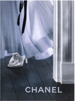
Fashion slave Jeremy Dante drew our attention to this demure print ad for Chanel. Devoid of slogan and famous face, it reveals nothing and leaves us wondering what the label has in store.
What is the shape of that dress? Where's that ribbon falling from? How wide are the windows giving off that hint of light? And can I get a 360 on those shoes?
We're not sure when the ad went live, but it's much in keeping with Karl Lagerfeld's Coco Avant Chanel teaser and silent film (now on chanel.com), which weds personality to the enigma of Coco at a painfully protracted pace. It's also the polar opposite of Marc Jacobs' latest interpretation of Louis Vuitton, featuring an accessory-heavy Madonna and gratuitous splashes of orange.

|
|


