If you're going to advertise a product that helps you tighten our ass and make your legs look great, you might as well highlight the results of using that product, right? That's exactly what DDB Chicago did for Reebok in a new commercial.
In the ad, a woman talk about the features of the show and how they can "make your legs and butt look great too." The camera operator, who clearly notices the woman's ass an legs have benefited from the shoes, thinks the results should be highlighted and zooms in on her assets.
While the woman isn't miffed at all by the camera's leer, she has to admonish the operator for an overactive use of the camera's zoom lens.
OK first of all if you wear this many clothes, you deserve to suffer from the wrath (if it even amounts to that) of global warming. Second, if you want us to understand anything about "parts per million" or the "natural state" of the atmosphere, don't use stripping models. They kind distract from anything else that's trying to be conveyed. And third, don't rob us of our climax. That's just mean.
You've always got to wonder about these ads. You know the ones. The entire ad is one large graphic. And the only other thing on the page is a tiny logo and, perhaps, a tagline. And it's in English but from non-English speaking country. Nine times out of ten, they are spec or spoof ads. And sometimes they can cause you to be sued for thousands by brands without a sense of humor.
This ad for a daytime dog care company asks us to wonder just what our four legged friends really do all day long when they're home alone. According to this ad, they are no different that us humans when we get a little bored and need a bit of distraction from the stress of our daily routines.
We've asked the creators of this ad, Jung von Matt in Stockholm, Sweden, to categorize this ad for us (they've confirmed it to be the deal deal) but we really don't care. We like it whether it's real or not.
We were so busy enjoying Golden Kiss Mayo on Friday (OK, not really), we didn't have a chance to share these radio jingle outtakes with you. Progressively more salacious, each take gets raunchier and raunchier and the directors becomes more and more, well, just give it a listen. But not near anyone who might be grossed out by some rather disgusting fetishes.
The debate about just what sexy is has been going on for as long as the first cave woman modeled the latest woolly mammoth fashions. Some enjoy full on nudity. Others like the teasing tantalization of skimpy clothing (think miniskirt, heels and a tight top). But some want everything left to the imagination.
In this commercial for Liaison Dangerous, we're given a glimpse under the hood of what would otherwise not be considered all that sexy. It's all relative.
Ever wonder where that $10, $20 or $100 went after you handed it over to to buy some food, get a car wash or tip a stripper? Well, Germany's Heart's Desire Association takes a look at a single bill's travels. It isn't pretty. But the organization promises bills that find their way into the organization will have a much happier ending.
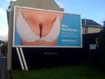
Oh how boobs can get advertisers in trouble. Especially really big ones with lots of cleavage spilling out of a bra. That seems to be what's at issue with an UlsterTrader billboard campaign carrying the headline "Nice Headlamps" and copy that reads, "What do you look for in a car?"
more »
You know those ratings that precede every movie you see in the theater? Well, the Vancouver International Film Festival has a new one. It's "V" and it states, "An Open Mind is Advised." So how do they creatively make people aware of this "new" rating? They employ a collection of sexual proclivities designed to widen our acceptance level of, by association we assume, new and different forms of film making.
The work was created by TBWAVancouver and directed by Tim Godsall. It's all about sexuality. We think.
If you don't mind robots swearing at each other while bitching about the creative process you'll love this cheeky-ish video pimping xtranormal Text-to-Movie software. It's a brilliant take on the expectations and misunderstandings more than a few people have regarding what's involved in the proper development of creative
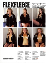
So yea. Britain's Advertising Standards Authority has received several complaints about a new American Apparel ad in Vice Magazine which features a young girl wearing shorts and a hoodie which, in one shot, almost exposes her nipple. The ASA upheld the complaint dubbing the ad "offensive and irresponsible" as the girl in the ad appeared to be under the age of 16.
According to American Apparel, the girl in the ad is 23 and the ad was meant to depict her relaxed in a "home" environment. But the ANA says the ad is inappropriate and must not appear again in its current form.
Inappropriate? How so? Hasn't everyone heard all girls sit around the house self shooting themselves? Have these complainers never visited a Facebook page? Or Webshots? Or Photobucket? Never seen a mirror shot? This is hardly racy compared to what's out there. Oops, this is an ad. Not some 14 year old boys afternoon "motivation."
OK so yea. Cover a bit more of the boobs and everyone will be fine with this.

|


