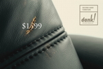
Here's a clever little campaign for Dank! Second Hand Furniture. Each print zeroes in on a piece of furniture; whatever defect mars it visually also mars the ostentatious price that made the item unattainable.
Also see Table and Chair. By the clever visual acrobats at DDB&Co./Istanbul; via.
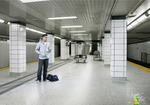
This print effort for Gain could probably have done with better execution. I had to read the tagline -- "It smells that good" -- and even then I had to look hard. And it was like, "Oh, it would appear that there's a person stuck to that other person."
But it isn't immediately clear that they're trapped there because they're smelling, and not because, oh, they got sat on and taken-with when their host got up again.
Variants include Gallery and Airport. Work by Leo Burnett/Toronto.
...when you've got a bra that turns your mammaries into superclamps? And consider this: if women had more paws for shopping bags, they'd probably be a lot less depressed. For the next eight minutes, anyway.
Just another support-illustrating gem by Wonderbra (via y via).
Previous efforts to break the mold with basoomas have included the glass-breaking bus shelter ad, the extra caution line at metros, and the, uh, "we hold big boulders" approach.
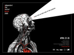
Much the way the Vitruvian Man did. There's something about great film that slips under your skin, gets into the meat of you; and few film makers will argue there isn't a deeply physical urge that finds satisfaction in producing such work.
For the Independent Film Festival Boston, agency ISM/Boston manages to peg that perfectly. Tagline at left reads, simply, "Vision lives on both side of the projector."
See equally compelling variant: "Blood, sweat and tears meet lights, camera, action."
You have to be impressed by the efficiency, don't you? It seizes the eye and drives the point home, nice and clean, like a sandpapered stake.
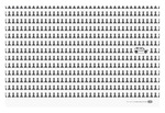
For the print component of the Kia Soul campaign, David & Goliath go an eye-catching, if tired, route: See pawns. See Soul. A new way to roll.
At first glance, we involuntarily thought, "Kia: synonymous with pawns." It took a few slow neuron-firings for us to be all, "Oh, wait. Kia: the break from the norm." And even then, we were like, "...nah."
Not super thrilling work. Then again, when was the last time a Kia got you hot? Variants include Sheep and Fish.
- Personality traits ... of album covers.
- Bring your tweets vintage. (Via.)
- Hope, delivered on the spin cycle.
- Facebook vanity URLs.
- Hulu desktop.
- Porn on Bing.
- Anti-gay-marriage ads hit NYC.
- Boone Oakley has fun trashing agency holding companies on its new website.
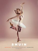
Creative for the Smuin Ballet Company is all over BART right now, and every time we come across one of the pieces we can't help but stop and stare for awhile.
One of the biggest problems with ballet is it's traditionally classified as a "high culture" pursuit, which gives the dance some cachet, but also shuts potentially innovative new young audiences out.
Hoping to level this barrier, agency Evolution Bureau positioned Smuin as a ballet group that dances on the razor's edge. Each piece has its own tagline, beginning with "Ballet but...", and the ballerinas are double-exposed over some human element of pop culture manifested in their dancing.
more »
Ben Kunz over at Thought Gadgets drew our obliging eyes to the latest manifestation of Hitler. This time it's for Rasayana, the anti-stress tea.
It might be overstating it to suggest Hitler would've been a totally different dude if he were more of a tea drinker, but you never know. At least one blogger has suggested to us that clutching a hot beverage generally makes you nicer.
More pretty pictures at Ads of the World.
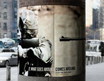
The Global Coalition for Peace wraps its convictions around telephone poles and street lamps with "What Goes Around Comes Around."
Each piece features soldiers whose weapons stretch so far around the medium that the barrels ultimately aim back at the bearers.
"Stop the Iraq War," the prints proclaim. NICE.
To promote the launch of Woodland Park Zoo's penguin exhibit, WONGDOODY came up with "More Colorful than Ever."
The print/outdoor effort replaces the penguins' humdrum "tuxedo" appearance with patterns that look suspiciously like the seat cover designs of misguided 16-year-old girls. And that's all we have to say about that.
See a variant labeled (*wince*) "Floral."

|
|


