Drawing a comparison between the silky texture of its namesake and its own, uh, "silky smooth sensation," Kimono Condoms dreamed up the print ad at left.
It features two smooth bodies intertwined; the man's arms bears the beautiful ornamentation you'd expect to find on geisha fare. The total effect invites a long linger.
Hoping to profit from the unfortunate fact that liquor companies only focus on chic alcoholics or incurable ass-gawkers, Corby Distilleries launched a beverage for the other crowd.
Lamb's Black Sheep Spiced Rum greets life with a simple-enough print campaign featuring authoritative white wording at the foreground of a chalkboard -- where a black sheep first cuts his teeth, presumably while scrawling mediocre sentences across them as punishment.
The work's nothing special but we did cop a grin when we saw the piece that read "You think bacon comes from cows." That's not so much black-sheepy as ditzy. But that's cool, most of us are a little bit of both.
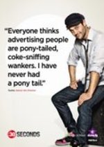
Inspired, I guess, by the unconditional love Mad Men receives from doting ad creatives, Australian network The Comedy Channel is launching a tongue-in-cheek ad drama called :30 SECONDS.
The show takes place in the present, not the past, which means that while lots of douchey Don Draper types still abound, you also suffer the loss of gratuitous smoking, for which much platinum blonde and gratuitous hipster rumpled-shirtiness is expected to compensate.
Palatable and time-wastey. See McBaney, Martin, Marion, Brooker, Barbara, and Sumo. Also see the print pieces, outfitted with irreverent quotage and shiny creatives.
The campaign, by Sydney's Three Drunk Monkeys, launches August 22; the show itself debuts September 7, 8:30 PM.
Look, I'm doing this because I know Steve would want me to. WE COVER IT ALL HERE. What do you do to lift a sagging campaign? CLEAVAGE TRANSIT POSTERS AND BUS SHELTERS. Okay, maybe there's no bus shelters, but a new poster for the upcoming general election in Germany features German Chancellor Angela Merkel (right) and Vera Lengsfeld along with the words "We have more to offer." Hmm, I bet. Wonder what possible American politicians could do this. Hillary & Ted Kennedy? I KID.
To promote a line of Connie Carman- created Couture Planet handbags and accessories made from recycled newspapers, a group of creatives, Keith Lane, Deborah Hines and Frank Rapp put together a series of posters that celebrate the demise of the newspaper poke fun at Prada and call attention to Paris Hilton's apparent lack of readings skills.
Remember when the whole anti-graffiti thing was all the rage with marketers trying to hire graffiti artists to "bomb" their brand all over the place? Well its back. OK, not really but here's a twist on the whole thing.
In Australia, there's an apparent bill posting problem causing undue visual pollution. Making matters worse are the ugly signs telling people bill posting is not appreciated. Well, always the category of company to put its mark on something, an ad agency has come to the rescue.
Happy Soldiers has taken it upon itself to rid the urban environment of bill posting and the ugly posters decrying it. How? With more postings, of course. But, this being the work of an ad agency, these are no ugly postings. Nope.
Have a look.
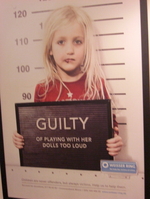
Hey, Cannes Lions delegates! Have a big heaping slice of buzzkill, brought to you by Weisser Ring!
I get that these are for a good cause. Given the appropriate context, these particular pieces are damn stirring.
But given that this image ornaments the exterior of the Palais and these ads plaster the interior, you gotta wonder: which sadistic member of the ad festival planning committee picked out this year's damaged kids motif?
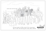
Toward its goal of creating "social advertising that actually makes a difference," Osocio sent us what looks like a hand-drawn print in which grinning creatives in suits stand around bearing trophies while people around them starve and emaciate.
"Awards can't feed the hungry," the piece reads, adding that, every year, hundreds of PSAs are made for the wrong reasons.
We digs. Work by Steal Our Ideas.
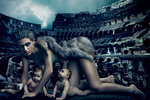
We were somewhere on Rue de Rivoli when we saw a print version of the image at left for coffee label Lavazza. Below the image of a feral woman clad in furs, her body hunched protectedly over two infants, an espresso cup clutched delicately in one hand, reads the tagline: "The Italian espresso experience."
Lavazza is the same brand that did the utterly carnal coffee-bean-grind prints two years ago.
After a bit of Googling we found out the image we saw is one of seven Annie Leibovitz-photographed prints for Lavazza's yearly Coffee Calendar, an artful and sexy tribute to a handful of Italian icons. The image at left is a reinterpretation of Colosseo & Lupa Capitolino and represents the January-February portions of the calendar.
more »
Fresh out the Harry Potter franchise, Emma Watson returns to earth on behalf of Burberry, which managed to score her in full postpubescent splendour.
She's clearly not the geeky kid witch we all took her for -- although this Mary Poppins-esque carpet bag leaves us with the sense she may have a few tricks yet. Or maybe she's just hiding an oversized umbrella that conjures the east wind when she needs to make life-changing nanny trips.
Brought to us by the incomparable Jeremy Dante.

|
|


