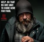
For client Vitae, the largest homeless shelter in the EU, McCann Portugal runs a rather unsettling holiday campaign in which people find a hollow-eyed homeless man in their trash bins with the appeal, "Help. So that no one have to come here for food."
Coming from a country in which passing change to the homeless is discouraged, we're hard-pressed to work out the call-to-action here. Do you give them a potted plant? Drive them to Vitae? Bake them a pie?
Women's health and reproductive rights organization IPAS campaigns to get women to speak up when they've been sexually abused. The ads well illustrate both the rage and sense of isolation that occurs when a person's been compromised. The little tear on the right cheek is helpful too, and the font is nice and raw.
The ads were put together by Santaclara, a spankin' new Sao Paulo agency. Well, this is a good strong start. Ethnic variations for IPAS are here and here.
Incognito informer FishnChimps points us in Ariel's direction for a redux in the car wars, which may or may not be a series of spoofs, though one could argue the breadth and popularity of them does these brands a major favor that few legit ads could.
In this iteration of the driving machine battle, BMW calls Jaguar a scaredy-cat by getting nose-to-nose and sending Jag's icon meowing back to the big tree it came from. Very cute even if, as unintentionally demonstrated in this ad, the Jaguar happens to be the prettier car and looks better still when compared to the blunt BMW hood. Nonetheless they got the point across fine.
Ad subtlety takes skill and a bit of patience with your consumer, but done well it makes all the difference in a great piece of print or television. A breaking campaign for Cars Guide enlists the magic of Cummins and Partners to deliver the message "Choice is everything."
You need to see the ads big for the full effect but check out the variations with Doc Brown and - by gad - is that Mr. T or a guerilla warrior?! We'd know that telltale feather anywhere. Of course guessing always gets one into trouble so if you know better, let us know and we'll telepathically pin a gold star to your pullover.
Saatchi and Saatchi throw together this print illustration of a rower fit to slip into a formidable Scylla-and-Charybdis-like vacuum because his Bose noise cancellation headphones are so awesome he just can't pay attention.
Funny how you get punished for not paying attention in real life, but this same deficit comes as a premium when illustrating how distractingly awesome a given product happens to be. Does that really help sell shit? We love the idea of getting lost with Beethoven but if the composer himself can actually fly down from heaven and lift us out of a boat destined for disaster then all the better, you can sign us up for some Bose headphones right now.
We somehow doubt the sound quality is that great, though.
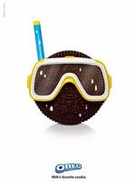
Under the tagline "Milk's favorite cookie," Draft FCB orchestrates a playful set of Oreo prints that illustrate "the dunk aspect of the Oreo twist, lick and dunk ritual and showcases the simple fun that dunking Oreo cookies in milk can bring," says Laurie Guzzinati of Kraft.
Okay. We can't fault Draft for saying "twist, lick and dunk" considering that's exactly what we do when we have the occasional Oreo. But after that lions-fucking insanity, which comes to mind every time we type out "Draft FCB," we just can't keep a straight face.
We're not sure if these are real and have a strong suspicion they're not, but the idea that they could be makes us happy. And even if they aren't, the strength virals have in consumer-generated media makes them just as legit WOM-wise for the respective companies involved. Just look at the arguments they generate.
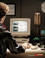
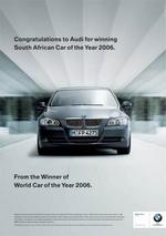
To wrap up the whole car-wars thing, the super-short synopsis: BMW gets snarky with Audi. Audi bitches them out. Subaru jumps in. Bentley pwns all. In fact we think we've just been sold on it. Why couldn't the Pepsi/Coke wars have ended like this?
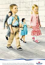
This somewhat creepy campaign is by Stena Lines, a major international ferry line. Apparently parents travel free if they bring at least two children.
Coolz0r points out it's typically kids who travel free when parents bring them on trips, but in this case the rules are reversed: kids become, in effect, authority figures as they're in control of the dollars being spent. (Don't they do that anyway though?)
These ads do a good job of illustrating that notion. There's just something unfailingly Mini-Me about them that rings funny. Check out another version here.
Condom Shop says "Don't be stupid" with some print that illustrates how forgetting a condom is the same as leaping into the line of fire wearing nothing but your bare ass. Sounds logical to us. We thank Ad Arena for this one.
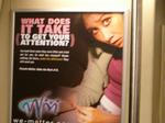
We Matter decided to start the year off right with print ads on BART featuring a girl cutting her wrists for lack of attention.
"How the hell can they wish us a happy 2007 with images like that?" snarled the teenage BART passenger who was forced to stare at it for the whole ride.
Hey, at least we know people look at ads and even take them a little personally. Maybe next year We Matter will glam up the campaign by putting one of those "HAPPY 2007!" party hats on its not-so-optimistic New Year poster children.
Read the copy here. We dig wake-up call ads, especially since cutting is a topic in suburbia that's not much addressed (and should be). That revelers came across the campaign over the threshold of 2007 was just awkward timing.

|


