To drive people into the arms of Philly, the Greater Philadelphia Tourism Marketing Corporation gives us a print campaign called uwishunu ("You wish you knew" in ... hipster-language?) which, from what we can tell, is all about people trying to infiltrate Philadelphia entryways.
See variations one and two.
The tagline: "Let curiosity get the best of you."
Our curiosity is going, "What's the heroin quotient in Philly?"
For World AIDS Day, Escala Comunicacao e Marketing unveiled a self-standing billboard with AIDS spelled in yellow condoms. The client was the Health Secretariat of Rio Grande, Brazil.
Something like 500 condoms were distributed. All told, this promotional collage says more than 8000 pedestrians "interacted" with the poster.
We always get a little sketched-out about the word "interact." If only 500 condoms were available, how did thousands interact with the billboard? Did they lean against it? Take pictures of it? Yell at kids or beat up cops in front of it? Sell their freely-acquired yellow condoms to peers?
The world may never know.
Update: A representative for Escala explained that the condoms were replaced everytime AIDS vanished from the board. That's kind of poetic.
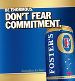
Nothing says BIG BRAND like a print ad with a big-ass typeface. With that, get to know the Foster's "BE ENORMOUS" campaign by StrawberryFrog.
Just another effort by a fermented beverage to make itself feel big -- real big -- by comparison. Instructions on BEing ENORMOUS are as follows (the spots are resisting our resizing tool. To see the whole thing, click on the ad and arrow down):
- Start an ATM conga line
- Become an urban legend
- Write your own theme song
- Make your middle name an adjective
Neato. Was "Australian for beer!" just not working out?
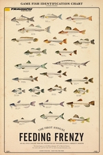
Does PETA care about fish? If they do, they might not like this new ad campaign from Triumph boats which promotes a Triumph Boat-sponsored "Feeding Frenzy" fishing tournament. With a Game Fish Identification Chart, the campaign, tagged "Good For You, Bad For The Fish," gleefully celebrates the all you can eat fish fry.
The campaign, created by The Republik in Durham, NC, includes posters, print and t-shirts to aid Triumph dealers in co-ordinating their individual fish fry events. And in case PETA wants to stage a protest, The first event will be held January 18 at Merritt Marine in Hillsborough, NC.
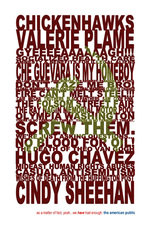
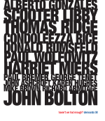
The Huffington Names/Slogans/Events campaign for Democrats '08 is allegedly so convicting that the campaign has decided to release stocking stuffer posters. Yes. Get your elongated 24x36" lithograph for $20 a pop.
Meanwhilst, the campaign enjoys some parody, courtesy of Michelle Malkin and friends, and gets compared to Frankie Goes to Hollywood.
Gotta love our political climate.
Cowabunga!
Gotta admire the strides Brigham Young University takes to protect the modesty of its Christ-centered scholars. Check out the policy on thongs and hemlines.
BYU grad Dooce piously laments, "I would have loved to have cartoon turtles call me 'dude' and remind me that 'piercings aren't acceptable, bro!' Would have brought me closer to Jesus."
See more here.
Sigh. According to a Huffington Post rep, Madame Arianna met co-chairman Rich Silverstein of Goodby, Silverstein and Partners -- allegedly single-handedly responsible for "Got Milk?", and asked him how the Democrats could get people to respond to their finger-pointing and whining -- er, issue framing.
Silverstein suggested a "visual blog" that metaphorically TiVos the last six years and plays them back "without comment" so the American people can connect the devastating dots.
With Silverstein's help, Huffington gives us three posters that consist of, well, finger-pointing and whining. Granted, in a very sassy typeface. See creative: Names, Slogans and Events. The tagline is, "Haven't we had enough?"
more »
Considering we're still detoxing from a distastefully delightful Popeye's turkey (don't ask), we thought we'd kick off the morning with a campaign loaded with pretty pictures.
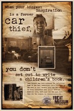
So here's creative for The Beat Museum, courtesy of Grey, SF. We hear you'll dig it if you're a big Kerouac fan, or at least somebody who still waves the flag for counterculture (you reverse conformist, you).
The posters will appear in magazines and on bus shelters throughout the hilly city. Website in the works.
We like them -- they've got that classy grit that so typifies the talented (and completely raging) bohemian beatnik. Plus, they teach you stuff without making you feel like a literature-starved ass-hat.
Our favourite is the poster we've affectionally dubbed the "fucking book" poster. Others (also nicknamed by us) include "hitchhiker thumb," "la grande HOWL," "no rules," and "junkies, drunks and criminals."
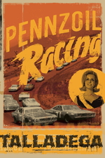
This gritty new campaign for Pennzoil was put together by TBWA\Chiat\Day and will appear at the SEMA trade show in Las Vegas.
The posters were printed on vintage paper to illuminate Pennzoil's old-school heritage and longtime association with NASCAR. They'll also serve double-time as prizes -- enthusiasts at SEMA will be taking copies home.
Maybe Pennzoil ads are the Leonetto Cappiellos of tomorrow. It's not like valorizing an oil firm is less banal than producing pretty posters for liquor.
The Talladega print is at left; see Indianapolis and Darlington.
We like. Then again, old-looking stuff always feels more substantial, doesn't it?
There once was a time restaurants where just a place you went to eat food. The came the chain and all the thematics that came along with it. Now, you can't operate a restaurant without investing heavily in a theme that will set you apart from every other restaurant in your are.
To help set Wisconson's Bridge Street Station apart from the competition, DDB helped tap into the owner's love for burgers and trains and gave the restaurant a railroad theme. Complete with the headline, "Chew, Chew," the campaign consists of ads, posters, branded take out boxes, signage, sound cards that delivered a steam engine's trademark "chew chew" sound, direct and table tents.
It's nicely done. Check out all the creative here.

|


