It isn't often we see a health or mental care ad that doesn't make us want to kill ourselves.
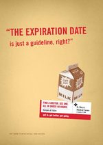
But Mortar Agency for St. Mary's Medical Center gives us a pleasant surprise with these witty prints that look like they're destined for the college demo -- known for taking liberties when it comes to staying healthy. (Take it from people who've swigged out of the expired milk carton too many times to count.)
The slogan is, appropriately, "Get in. Get better. Get going." If only repairing a broken back was that convenient. (Who uses a spotter, anyway?)
Our other favourites include Extra Spicy? and Here Kitty, Kitty, Kitty. See 'em all here.
Nothing rings in the holidays like the thought of wearing a new Chloe while unwrapping a golden box of truffles. Even if those truffles came from grandma, and even if you gave her the exact box two years ago.
This set of prints by Sugartown Creative is Godiva's attempt to position itself as a luxury item a la 10,000 water bottles or LV bags.
more »
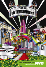
NYC & Company, which serves as New York's marketing and tourism organization, has launched a component at NYC Visit to help tourists feel more local. For the most part the site is a gigantic press release and if it possesses the rhyme and reason its raving PR people claimed, we're not seeing it.
Anyway, the new tourism effort for the Big Apple kicks off with a series of print ads and a TV spot, all of which are posted at the tourism site.
The print ads are explosions of ... just ... stuff and they all make stark statements: This is Entertainment, This is Fashion, This is Food, This is Shopping, and This is Just Another Day.
For the most part you get a Saks Ad Meets Highlights for Kids feeling.
We're not crazy about it. But hey, maybe the ads are amazing when they're three feet long and accosting you from the side of a building.
Either McDonald's gets off on the idea its golden arches could surpass sunlight, or somebody at DDB, Sydney is fucking wild about Egg McMuffins. (They are compelling sandwiches.)
Variations here and here. It's like some starry-eyed Nikon hobbyists couldn't decide which angle they loved best so they decided to pass all three favorites off as a tri-variant print campaign.
Are we supposed to compliment the photography?
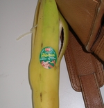
Adrants reader Adam Silverthorne writes to tell us about some advertising he saw on a banana he bought this morning. While isn't altogether new, the tie in is brilliant. The ad is for Disney's The Jungle Book DVD. Complete with image of a monkey (chimpanzee?), the ad gets points for relevancy.
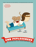
Leopold Ketel & Partners have created a campaign for the Oregon Humane Society to encourage the last 1/3 of the petless Oregonian populace to adopt. Campaign imagery reads, "End Petlessness: a pet for every man, woman and child." More prints here and here.
And if you have :30 seconds to burn on something that will make you go "awww" for as long as you can exhale and make noise at the same time, watch the TV spot, which looks like it would be more comfortable on CuteOverload.com than on gritty public TV.
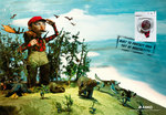
We're kind of crazy about this campaign for Asko by SMFB. If you have no idea what Asko is, that's cool, we didn't either. Apparently it's a brand for washing machines, and now it's the only washing machine we want.
The creative uses the playfulness and grit of claymation to tie our everyday self-delusion to the domestic cuddle-factor associated with doing your laundry. Fantastic balancing act.
Note the modern hunter-gatherer at left, braving the wild with his flannel "suit of masculinity." Check out the long-legged jeans-sporting chick as she towers over all, as much in her imagination as in the real world. Observe how proper washing can add self-esteem to otherwise self-deprecating shirts.
And consider how Asko protects guardian teddy bears! We are hugging ourselves at the very thought.
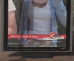
Three months ago, we reported Virgin Mobile catching some heat for using images from Flickr in an Australian ad campaign. Today, the media is all aflutter over the story because the family of one of the people featured in the campaign is suing Virgin Mobile for causing their daughter grief and humiliation.
The person featured in the ad is a girl of 16. The headline of the ad reads, "Dump Your Pen Friend" and the copy reads, "Free Text Virgin to Virgin." You read whatever you want into that one.
- Tom Ford and Vulva fixate on a particular female body part and introduce a new advertising trend: Vaginads.
- Not that you frequent a laundromat all that often but if you do, you just might be assaulted by washing machines bearing gigantic advertising posters.
- We stir debate as to whether or not Mazda, which does still make cars, can still create good commercials.
- What's a week without an appearance by our favorite hottie, Obama Girl? This time she's hooked up with Giuliani Girl to support the troops on behalf of the Iraq and Afghanistan Veterans Association.
- Look! Look! Look! Now you can blow an ad banner and make a website freeze!
more »
To draw more impressionable minds to its bonfire, Temple University launched T Means More, a campaign that turns the "Temple T" into a symbol of character, integrity, commitment, etc.
We are bored by this campaign and think that Temple gratuitously abuses the color red. Might be a good idea to just mail all potential students a copy of this book.

|


