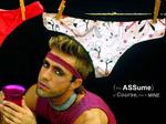
Flickr user Alane Golden has created a set of American Apparel ads he created as "a presentation for American Apparel. Call it my attempt landing a creative gig. Just something i have thrown together -to be reproduced nowhere, except perhaps as photos for my mates who posed!" No there's some serious consumer-created advertising dedication for you. The ads certainly mirror American Apparel's odd image but seem to steer clear of the already over-done kiddy-porn look which has gained the fashion brand fame and notoriety. Check out all the ads here.
Adverblog points to Banner Blog, an Australian weblog with the sole purpose of collecting and highlighting advertising banners created by Australian marketers. It was created by Soap Creative's Ashley Ringrose and RMG Connect's Ashadi Hopper.
Almost a year after its release in Japan, Ad Age is featuring the McDonald's McHottie spot calling it "Ronald McDonald as you've never seen her before. Well, we have but we're glad Ad Age readers can now clue in to to what Ad Age cites as a trend "where the clothing worn by brand icons has become a fashion craze for Japanese school girls." What did Hilary Duff Say? That's so yesterday? Anyway, enjoy. We can't all be the first to discover a trend.
Other spots featured in this week's Ad Age TV Spots of the Week include Strawberry Frog's first work for Heineken which involves soccer and a lot of pigeons pooping in sync; a psycho-granny torments her son on a bed of nails to promote Universal Orlando's Halloween; a kind of stupid DDB-created Diet Pepsi spot in which a Pepsi machine is drafted as a New England Patriots player; a stirring, emotionally schmaltzy W&K-created spot for Miller High Life featuring the Moon Girl which Ad Age hated so, of course, we love; a BBDO-created iPod copy-cat spot for Cingular's new Rokr phone along with Madonna's telephone booth spot which very clearly but apparently not clearly enough for Chicago Tribune advertising columnist Lewis Lazare, explains how 100 songs can be crammed into the Rokr iTunes phone; and, finally, Kaplan Thaler created an IAG "most liked" Aflac Duck commercial in which the duck is hurled out of a hammock and into a neighboring pool.
Bucky Turco points to recent ad in L Magazine for the new Scion tC which promotes the cars ability to be customized with 30 available accessories. It's all about realizing one's inspirations and how the Scion tC makes that possible. However, there seem to boundaries to this realization as indicated by the disclaimer under the car's image which reads, "Vehicle featured is modified with non-Genuine Scion parts. Check with your local dealer as some accessories may void warranty, negatively impact vehicle performance, and may not be street legal."
Basically, Scion is telling buyers to go ahead and realize inspirations with their car as long as those inspirations live within the confines of Scion's available and, likely, highly priced options. Have fun, but not too much fun. It's a mixed message at best. Scion wants tuner wannabes to believe this car will be the answer to their dreams...as long as those dreams aren't too broad.
Dish Network has launched a microsite called TV Doesn't have to Suck with the nifty URL suckfreetv.com. With a couple of spots, a section which sadly demonstrates how detrimental sucky TV can be and a game that lets you suck grandma out of her chair into the TV, the microsite does a good job making fun of bad TV all in the name of promoting Dish Network. The problem is, TV doesn't suck. The argument that satellite TV is better than cable is no longer appropriate if it ever was in the first place. In fact, cable may be better than satellite in some respects when it comes to features like HBO On Demand which, we're told, isn't available via satellite; speedy internet access and the ability to use cheap phone service like Vonage over the cable connection.
That said, the microsite is funny enough except for one major design peeve of ours. We simply do not understand why designers feel the need to un-necessarily alter the size of the browser window, in this case, maximizing it to full screen. Leave that shit alone. Your creative isn't the only thing happening on a person's desktop. The tactic is almost as bad as a pop up.
Max Lenderman points to a billboard created by TBWA/Vancouver which leveraged the unfortunate but dependable human propensity to steal stuff. The billboard was created for security company Black Tower Home Security and after enough people had stolen various items off the billboard, the headline, "People Steal," was revealed aligning nicely with the Black Tower's business proposition. Good stuff.
Confirming the well known fact that there are no more new ideas and that the sincerest form of flattery in advertising is to copy another's work, Starbucks is the second company, after Netscape, to copy the office cubicle microsite thing, apparently originated by Hostway in April. Now, for those who like to snoop, yes, Starbuck's version of the office cubicle site, called DoubleShot, resides on a site that was registered way back in 1998 but an informant tell us the cubicle creative was recently launched. No doubt, Adrants readers will correct any errors in this assumption.
The site itself has all the usual stuff from a lame video to a picture of parents that say "hello" to a gadget sweepstakes to voice mail messages to a ceiling darts to a number you can call to reach "Hank" who, of course, isn't answering. It's all been done before. Done. Done. Done. But, why is it that we spent so much time on the site engaging in "brand immersion" as those account management types like to call it? maybe the office cubicle is the new :30. Hey, the :30 worked forever. Why not the office cubicle?
Kosher.com has launched a little promotional cartoon, created by Dan Meth, which does a great job clearly explaining the Kosher.com offering. From mentioning the foods they carry by name and showing them to explaining where they came from to telling you how can buy them, Kosher.com makes it clear they are they place to go to when Kosher food is what's for dinner. It's not rocket science but, unfortunately, too many commercials try to be and fail. This one doesn't and, pleasantly, succeeds.
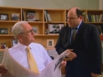
The verdict is in. No one likes the new Lee Iacocca/Jason Alexander Chrysler commercial. Well, at least no one in the ad industry that is a member of the Adrants discussion group. Even so, wondering whether bringing Iacocca back was effective, one member did an informal survey of people under 40 and found none knew who that old, gray-haired guy sitting behind the desk was. When told it was Lee Iacocca, the man who saved Chrysler from extinction, many replied, "Oh, whatever."
Again, we question the wisdom of trying to recreate a previous success. Whether it be an idea-less Hollywood remake or an attempt at mirroring the cult-like success of a previous ad campaign, rarely, if ever, does the follow up come anywhere near the success of the first effort. Having Alexander approach Iacocca from behind as he did many times the back of Steinbrenner in Seinfeld is simply layering another has been success on top of another. Iacocca should have said no to this. Alexander should have said no. Those who came up with the idea for this should have said no. In spite of these failures occurring over and over and over, it never seems to register with those who insist upon borrowing from past successes (think Hilltop/Chilltop) instead of creating something original.
With barely legal curiosity and longing, the young girl in this ad dreams of the day when a very large Durex condom will come between her and the ripped prince's burgeoning bulge her eyes wistfully yearn. With the headline, "One day you'll wish you had a Durex condom," the ad hearkens early innocence and an "I wonder what that would feel like" eagerness only experienced early in life.
Some might label the ad overly racy or a poor attempt at humor but they would be wrong. The ad is extremely honest conveying natural human desire and sexuality which, all too often, are portrayed with snickers, avoidance and censorship.

|
|


