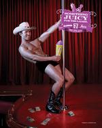
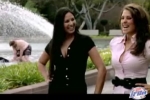
Thank you, 7 Eleven! Finally, we can feature an ad campaign that objectifies men. Rather than scantily clad women, we have scantily clad men vamping for 7 Eleven in Australia to promote the chain's frozen Slurpee. With gleeful abandon, the men in the ads are given the full beefcake treatment and portrayed as poolboy, pole dancer and maid. Contrary to what one might assume, this reverse double standard-ish campaign was not created by a bunch of giggling female creatives sitting around the conference room table but by five guys at Leo Burnett Melbourne...who probably also giggled madly while sitting around the conference room table. This ought to keep us editorially balance for at least another year, don'tcha think?
When we heard Philips was a new logo for its environmentally friendly -focused product line called The Philips Green Tick, we thought "Eew." "Disgusting." "Gross." Then we looked at the logo, saw that it looked nothing like a tick and said, "Huh?" The thing looks more like an ear of corn with a circle around it than the disgusting creature that love to borough itself into your skin.
Certainly, the word tick has many meanings but the sound a clock makes or a check mark or an informal unit of measure were not what immediately came to mind. Perhaps, unlike in Northeast America, they don't have the nasty blood sucking creatures in the U.K where this campaign originated. Perhaps, as is usually the case, we're talking out of our ass and making a big deal out of nothing. You choose.
Just where do we start with this one? First, some lessons in PR 101. Don't send a press release to a media outlet touting you've offered exclusivity and then, in the same press release, mention you've posted the commercial in question on YouTube. Last we checked, there are several billion other people who have access to YouTube on an given day.
Second, don't call something viral and, in the same press release, mention the commercial won't launch officially until the next day. And third, don't create a commercial that features insects getting pelted by food substances while filming it all in slow motion. Insect have cause groups to, you know. Fourth and finally, for God's sake, don't call a commercial a "film" unless you have your egotistical head stuck so far up your Hollywood wannabee ass, you can't tell the difference.
more »
Now here's an art director's wet dream. Giving sunglasses far more cred than they deserve, Chuck McBride's new agency, Cutwater, has turned the average pair of Ray Bans into some sort of cultural icon. Oh wait, they already earned that status so we guess it's all good. Produced by HSI Productions and directed by Michael Haussman, the spot ends with the super, "Never Hide," which, for a sunglasses commercial, is pretty twisted but exudes so much positivity.
Any commercial that tells us to "make up your fuckin' mind fuckin' make up your mind" is good in our book. This might not be saying much but we liked this commercial more and more with each viewing. Fans of frequency in the media department will love that notion. Give it a watch. It's not your average sunglass commercial. Maybe Chuck's stabbing video has, indeed, led to good things.
Naming the best Super Bowl commercial is, at best, uselessly subjective and wholly irrelevant but we're going to do it anyway. And, in a shocker, we're going to agree with Advertising Age's bob Garfield and dub the Emerald Nuts Robert Goulet commercial our favorite. It's just twisted and quirky enough for us to appreciate and, not to be dismissed (although it usually is with Super Bowl ads), did a pretty good job of sliding some product benefit into the ad. So, Bob, what do you think? More importantly, what does everyone else think? Are we nuts? Oops. Sorry. Anyway, both of us (Angela and Steve) thought it was the best so we're going to honor it the Adrants Favorite for this year. The ad was developed by Goodby, Silverstein & Partners, San Francisco and was directed by the kooky and famed Perlorian Brothers.
more »
As Sunday turns into Monday and time allows for the additional digestion and review of Super Bowl commercials, Bud Light's slapping ad has us laughing out loud this morning. When we viewed it during the game along with the insanity of the rest of the event, we didn't have time to enjoy the very hilarious wink/nod embedded in that ad. You all, of course, remember the Agency.com YouTube video fiasco in which Tom Ajello's fist bump became the signature of something...um...less than positive about the ad business. Well, wasn't it hilarious to see that very same notion become the basis of the Bud Light Slapping ad in which a guy, in response to an offered fist bump, says, "Yo, Steve, fist bump is out man!"
After that, the commercial turns into a humorous slap-fest but the funniest part of the ad is the end when the old dude (ad exec? hmm) offers up a fist bump and says to the young dude, "Nice job in there, Larson. You saved the account" to which the young dude responds by slapping the old dude. There's no way this commercial's creative concepting occurred without mention of Agency.com and its famouos fist bump. Nice work, guys.
OK, this is just gross. There's a reason why hot women (and men) are allowed to take their shirts off and strut their stuff for the general public's appreciation. That's the reason why that 2003 Miller Catfight Super Bowl spot received so much notoriety. While Miller did create a male hottie version of the pool/mud wrestling spot, the two guys in that ad stopped short of having an actual fight and got all "sensitive man" on us to which, we wrote, "Oh please...can't they just beat the shit out of each other like the girls did in the mud wrestling spot?"
more »
If memory serves, after 9/11, wasn't it the French who sort of dragged their feet and made things difficult for the countries trying to tally together against Bin Laden? If so, that might explain this ad for French tree hugger site Defi Pour La Terre which thought it would be witty to transform the image of two trees into the twin towers burning on that fateful day. All to somehow equate the value of a tree to the value of a human life.
We not sure any amount of time passed makes this sort of thing OK. Then again, we're American. We knew people on Flight 93. The French? Well, perhaps they didn't know anyone who died that day or just feel Americans can't keep their hands out of other countries' issues. While the latter may be true, mocking a world event such as 9/11, at least for now, is still in very bad taste. And the French are supposed to know about taste, right?
Over the past few months, Copyranter has been diligently following the ever increasing cup size and revealing cleavage of True.com models who force you to stare at them every time you log into your MySpace page. Now, it seems, stodgy Match.com has had enough and has instructed its creative folks to unleash its own D+ cup cleavage upon us to attract eyeballs just as True.com does.
Copyranter notes the model in the ad is said to be an actual Match.com member (as opposed to True.com's hired models) but also questions the validity of her "Brody100" profile and posits she's a Match.com employee or a "paid plant." Who cares. Cleavage is cleavage after all so we're not going to be picky. What's that saying? "Bigger is better?"
UPDATE: We have been assured by Match.com's PR agency that Brody100 is, indeed, the real deal. She, along with 25 other Match.com members are featured in the company's just launched campaign.
We really like these ads for Korbel Royal and Korbel Blue Hawaiian, which made Steve want to dive into his computer screen, pop the cork and down a bottle while I experienced a bizarre craving for champagne with essence of coconut.
Korbel tagged agency Carmichael Lynch and Gasket Studios, who with their animation wanted to turn the ads into an experience of "visual taste." Gasket founder Greg Shultz adds, "Fluidity, fun, Americana and nostalgia are mixed with a very current aesthetic - the very essence of the Korbel champagne cocktails." He appears to have some trouble committing to just a couple of good adjectives there. In any case the wine cooler - oops, champagne cocktail - ads leap off Time Square this month but expect to see them elsewhere.

|
|


