To promote its new GMC Yukon SUV, GM has launched an interesting campaign that uses graffiti-like imagery that's really engineering equations along with a URL pointing people to a microsite called Beyond the Drawing Board. On the site, there is endless information about the vehicle presented within the grafitti-like motif (OMG, did we just use the word "motif?" Please, forgive us. That's like saying "synergy" after the 80's ended.) Upon hearing the audio intro to the site, "What happens when passion becomes obsession? When the need to innovate is unquenchable? When the desire to create is all consuming?", we resisted the urge to respond, "Gee, um, create a piece of Flashtastic orgasmimage that makes our tired old laptop's fan spin up to top velocity in an attempt to cool the burden placed on the processor by all this Flashtastic exuberance."
more »
Adding a change up to the American Dairy Association's Got Milk? campaign, Goodby, Silverstein & Partners has created a new campaign focusing on a race of aliens from Brittlelactica who suffer from a "series of horrible health ailments" until they visit earth and discover a special elixer called Da Iry. A TV ad points to a content-rich website that riffs on the supposed problems a diet without milk can cause. Brittelactica is broken into four regions, Insomniastan, PMStonia, Papua Hairthinny and Cavitopi, each suffering from ailments caused from the lack of milk. Each region contains a history and a message from the region's chancellor. each of whom suffers from his region's ailment.
more »
Ideas for bra ad concepts are as endless as Peter North's "product." There's no end to the way you can manipulate society's obsession with breasts into an ad campaign. While these concepts aren't rocket science, most good concepts aren't. They work because they are simple. And these ads for Wonderbra are very simple. One is playful. The other pokes fun at the relationship between breasts and shirt buttons. What more can really be said about a bra that hasn't a;ready been said?
We don't know where this lamp post ad is or who the advertiser is but it certainly is attention getting. Beyond the effective merging of the actual lamp post with the post in the ad, there's the whole woman wrapped around a pole like a pole dancer thing that never fails to increase the height of attention commanded by such imagery. See the full image here.
more »
To celebrate International Women's Day on March 8, Indian agency The Flea created this short clip which very simply asks everyone in the breast-obsessed world to look at women as more than a pair of bouncing breasts. It makes the point very clearly. Of course, it does so by highlighting the very thing it aims to eliminate. Then again, the whole purpose was to attract attention to the issue and what better way to do so then to show a pair of bouncing breasts.
Pastor Scott Hodge was walking down Chicago's Michigan Avenue yesterday and spotted this unique window dressing promoting Apple's new iPod Hi-Fi. Aside from the fact, the whole things just a really fancy speaker, the execution is most certainly attention getting and speaks well to the proverbial window-breaking qualities of proverbially kick ass sound systems. Check out the full sized images here.
John Brock points us to a story about a recently launched Mexican television campaign from the National Women's Institute which portrays blow up sex dolls as office workers to somehow get men to stop treating women like sex dolls. Somehow, we just think this reinforces the stereotype.
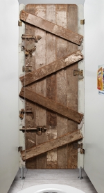
Leo Burnett Lisbon has done a very cool campaign for Kellogg's All-Bran Plus cereal which found the perfect contextual location for its message: the bathroom stall. The promotion placed large stickers that looked like a locked door or a brick wall on the backside of bathroom stall doors along with another poster on the side wall explaining the cereals benefits.
This is perfect on so many levels. First, it's unexpected and catches attention. Second, the locked door makes the subliminal connection to, well, being blocked up if you don't eat enough fiber - something All-Bran Plus provides. And third, what else is there to do while in the toilet than read an ad. Brilliant work. See the creative in its full glory here.
We just love when a campaign delivers a single message, does so with whit and doesn't try to do more than any single ad can do. These four commercials for Adidas' Climacool shoe are good. Really good. They continually drive home one point: these shoes will keep your feet cool. An the ads do it an amusingly quirky fashion. They were created by TBWA/Chiat/Day San Francisco and produced by Reginald Pike which, as a side note, seems to be the only entity out there that knows how to properly display their work online in a simple to consume fashion. No attachments. No wordy press releases. No cumbersome windows video formats. Just a simple email with credits and a single link to a clean, embedded Quicktime video. As a media property, we greatly appreciate that.
OK so maybe this campaign grabs attention visually but does anyone playing/winning the Minnesota State Lottery want to look like a stupid, buck toothed gopher? Oh wait, that's pretty accurate. See more idiots here.

|
|


