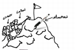
You know how the Leo Burnett website does that cute (but sort of messy) thing with the pencil? Labov & Beyond must've seen it and gone, "Hey, we should turn that whole 'scribble' concept into the core model of our site redesign."
Because that's exactly what it did.
more »
While the eBay we know and love is busy terrorizing holiday icons, eBay France highlights buyers' individuality with a little bit of TV love.
Its new campaign, eBay c'est vous (eBay: it's you!), orchestrated by BETC EuroRSCG, encourages online sellers to buy ad space in TV spots for products in a given category.
Adverblog explains that 10 product categories will go up for grabs, with sellers bidding for each space. Money collected by eBay will be donated to a charity called Planete Urgence.
Very "web 2.0." (Can we ban that phrase forever?) The big question is how the ads are going to be put together. Our guess is that there will be guidelines similar to what sellers fill out when they put items up for auction. That'll keep things nice and organized.
"One market. Infinite possibilities." That's the going slogan for the NYSE, a brand so big and so embedded in the American financial subconscious that seeing an ad for it almost confuses us.
This pair of spots -- dubbed Market Conditions and One Destination -- are chock-full of NYSE listed companies and glorify the speed and interconnectedness so necessary to business today. The agency responsible is Fallon Worldwide, but the smooth production comes from Stardust.
We were really fond of the last spot, which moved slowly and did a better job of illustrating a blooming world of "infinite possibilities."
All in all, these do a serviceable job of keeping the NYSE salient in ad land, but they're not especially resonant. It could just be the new narrator. He has a smack of fresh 90s dot-com-ness to him.
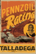
This gritty new campaign for Pennzoil was put together by TBWA\Chiat\Day and will appear at the SEMA trade show in Las Vegas.
The posters were printed on vintage paper to illuminate Pennzoil's old-school heritage and longtime association with NASCAR. They'll also serve double-time as prizes -- enthusiasts at SEMA will be taking copies home.
Maybe Pennzoil ads are the Leonetto Cappiellos of tomorrow. It's not like valorizing an oil firm is less banal than producing pretty posters for liquor.
The Talladega print is at left; see Indianapolis and Darlington.
We like. Then again, old-looking stuff always feels more substantial, doesn't it?
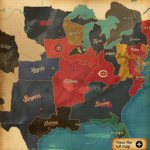
Nike and Major League Baseball play on the United Colors of Benetton to give us the United Countries of Baseball, a world segmented by team allegiances instead of by states or countries.
The idea is to map the "borders of fan loyalty." Each baseball-playing country has its own map, alongside posters with player nicknames specific to each territory.
The campaign was orchestrated by Cole & Weber United.
We actually didn't think baseball had a rabid fan base any longer. Post-steroids scandal, it looks like basketball is taking the whole "American Dream" torch. See recent promotions for Dwyane Wade and Monta Ellis.
Time Warner Cable wants you to know it thinks like you think.
(And by that, what it means is, it can take your crappy ideas and turn them into products that sell in the mainstream market.)
The campaign site was put together by Ogilvy & Mather, with casting by sausage. It's actually pretty neat. Click on a character in the suburban setting to see what they've invented to make their lives better, and find out how Time Warner pwned their asses.
What do you get when you mash up the quirky language spots proffered by Berlitz, and self-deprecating animations for Virgin America?
You get Planeguage by Delta. (Or more accurately, by CAA.)
See the spot entitled "Middleman" here.
The music's a little jarring but the scenes -- unrestrained kids, the woman who keeps opening and closing her shade, the little dance you do when you've been holding your pee -- are too close to home not to crack a smile.
Nice to see airlines spending money on advertising again. Now, if only they could pull their CRM act together. Some watchers have commented a company like Delta should hold off on making jokes about their crap airline experience -- when it's you that gets stranded, and you that gets aisle-bumped, you're not laughing.
A cute campaign does not a great experience make.
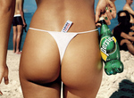
Apparently tiny, cover-nothing thongs can actually make you hot (temperature hot, that is) according to this French Perrier ad featuring a woman in a thong seemingly cooling her overly hot ass with a bottle of the stuff. This sort of advertising is still acceptable (thankfully in some respects) in places outside the U.S. and God forbid if we American get gratuitous and degrade women (and men) into objects of desire.
more »
Well here's a powerful one from the Helen Bamber Foundation. It features Emma Thompson playing the part of a woman with two very different lives. One, a normal woman and the other, a sex trafficked prostitute. The graphic nature of the commercial hits home hard with the message women who are traffiked for sex lose much more than just their names. Powerful stuff.
There once was a time restaurants where just a place you went to eat food. The came the chain and all the thematics that came along with it. Now, you can't operate a restaurant without investing heavily in a theme that will set you apart from every other restaurant in your are.
To help set Wisconson's Bridge Street Station apart from the competition, DDB helped tap into the owner's love for burgers and trains and gave the restaurant a railroad theme. Complete with the headline, "Chew, Chew," the campaign consists of ads, posters, branded take out boxes, signage, sound cards that delivered a steam engine's trademark "chew chew" sound, direct and table tents.
It's nicely done. Check out all the creative here.

|
