Hrm. While colas try brewing competitive energy drinks, Red Bull -- arguably the best-known of them all -- has decided to launch its own soda. We give you Red Bull simply Cola.
No word on when it's appearing in the States, but it's au naturel, with 23 unmolested ingredients and slightly more caffeine than most sodas.
To promote simply Cola, Red Bull is distributing leaflets that serve two purposes:
- Highlighting the drink's ingredient list (none of which is the taurine that made them famous. Although there's mustard seeds and cardamom for kick)
- Justifying its entry into the market. Because this isn't just any cola. It's special cola: strong and natural (says them, not us)
Well, hell. We'd drink it.
Have you ever been to Build-a-Bear? You know how the employees give you a little heart pillow to wish on and put inside your bear, right before it's sewn up?
Graft that process onto your daily run. Put a piece of Nike in your shoe.
We didn't really get this ad so we read the pressie for clarification. This is what it says.
more »
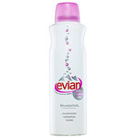
Because convincing people to pay more for water in ultra-fancy packages never gets old, Evian Canada is re-launching its brumisateur facial spray this April. And at $10 per bottle, we're sure they'll call it a bargain.
According to the PR folk, this soothing spray is good for:
o Hot afternoons on the golf course
o Wedding giveaways (Eva Longoria and Tony Parker gave some away at their wedding. WAIT A SEC. Doesn't Eva drink HINT?!!)
o Setting make-up
o "Those pesky hot flashes" -- their words, not ours.
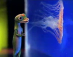
Possibly because he proved such a smashing success in San Diego, the Association of Zoos and Aquariums has brought a man dressed like GEICO's Gecko to the Houston Zoo along with a live gecko exhibit.
Houston Zoo director Rick Barongi called GEICO "a great partner for zoos and aquariums." What?! GEICO on best behaviour amongst wee kiddies and disgruntled animals? We believe it. If we were the most visible insurance option at a zoo, we would be too.
Having fielded studies, interviewed researchers and read "over 50 books" (!!!!) about marketing to women, Hoffman York has launched Kaleidoscope Group, a girl goddess think tank.
The website greeted us with an actual kaleidoscope of women and some Lilith Fair music that stimulated the growth of our leg hair follicles.
The group coined what it calls the "Time Zero Effect," which posits that even one negative element in an ad to women will blow your brand out of her periphery. (0x0=0. Get it?)
more »
Adrants reader Atif sent us Delta's new airline safety video. It's all slick production and jammed with in-flight classics:
o A hot pilot
o A distractingly hot spokes-stewardess (Dubbed "Deltalina" by the Flyertalk forum geeks, for her similarity to Angelina Jolie)
o The requisite forced enthusiasm for the 5 minutes of life-saving schlock we've heard 30382943908453908 times
o The "No Smoking" finger wave
o An Orbit tooth glisten, complete with sound effects (wait for it!)
The spot felt gimmicky because it was gimmicky. But maybe there's genius in thinking a formulaic safety video can win back some groove with a commercial tribute feel.
more »
Sometimes even lowly coffee brands needs the occasional boost and that's what Indianapolis-based Young & Laramore did for Memphis-based Ugly Mug coffee as part of a complete re-branding. Focusing on coffee's true purpose, to dramatically kick your head into gear each morning, Y&L went bold. Very bold.
more »
"If you wear it, they will watch." That's the premise behind the concept of wearable video (patent pending).
The business plan is simple enough: just slide a video vest onto "brand ambassadors," a winning euphemism for "leggy girls in bikinis and/or short skirts walking around with audio/visual torsos." Big upgrade on ye olde standby.
Online testimonials included "Hey, cool" and "I was drawn to her."
...Yeah.
When it comes to targeting the elusive Hispanic consumer, Cilantro Animation has this to say: "Be prepared to offer more than just Hola!"
(Though we'd like to point out that strategy worked wonders for Dora the Explorer.)
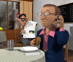
But Cilantro -- which creates Hispanic cartoons like the one at left -- makes an interesting point. When we hit ad:tech Miami we were overwhelmed with a sense that the Hispanic market remains unimpressed with the way big media has (or hasn't) tried to reach out.
And indeed, a salsa-colored Hola! just doesn't cut it when you consider the range of ethnicities blanketed under what we breezily dub Hispanic: Mexican, Cuban, Peruvian, Venezuelan, Colombian, Ecuadorian, and others -- all with their own cultural customs, jokes and sensitivities.
more »
Check out the Electric Tiger Land shoe campaign by StrawberryFrog, Amsterdam (print variations 1 and 2).
Here's the accompanying spot.
The pressie tells us the shots are of a giant "city in a sneaker" sculpture for Asics' Ontisuka Tiger.
The sculpture was inspired by Tokyo and has Japanese market signs in the toe, Onitsuka Tiger vending machines in the heel and the Narita airport runway on the the tongue. Versions were also made for Germany, France, the UK, Korea, and Australia.
more »

|
|


