Stretching the metaphor to the limit, Hewlett Packard has launched a small business campaign called Happy People which illustrates how a well- tuned office environment (courtesy of HP, natch) can conjure the brilliance of Mozart. If, in fact, the entire soundtrack in this ad really did come from simple office objects, we think it's a wonderful achievement reminiscent of the Honda Choir ad.
Shake Well Before Use points us to Engadget's collection of the best of the worst ads seen at this week's CES conference. Predictably, one involves word play on big boobs. Check them all out here.
Not much to say about these Volkswagen Toureg ads other than what does a woman standing in what looks to be a prehistoric dinosaur landscape and a man standing in a rocky, desert-like landscape have to do with selling an SUV? Maybe it's Friday and we're tired. Maybe we like more descriptive body copy in out ads. Maybe we drank too much last night.
Yes, yes, Second Life is apparently alive. While haven't been there in months, commerce seems to be alive and well or at least the promotional aspects of commerce. Here's an ad campaign for Hang the DJ clothing shop. Just like in real life, Second Life virtual hotties model the shop's wares. While the men's t-shirts are likely to fit any average guy, it appears the women's t-shirts have to be specially sized to accommodate the huge breasts every female in SL seems to possess.
And you have to get a kick out of the odd juxtaposition of each male model's left hand appearing eerily between the crotch of the model to his left.
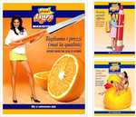
Thank God for Flickr because without it, we wouldn't have these WTF-inducing advertising images catching our eye as we scroll hundreds of ad images every day. This one, apparently for some king of orange juice (?), features a kid with a giant pencil, a bikinied woman straddling a rubber duck (read what you will into that) and an impossibly leggy woman with an impossibly short (OK, we've seen shorter) mini-skirt and an impossibly long knife...nest to an orange. Whatever.
And yes, we're sure it all would make perfect sense if we could read the language the ads were written. But, then, what fun would that be?
WeightWatchers, playing off the post-holiday weight gain agony so many apparently suffer from, has launched this Duval Guillaume-created video entitled My Body is Out of Proportion. It features a fat guy who sings, cowboy-style, about the woes of weight gain such as not being able to see his toes and how it would be so much nicer if he could. We like.
Apparently because even elevators are no on green freak's naughty list, we are now blessed with a lengthy dramatization of ascending three flights of stairs Everest-style. Please.
Adrants is happy to announce its continued partnership with Business Development Institute and its ongoing series of Diversity in Advertising conferences. Aimed at addressing an issue that usually receives nothing more than lip service, the conference series hopes to keep the discussion of diversity in advertising alive and to broaden the appeal of a career in advertising to all.
This year, there will be four events. On February 12, the Second Annual Advertising and Marketing Industry Diversity Job Fair will be held at the Academy of Art University in San Francisco. On February 27, the conference will travel to New York's NYU. In March, we will hold our first job Fair conference in Chicago. And during Advertising Week September 22-26, we will hold our second Experienced Hire Diversity Recruiting program.
We'll share more details with you as they become available. The BDI website will also carry updated conference information and details on how to attend and/or sponsor.
OK, OK OK! We don't usually highlight spec ads but because no less than nine people have sent us this video, we guess there must be some kind of demand for it so here it it. Believe it or not, we've grown tired of Wonderbra's wacky efforts at advertising its supportive devices but it seems many have not including the creators of this wannabe ad.
The "ad" uses the age-old visual trick of the revolving spiral that, when stared into for a while, can make the following image appear to move as well. In this case, it's a pair of bra-clad breasts which seem to continuously get bigger. Yet another witty representation of the apparently magical breast enlarging qualities on Wonderbra.
more »
Either ingenious or just gross, Clearasil has placed a sticker that looks like a zit on German teen magazine stadtlichter. Created by Euro RSCG Duesseldorf, the sticker says "Get rid of it" and when removed from the magazine cover, the Clearasil brand is revealed along with the brand's website address.
Assuming teenagers still pick zits off their face, it's likely they'd be predisposed to pick one off a magazine cover as well. It seems they did according to Clearasil which reported a spike in website traffic during the run of the campaign.

|
|


