We just got a press release that starts, "PURDUE EMPLOYEES FEDERAL CREDIT UNION BLOWS AWAY THE COMPETITION." And no, it's not a reference to some landmark deal-making.
It's an announcement about its AdPack marketing strategy!
The credit union is giving away 20,000 branded tissue packs at Purdue University football games. The packs read, "Don't blow it with another credit card."
Har har.
We made a lot of "blow" references in college, but none of them actually had to do with credit cards. Well, except for one.
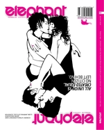
Boulder agency TDA Advertising & Design, "a big advocate of, and more than willing to perform gay marriages, " so says CD Jonathon Schoenberg, has created an interesting cover for quarterly elephant magazine, a guide to "The Mindful Life." Intertwined are two couples each embracing their partner creating some intriguing optical trickery. Depending upon your sexual proclivities, it just might be fun to be in the middle of all of that.
Those who watched 300 in a theatre full of high school kids know it was just a matter of time before the film sparked an epic spoof with a disco king-meets-Bring it On kind of feel.
And no, we're not talking about this.
The wait's over. Meet the Spartans. The trailer's almost as guffaw-inducing as 300 itself.
The Zune is getting mighty sexy ad-wise. (Not like Microsoft hasn't got the blow to cash -- er, the cash to blow.)
The brand enlisted TAG, SF to build a silent spot for the 20-foot GeoffreyTron billboard in Times Square. The final product, Zune Tron, made use of work by Stardust, whose job it was to enliven the spot without use of actual sound. That's a tall order considering the product is an MP3 player, but it turned out damn pretty. It must have been gorgeous in person.
GEICO supports wildlife conservation. Not convinced? Watch the gecko have a heart-to-heart with an otter and a jellyfish, courtesy of the Association of Zoos and Acquariums.
The gecko shtick never gets old. We're glad GEICO didn't lose sight of that in the face of its neurotic caveman's mushroom cloud popularity.
Catch the gecko in the flesh at the San Diego Zoo's Children's Zoo from January 5-February 17. You'll meet a few real geckos, and a big fake one too. (The GEICO mascot, that is.)
ABC's The View and Kimberly-Clark -- the pretty name behind a bunch of brands lying around your house -- are conducting their second annual Room-a-Day Giveaway. 16 people will get 25 grand for a room makeover from January 12 to March 7.
15 winners will be announced on the show; the 16th will appear on the March 13 episode. Last year (arguably the height of the UGC craze) the contest got about 3.6 million entries.
It's not like there's anything else to watch, right? Damn writers strike.
Perhaps they haven't seen ATT's logo. Perhaps they don't care their new logo conjures a lazy Saturday afternoon at the beach. No, Xerox and Omnicom' Interbrand, which just unveiled its new logo today, thinks a red beach ball will do just fine conveying its desire to be known as a company that is "engaging and approachable." Yes, "engaging and approachable" just like small child at the beach who wants you to play beach ball with them.
After 20 years of that big red X, 18 months of research and development has yielded...a beach ball. Yup. When we think of a serious document management company, we think of...a beach ball. Don't you?
Anyway, life goes on and after a month or two, no one will even care about this let alone remember the original red X logo.
Yup. we're ready for it. Ready for everyone to tell us we're reading way, way too much into this Target billboard that places a certain area of a woman's body highly targeted by men right in the middle of its signature target logo. But you can't tell us not a single soul at Target or its agency looked at this and didn't see a certain interpretation that could be construed as objectifying to women. There's just no way.
Would it have been that hard to place the image of the woman so her upper body was in the middle of the target rather than her...um...crotch? Seriously. Perhaps the initial concept had her playfully face down in a pile of snow emblazoned with her ass in the middle of the Target logo but someone at Target said, "We don't do doggy style at our organization. Flip her over please."
Sometimes an innocent instance of "sticking it to the man" is not just sticking it to the man. It might be sticking it to women. Literally. Blood and all.
Words & Pictures takes a closer look at the activities of the East London Decapitator and observes the lauded ad-manipulator targets women five-to-one.
Considering the female half of Adrants is the Queen's Country right now, that's a ratio that literally hurts our necks.
Read the analysis, if only for the accompanying "DIE, BITCH" comic.
What do you think? Is this all in good fun, or the makings of a carte blanche psycho?
This Round Table ad by WONGDOODY has a stripping knight in it. It's not as exciting as it sounds, but it's probably funny as hell when you're high. (Then again, so is this.)
The ad is for Big Vinnie, a New York-style pizza for the budget-conscious. (But who's gonna remember that?!)

|


