To raise awareness (and hopefully funds) for the homeless, Munich-based magazine Biss disseminates 300 strange little posters and print ads to show nature doesn't automatically grant everybody a place to call home. They are somewhat creepy as expressions cross between homeless angst and something sea creaturish. The layer of slime probably throws us off. Or is that malnutrition?
Copy reads, "Nature doesn't provide everyone with a home. Help homeless by buying this magasin."
See the snail and turtle variations.
We're inexplicably enchanted by this strange ad for Toohey's Extra Dry created by BMF, Australia. AdFreak describes it pretty perfectly: "The farmer-hero in the commercial uses a strand of hair from his own greasy pompadour to grow a field of magical corn..." and that's all we can tell you because now you must watch it.
All we can say is, the rockabilly husk-nurturing Aussie farmers make the rock-throwing beer purveyors stateside look damn lazy. Though if it's any consolation, both exhibit a propensity to steal beer from the less fortunate (or just less quick).
And A-B calls beer democratic.
We don't know whether or not it's important to be the first brand to appear on a nanosite dependent entirely on video players, but after clicking on the link (resting at the deceptively named Bore Me) we know we are not going back to sleep.
Dude. That kid is pissed off. Then again, you could be singing in German (which at some point he does) and still sound like you're about to rend somebody's limbs off with your teeth.
Backstory: 20th Century Fox is the first brand to appear on the video player-hosting nanosite Bore Me. They'll be pushing interactive for 28 Weeks Later, a film that's supposed to be scary but probably won't be as addling as the screaming German spawn.
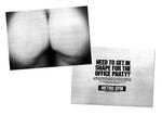
Oh, the fabled office party. That national workplace pass time which accomplishes nothing except to make you look like an idiot in the morning for that thing you did last night which, in the heat of the moment, you thought was funny...but really wasn't. There are countless stories of office parties gone wrong but Metro Gym wants to help. Well, at least with one ass-pect of of the party: toning your ass to perfection so when you place your naked ass on the copy machine, the reaction to the result will be jealously rather than laughter. Metro Gym thinks there's nothing hotter than a tight ass sitting on a copy machine and they promise to help you get that tight ass.
more »
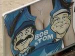
A group of Boise mothers are miffed over a recent billboard promoting the Indianapolis-based Bob and Tom show which shows the pair emblazoned cartoon-style on a t-shirt stretched across a pair of very large breasts alongside the headline, "2 Boobs in the Morning.". The Boise affiliate which airs the show, in response to complaints, has decided to take down the board.
One mother, Kayla Mooso told Indianapolis television station WRTV, "My kids both saw it and my daughter is seven and she said, 'Mom, that's gross, that's immodest.'" Hmm, any seven year old who can use the word "immodest" certainly has the right to an opinion.
- In an odd sort of 180, bloggers and podcasters now have their own print magazine called Blogger & Podcaster. Scoble Graces the cover.
- We had a contest a week or so ago and awarded tickets to five Adrants readers for the Future of Online Advertising conference. If you didn't win here, youo can check out the contest over at Beyond Madison Avenue.
- Maybe this will finally answer the question asked but not answered by some network interviewer years ago about what exactly Avenue A/Razorfish does.
- Who knew? Certainly no one expected it after the merger but AOL's ad sales are up 40 percent and have helped Time Warner look pretty for for Q1.
- Well that's no fun. JWT Chicago has cut 30 people after losing some Kraft Foods business.
- Imus is planning to sue CBS over firing. Please. Can this just go away!
- Clear Channel is selling 362 stations for $820 million as part of a plan to go private.
- If you need to bitch about products or brands, the newly launched Test Freaks gives you the place to do so.
- After losing the account seven years ago, Kentucky-based Doe Anderson, a won it back Wednesday.
Ripe Blue Tomato's Greg Gillispie was on a recent road trip and wanted to share with us his interpretation of radio's recent HD radio promotions and wrote "Today I was on the road over 200 miles. I heard a number of station promos or spots for HD radio. All the spots were about the QUALITY and none about the CONTENT. And, all the spots were buried in the middle of the stopset.
So...I'm supposed to buy this new-fangled thang because it sounds good? Gee, why do they have to tell me about this when I seem to think what I'm listening to... with this spot...sounds pretty good. Or at least the QUALITY sounds pretty good.
But if I buy this new thang, what the hell am I supposed to get? CONTENT better than what I'm currently getting? Something different, unique, beneficial, entertaining, informative, WHAT?? They didn't tell me. Oh...and if I get it, should I STOP listening to what told me to GET it?
I'm Humbly Dumbfounded...or HD for short..."
more »
When we heard Philips was a new logo for its environmentally friendly -focused product line called The Philips Green Tick, we thought "Eew." "Disgusting." "Gross." Then we looked at the logo, saw that it looked nothing like a tick and said, "Huh?" The thing looks more like an ear of corn with a circle around it than the disgusting creature that love to borough itself into your skin.
Certainly, the word tick has many meanings but the sound a clock makes or a check mark or an informal unit of measure were not what immediately came to mind. Perhaps, unlike in Northeast America, they don't have the nasty blood sucking creatures in the U.K where this campaign originated. Perhaps, as is usually the case, we're talking out of our ass and making a big deal out of nothing. You choose.
We're curious. Well, we're always curious but this morning, we're particularly curious about why current and past advertisers have chosen to advertise on Adrants and why potential advertisers haven't. First, of course, we like to thank every advertiser who has supported Adrants over the past five years. We thank you for your support and, though it sounds cliche, Adrants would not be where it is today without you.
Secondly, we're interested in why you chose to advertise with Adrants. Was it our editorial style? Our readers? Our independent position in the industry? Our rates? The results you achieved? The business you gained? Association with the Adrants brand? Something else?
And thirdly, if you are a marketer and haven't yet advertised with Adrants, we're interested in that line of thinking as well. Again, is it our editorial style? Our readers? Our independent position in the industry? Our rates? Association with the Adrants brand? The perception we are something less than "mainstream media"? You don't feel you will achieve your desired goals? Something else?
While we may turn this into some sort of formal survey at some point, we'd love to hear any comments, positive or negative, from those of you who have advertised and from those of you who have not in our comment section. Remember, while it may seem to take several years for your comment to post, fear not, be patient, it will definitely publish. Thanks in advance.
Agency Yamamoto Moss Mackenzie walked out of the National Agri-Marketing Association Awards with first place for a series of ads they did for John Deere Credit's Farm Plan.
The ads involve burly farmers taking bubble baths and walking decked-out little dogs. The idea goes that the Farm Plan lets them focus on la dolce vida.
It's odd enough that an association for agri-marketing in specific exists. Beyond that, it's entirely possible that the salt of the earth may also be preoccupied with exfoliating.

|


