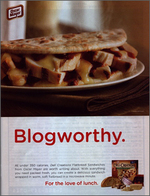
The other day AdFreak drew our attention to an Oscar Mayer ad that showcases a tasty-looking flatbread pita under a smarmy but irresistible headline: "Blogworthy."
This marks two blogs that bit the bait. We acknowledge it's sad that a brand can put BLOG in an ad and have at least one love-starved blogger (ME, ME, ME!) clamoring to name-drop them, but hey, it means something when the creators of your childhood anthem finally nods its head in your direction.
Life is complete.
With a supremely effective visual, this PSA for the United Nations World Food Program in which Sean Penn illustrates how, comparatively speaking, cheap it would be to feed every hungry school child for a year makes a powerful statement.
With the Wall Street plan costing $700 billing, the Iraq war costing $600 billion and the European stimulus plan costing $200 billion euros, the $3 billion dollars needed to feed hungry children for a year seems quite affordable.
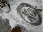
And it's neither hot nor yellow. To spread the word about sports channel/athletic lifestyle brand Extreme, London-based CURB conducted what it calls a "branding blitz" all over the city of Big Ben.
You may have heard it snowed in London on Tuesday. That same day, CURB decided to use this fresh white slate to Extreme's advantage. By late afternoon, 350 high-profile locations were slathered in more than 2000 Extreme logos.
We've seen this type of effort before, where a city is "branded" via street stencils or stickers. But we were still impressed with the speed of concept development, approval and deployment: a couple hours, more or less, to act on the rare snow day.
more »
Last year the California Milk Advisory Board started casting for a new cow to star in future campaigns. Guess the entries thus far haven't been mind-blowing, because "auditions" are still being taken. The most recent one is from Soo, a would-be diva with -- wait for it! -- Seoul.
We're of the growing suspicion that Milk is gunning for California's tourism department dollars. Really, do we have a tourism department? Because when we think of Cali, we increasingly envision catty heifers and great big cheese wheels.
Anywho, read bios and vote for your favourite meat slab at the website. Facebook add-ons come stock. Work by Deutsch LA.
more »
Don't you love those commercials that paint the world as a place in perfect harmony? Where everyone is happy? Where children play together happily? Where everyone is optimistic?
While it always seems to be asking too much, that didn't stop Publicis Hong Kong from creating this feel-good Western Union commercial in which floating blobs of yellow form the word "yes" reaffirming that, yes, life does move forward and people are saying yes to a brighter future.
Oh, and Western Union is there to help that happiness happen.
more »
Mooching off the 3D Super Bowl shenanigans, Crest and Digitas launched Kiss Me in 3D, a site that promises all the steam and slobber of a warm, lusty body. All you need to fully realize the experience is a pair of 3D glasses and an extremely vivid sensory imagination.
Once outfitted in the specs Digitas hopes you didn't throw away over the weekend, pick a make-out partner. Then choose three kissing styles to get the party started.
more »
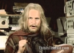
Here's a weird one. Woody Harrelson dressed like homeless geek by the name of Charlie Frost. Something to do with $4,000 Super Bowl tickets, living on Jupiter, the Institute for Human Continuity, a global survival lottery and the apparent end of the world in 2012. December 12, 2012 to be specific.
OK, enough of that. It's promotion for Roland Emmerich's movie, 2012.
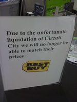
One could interpret this Best Buy POP sign in two ways. First, it's simply a somewhat snarky statement about the demise of Circuit City and how, since Circuit City will no longer exist, there will be no prices to match.
Second, the sign could be a simple admission Best Buy can't possibly match Circuit City's liquidation prices because if it did, Best Buy could find itself facing liquidation. Likely it's the second interpretation and is based purely on the need for Best Buy to meet its own bottom line.
No, not that kind. This kind comes from Barats & Bareta, an online comedy team who've decided to take on advertising and, once again, confirm the notion the industry is a very, very strange place.
People, we must "adapt and embrace."
So there was the Barclaycard slide commercial, remember? It's the one where a guy the office strips down to his underwear andhttp://www.youtube.com/user/Barclaycardcreate commutes home in a giant water slide. And, because it's a commercial hyping Barclay's slideless card, the dude buys a lot of stuff on the way home just buy holding his card near the scanner.
And, yes, it would have been funnier it it had been Donny Deutsch going down the slide in that Speedo. OK, maybe not but it would have fun to watch. OK, maybe not. It would have been repulsive and made us vomit so thank you, Barclay for using some anonymous dude.
more »

|
|


