Sometimes commercials delivers their message with a sledgehammer. Other times, such as with this Canadian Woman's Foundation commercial to end violence against women, the delivery is far more subtle. So subtle, in fact, that in this case the spot had to be watched a couple times before the message made sense.
The physical separation between the husband and his wife and two kids as they sit on the couch in the commercial is an analogous illustration to the emotional separation that can come with spousal abuse as well as the emotional separation caused by years of suffering abuse without complaint
Some spots need to be viewed over and over again to be truly appreciated. Others, like this All Bran Honey commercial, need to be viewed over and over again get past staring at the unbelievably gigantic nipples protruding through the shirt of "Tall Jan" ... to truly appreciate what the hell the ad was trying to sell.
Apparently it's a word play on All Bran is delicious versus Tall Jan is malicious. Whether or not the "protrusive" scenario was intended or not, it achieved repeat viewership and what more could a marketer ask for?
It must be Amnesty International day. First there was the sex trafficking ad. Now there's the waterboarding ad.
Waterboarding is a torture method for encouraging prisoners to, well, do what they are asked to do. Apparently America uses this technique and Amnesty International doesn't like it. The :90 makes the point but takes an interminable :60 to get there. It's like some art director was like, "Dude, let's illustrate the beautiful innocence of water and then suddenly cut to the horror of its abuse." Um, yea. Next time, make it a :30.
Is it wrong to think this Amnesty International sex trafficking ad is just a tiny bit hot while at the same time realizing it's a clever representation of a reprehensible practice? Please! Don't confuse. It's like those ads where young girls with huge boobs are used to convince you underage sex is a bad thing while making you want to have sex at the same time. (Not with the underage girls in the ads, mind you. Contrary to popular belief, even I know the difference between right and wrong.)
The ad, created by Switzerland's Walker, does catch the eye and that's half the battle in this game. But like the underage sex ads, it creates an uncomfortable awkwardness. Maybe that's a good thing. Perhaps it causes one to feel a bit skeeved. Trouble is, the people who engage in this reprehensible practice, after seeing the ad, may simply be more motivated to find the next young, hot thing to trade like a piece of property.
This, by far, is the best logo fuck up ever. Even better than that pedophilic one from that pediatric center. While the goof has been found out and may (or may not) be corrected, that didn't stop employees of the UK's Office of Government Commerce from having a laugh over it. Flip the logo 90 degrees to the right and you'll understand the gaff.
more »
They came for the smokers, and I did not speak up because I wasn't a smoker.
They came for the caffeine junkies, and I did not speak up because I drank neither coffee nor tea.
Then they came for sex, and chocolate, and my sluttiest Halloween costume, and there was no one left to speak up for me.
more »
Remember Chicken Soup for the Soul before it got all commercial and had spin-offs for grandparents, moms, kids, and your apathetic father? Imagine if it were audio/visual, and that would get you The Responsibility Project, a series where four RSA directors try interpreting what it means to be responsible. Commissioned by Hill Holliday for Liberty Mutual.
See Mandy and Lester by Lena Beug. You may find it bears a slight resemblance to your childhood -- if you're squinting, and your neighbors were named Kevin and Paul.
more »
Apparently Heineken has started a radio and (cheese-tacular) TV campaign that directs people to a subsite that isn't even up yet. (We tried. Still doesn't work.)
Try your luck at SharetheGood.com. Jetpacks, who seems sort of traumatized by the radio spot, went out of his way to check the Who Is data behind Share the Good (registered to Brian Citron, Associate Brand Manager for Heinie) and see if it works on other browsers (no).
UPDATE, 10:10 EST: The site is up now. And it only took all morning. Good going, guys.
more »
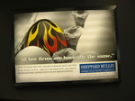
Making a name for yourself in the legal world must be tough without OJ Simpson or sex tape spawn. What's the average divorce attorney to do?
A few things, actually. You can force your lawyers to take up lederhosen and the accordion. You can make divorce look really appealing. You can form strategic liaisons with pizza parlors.
Or you can invite a comparison between yourself, and Gene Simmons, and omelets. Guess it's a matter of what you personally find less morally reprehensible.
To propel its classic kicks back into salience, Adidas made a gigantor pair of Superstars and gave one shoe to each coast.
I did The Eyeroll when a bunch of dudes started whipping out spray paint cans because the first thing a brand does in crisis is reach for a graffiti artist. (Adidas also did the tagging thing last year and the year before. Plus, Reebok and Converse have already peed on this hydrant.)
But the resulting footwear is (of course) pretty dope. If in doubt, a whole three seconds of the video is devoted to recording some dude in a doo-rag giving Adidas props.
Sam Flores and Upper Playground designed the left coast sneak; NYC and Surface2Air, Paris handled the right. Thanks in:fluencia for pushing the news our way.

|
|


