OMG. Just when we thought we'd written this line for the last time, we're gonna write it again: "Just when you thought every last inch of space had been covered with advertising, yet another appears." Most recently, it was the front of washing machines in laundromats. Now, it's the front of plows to promote Audi Canada's Quattro event which aims to get people into dealerships this week to try ot the vehicle.
Accompanied by radio, print and online, five snow plows were outfitted with signage and painted plows which read, "Winter is Coming" along with the dates of the event. As we've said every time before, it's only a matter of time before someone offers to paint our house for free as long as they can paint a giant logo on the front of the house. Lowe Roche created the campaign.
Here's a pair of commercials for the Swedish beer Falcon that pits man against man in a game of typical male oneupmanship. As men argue over who's beard is thicker and who can withstand the coldest of temperatures exclaiming "really thick" and "really cold," Falcon's "really beer" message is really clearly delivered. Again, simplicity wins.
The campaign was created by Saatchi & Saatchi Stockholm and produced by Social Club.
Check out Crescent Heights, an effort by P&G to promote Tide through the lives of twenty-somethings (Quarterlife, anybody?) with painfully bright clothes.
Endless product promotion aside, we admire the series' capacity to remind us so vividly of Saved by the Bell: The New Class -- except without the charm of the previous class' success to leech off of.
And the fake messages on the discussion board (generously mocked by the seven or so watchers of the series)? Nice touch.
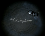
Here's a wink-wink nudge-nudge type of spot meant to tell us that while Lexus would never actually approve of making doughnuts, tearing into corners or nailing sweet spots, its '08 GS is certainly equipped to.
We like to compare this subtle new tongue-in-cheek attitude to those gleefully bad-ass -- but still luxury-class -- Audi ads.
The spot, which debuted this evening during Boston Legal, is brought to you by Team One Advertising, LA, and visual effects firm a52. We wish Lexus would try being funny more often. Generally speaking it can be a bit ho-hum.
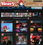
Tomorrow, Wendy's and its team of red wig wearing goofs will take over the Heavy.com site at 10AM EST for a 12 hour period. The site will be emblazoned with Wendy's and red wig goodies including the magical placement of the red wig atop people's heads in videos featured on the site.
While some may disagree, we think the red wig campaign is one of the best since "Where's the beef?" barring, perhaps, Dave Thomas' long running appearance as spokesman.
We're told by Joy Martinez the guy in this video works (worked?) at MediaVest, reached an "I'm mad as hell and I'm not gonna take it anymore" moment" and decided to run around Times Square naked. This is what our business does to people?
This spot for raising STD awareness made us kind of sick, mainly because the guy in the chlamydia suit actually looks like somebody we dated. (It's amazing how unforgiving memory can be.)
Check out the STD Monster subsite to see more chlamydia behaving badly.
"Can I crash in your fallopian tube tonight?" God damn.
The spots were put together by the cats at SecretSauce.tv. There's also a contest where you can vote for your favourite chlamydia spot to win a free STD combo pack. (That's a series of tests for Chlamydia, Gonorrhea, Syphilis, Hepatitis and HIV.)
The only thing we can think of that's cooler than a jam-pack of STD tests is a gift basket of microbe stuffed animals. Ebola never looked more cuddly, especially under the unattractive highlights of the chlamydia monster.
28 Seconds Later is a (completely left-field!) short film promoting the DVD release of 28 Weeks Later. It makes fun of -- but also revels in -- the gratuitous bloodshed and flimsy premises of zombie tribute movies.
It blew our minds. And then we ate them.
See the other three here. The shorts and website were designed by Kulavortex.
Heh-heh. This bad-boy was put together by Doom & Dickson of the Netherlands.
We're so glad there are companies out there like Odol making mouthspray because holding Listerine in our mouths for 60 seconds takes way too long, and chewing gum makes our jaws tired.
It isn't often we see a health or mental care ad that doesn't make us want to kill ourselves.
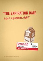
But Mortar Agency for St. Mary's Medical Center gives us a pleasant surprise with these witty prints that look like they're destined for the college demo -- known for taking liberties when it comes to staying healthy. (Take it from people who've swigged out of the expired milk carton too many times to count.)
The slogan is, appropriately, "Get in. Get better. Get going." If only repairing a broken back was that convenient. (Who uses a spotter, anyway?)
Our other favourites include Extra Spicy? and Here Kitty, Kitty, Kitty. See 'em all here.

|


