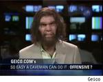
If you like the Geico Caveman, you may be seeing a lot more of him in the not to distant future. And no, not because he'll keep popping up in commercials but because he'll be the star of a new ABC sitcom. That's right. Apparently someone over at ABC likes the caveman so much, they want three of them to humorously battle prejudice while living in Atlanta.
Joe Lawson, the Martin Agency copywriter behind the Geico campaign is on-board as a writer at least for the pilot which will even feature a Gieco spokesman. Now that's some serious brand integration.
Product placement is for losers. Getting your ad campaign turned into a TV show is the new new thing. Just think. Now, we can expect TV shows about a fast food worker who dreams he's a rapper married to a bald pop star. Or two closeted gays who go under cover as manly auto mechanics to hide their love for each other from their uptight, Southern Baptist families. Or even an emotional drama about the father of a family of robots who has just lost his job, contemplates suicide and fights to put his life back together for himself and his family. The possibilities are endless. Start submitting your campaigns to the nets right away! They're in a buying mood.
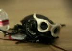
To promote its second annual Bugzhibitz show, an exotic bug event that runs March 9th-18th, the Toronto Zoo puts Jeb, a Hissing Cockroach from Madagascar, in the spotlight to do the talking.
Bugs Rock highlights Jeb's adventures from the Wild Wild ... wild, to ascendance as a star (complete with a music video) at the zoo.
With all these brand personas floating around we'd really like to see an icon face-off. Nothing against the hissing cockroach, but we wonder how long he could hang with the Geico Gecko.
A new campaign for Australia Post takes a look at every day of the week, each of those day's traits and how Australia Post works for Australians every day. In fact, its tagline is "Part of Every Day." Of course, Monday is the worst but Australia Post says it's there to make the day easier. Who new the post office could be so helpful? View all seven spots here in one video.
New Belgium, the source of our beloved Fat Tire Ale, kicks off a campaign toting "the sustainable side of whimsical [read: alcohol-soaked] living."
Denver's Cultivator Advertising and Design create Follow Your Folly, guiding jovial beer lovers to an interactive Wonderland promoting sustainability with bare-assed but enviro-friendly efforts like Save Our Rivers. Tagged "Follow your folly. Ours is beer," a featured beer appears in each promotion.
It merits noting that even before Google got all extra-extra with their bike-riding culture and alternative energy hype, New Belgium was already laying the groundwork. They were also the first brewery to switch to wind-power in 1999, and employees ride bikes or walk to work. With careful recycling, reuse and composting methods, only 2% of their waste becomes landfill.
Follow Your Folly looks to us like great marketing in harmony with the socially responsible values of a good company. Even if some people don't care about environmentally responsible corporate conduct, we sorta do. After all, beer is nature's nectar.
Feel like showcasing your marketing savvy with a public guerilla campaign? Post-Boston, be careful - The People are sensitive of late.
At least that's what Microsoft's discovering with its recent ground-floor attempt to push the Zune.
A blast of music from the tricked-out Zune-mobile sparked sleep-deprived residents in Lower East Side Manhattan, not to drop their iPods, but to seek restitution on a scathing site called Wake Up Microsoft.
To start with, they sarcastically thank the big blue company for their "noise terrorism." Noise terrorism? Is that anything like Lite-Brite terrorism? While Microsoft deserves a wrist-slap for thinking they could start a spontaneous block party, this certainly isn't the only shockwave of moody distaste they've inadvertently triggered lately.
Update: Cliczune's post on the Zune SUV includes the comment of at least one user who wouldn't mind being jarred out of sleep at 3 AM by the system's impressive clarity.
With asymmetrical seams (sewn by hand ye old indentured way) and copper rivets, Levi's Copper jeans allegedly hark back to the first jeans ever. To promote this hat-tip to history, Ogilvy One, Singapore also takes a nod backward with a pure HTML-written site.
Using archaic inconvenience to promote user interactivity, oversized imagery elicits scrolling in all directions. Copper trivia pops out of the dirt in old-school info windows and facts on the jeans appear in drop-down menus starkly interspersed across the huge denim-and-dirt backdrop. The usability and aesthetic annoyances that come with vintage web design nipped more than once, but we dig the creative effort.
If you're so inspired that another day without Copper jeans will kill you, print out a life-sized PDF to try on. We've never worn PDF before and we can't wait to show all our friends.
Thanks to Richard Ho of AdCritic.com for the Levi's Copper info.
When in television, it goes without saying you might run into some odd policy meant in some way to protect you from The People or The People from you.
This is exactly what Conan discovered when he joked in passing about the existence of HornyManatee.com on air. An irate NBC called to let him know he can't just mention a site that doesn't exist, and now they have to purchase HornyManatee.com.
So that's exactly what they did. And instead of just redirecting it to NBC per the quid pro quo, they thought, why not pull out all the stops? The results make a good ice-breaker and they even managed to tie it to a cause, because you know how much people love cause-oriented consumerism.
Take the fetish tour for a complete manatee explosion.
That was disgusting. Forget we said that. In other news, and this is totally off-topic, we just found out that right whales have testes that weigh over one ton. HornyWhale.com, anybody? Wow, we've totally succeeded in grossing ourselves out. This is a new high. Or low.
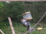
PETA may just have a heyday with this one. A recent Gmail correspondence resulted in this set of Google-served text ads. The mash-up was so strange we had to keep it - not just because of the menagerie of animals but because we can't believe there's such a thing as Squirrel Circus. (Watch the video. We're building a squirrel playset the second we get home!)
While the acrobatic squirrels amused us two minutes too long, the Armadillo Eliminator strikes us as sinister. Those bottles of death fluid are like a cross between antifreeze and Dip.
Like food poisoning after a post-Lent binge, the content spider probably experienced a bad reaction to the recent rodent rampage at KFC and the Geico caveman. But of course we could be totally wrong - armadillos and squirrels feature regularly in discussions we have with strangers over the internet.
Calling attention to the nastiness of the Holocaust for the University of Colorado, Boulder's Holocaust Awareness Week, is starkly dark campaign, created by TDA Advertising & Design, that reminds us of the horrors that time brought. From freakish experiments on the body to pressure chamber torture to showers of gas, bulletin board postings, door knob hangers and shower hangers slap students in the face with this message of remembrance. A radio spot featuring a sickly twisted fairly tale accompanies the campaign. There's nothing pretty about this campaign and that's as it should be.
See the campaign components here and listen to the radio spot here.
We're always open to a time-waster. TAMBA gets all competitive by hopping in on Comic Relief's Digital Challenge, where they launched a new game called Red Lead in honour of Red Nose Day 2007.
The idea is to get the Red Noses from one side of your monitor to the other without getting stabbed by a sharp pencil. Different sorts of noses, like the golden ones, are magical. In case you wondered, there is a cause attached to this.
Note image to the left. Then consider what we said here. The game is cool and all, but are we destined for one sensory violation after another today?

|


