Every country's culture is different from another's but Japan's always has an enjoyable bit of quirk to it which, like any country's culture, makes itself quite evident in its commercials. In this ad from the Japanese Dairy Council, a chalk fight of epic proportion breaks out between a student and a teacher.
Sadly, if this sort of spot was attempted in America, some cause group would rise up and cry inappropriate student/teacher interaction! Too Violent! To...who knows but they's come up with something.
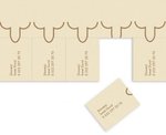
To promote his circumcision business on a shoestring budget, Ismet Dural of Istanbul, Turkey prepared the tear sheets at left. More photos here.
It's so deliciously creepy. Not only do you get to casually circumcise, you can carry the fruit of that labor in your pocket all afternoon long.
For its Kirchner and the Berlin Street exhibition, MoMA worked with Behavior Design to put together an online "companion piece" where users can explore the art from their computers.
The exhibit showcases "Street Scenes," a series by expressionist painter Ernst Ludwig Kirchner. Visitors can sift through pages of his original sketchbooks in a smooth little image gallery. Art from "Street Scenes" can also be juxtaposed to the original drafts.
more »
To facilitate the all-online launch of Kit Kat Cookies & Cream (on the record: yuck), Nestle got into bed with JWT/Sydney and RMG Connect to conceive Hans Fagerlund, whom they describe as "a cross between Jack Black and Will Ferrell."
That's some fucked-up cross-breeding.
Our little freak Hans is also a Chunga Champion, Chunga being the art of stacking Cookies and Cream Kit-Kats with his bare hands. Seriously. It's Jenga! With calories!
more »
For a recently-launched TV campaign, Yell.com is seeding videos across YouTube that wrap up its TV ads.
In the spot we reviewed, a bratty kid called Marcus tells party planner Fresno he wants a ghetto-fabulous fete instead of a Roman-themed party. Fresno takes on the challenge. Here are the results, complete with party footage and interviews with Fresno's assistant and Marcus's parents -- the feeble, well-to-do folk that created the monster in the first place.
Nice idea, not super-engaging though. How do TV viewers know to go online to finish the story? It's not like the spot was a cliffhanger, and I don't think anybody feels personally invested in Marcus's fate. Or even Fresno's, for that matter.
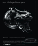
At first I thought the thing at left was a snail. But no, it was an amorous man with a French horn for a head. (Tagline: "Seeing and hearing like never before.")
This is part of a print campaign for Pioneer's KURO line of TVs and audio-video gear. Put together by TBWA\CHIAT\DAY\Los Angeles, each ad depicts a person in some state of metamorphosis, which represents the emotional heights your entertainment system should be helping you reach. Variants include butterfly girl, road carnage, trumpet man deux and trois. (But where is The Fly?)
Weird, but nice to look at. AdFreak observes the stuff Pioneer did last year was "even odder," and a lot less pretty.
In June, Visa worked with AKQA to offer $100 in Facebook ad credits to the first 20,000 small business owners that downloaded its Visa app.
The app now boasts 42,543 monthly active users, but comments on the Visa Business Network page consist almost entirely of people that never received a coupon. Others are confused about whether the credits are just supposed to appear in their Facebook Ads cache.
"I smell a scam," Johnny Premier says; Frank Horbelt shouts, "There's potential here ... (But you guys are squandering it!)"
more »
Anyone who thinks the wording of the erroneously sent Carat documents about impending layoffs was, in any way, different from other agencies' documents on the same topic is an idiot. It's always about saving face. It's always about making the agency look good in front of the client. It's all about positioning to protect the business. There isn't an agency out there that hasn't thought of or written the same thing Carat did in those documents.
But here's the thing. The words in any agencies' documents are almost always set aside when two human beings - the one doing the firing an the firee - sit down face to face in the same room to address the dirty reality of layoffs. They are inevitable and there is nothing anyone can do about it.
more »
Here's an intriguing bit of information provided to us by Adrants reader Don Russell. Russell notes the use of Amazon's paperless Kindle in a Verizon FiOS commercial which humorously compares a Verizon repairman's installations with a cable guys cancellations. They're all the same, of course.
That's not the intriguing part though. It's the Kindle, which is powered by Sprint's EVDO network that raises the eyebrow. It's not often you see a competitor's product displayed so prominently in an ad. Of course, as self-professed geek Russell notes, it does take a geek to notice these things and most other people - including the props people on the set - simply don't. Still.
In yet another "homage" if you will, a brand has "borrowed" the imagery of an artist for commercial gain. In this case, it's 1800 Tequila giving nod to the work of artist Charles Burns. Eric Reynolds has the image here. Once he saw the ad, he contacted Burns who said the ad was a complete surprise to him though, perhaps in a nod to his own work, he added "makes me wanna drink some tequila."
If you're going to have your work "stolen" the least it should do is work in the form for which it's been "stolen" for. According the artist, himself, the work seems to have accomplished that task. Burns' work can be seen here.
UPDATE: Dead As We Know It, creator of the work, defends:
Actually this campaign was created by my agency, Dead As We Know It, using many pieces of art from artists around the world. This was just one of a large number. If you go to www.1800tequila.com you can see all of them. Eventually there will be 1800 pieces. Jorge Alderete, of Mexico City, has a great portfolio encompassing a wide range of work, possibly influenced by Charles Burns as well as all the cartoon and graphic work that Charles Burns was influenced by. By no means did we originally try to get Charles Burns or someone to cop his style. We saw a cool CD cover that Jorge did and acquired another piece in the series. Check him out, http://www.pocko.com/pockopeople/artist/jorge-alderete/
Seems to be a month of people accusing people of thievery, really sad statement on the state of things. And, just as my agency wasn't ripped-off by Amalgamated for the Virtual Drinking Buddy, we did not rip-off Mr. Burns or one ad in this extensive campaign. So, let's shut-up and get back to the noble profession that we are known for.

|
|


