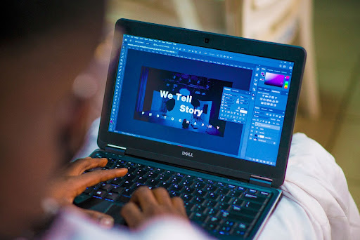
Using Social Media Banners to Your Advantage

The advantages social media can unlock for your business or career are to some extent limitless. That said their effectiveness as your purely customizable marketing tool depends solely on how you take advantage of the various platforms at your disposal. Have you ever considered using your top banner on LinkedIn or Facebook to promote yourself or your business?
Your Banner, Your Future
There are numerous guides on how to perfect social media advertising or how to increase your reach via social media, but many of these guides tend to ignore what visitors to your profile are going to see first: the banner. In that relatively small rectangular box, you can provide critical information about yourself or your business in one split-second impression. Taking advantage of that impression may determine whether the visitor reads on or not. In the rest of this article we will share some design pointers to take advantage of that second you have to make a good impression.
Tools of the Trade
There are several great online tools to help you create the best banner for your needs, one such great online tool can be found here at https://viewst.com/linkedin-background-banner/. That said if your business or career is in the architectural or building sectors including imagery of tools associated with your profession is one way to set the tone for your page easily. If you're a photographer depictions of a camera can be the perfect start to your introduction. Alternatively, an image of your workspace can perform a very similar task to winning the hearts and minds of visitors to your page.
Flex Your Awards
If you have received a prestigious award related to your profession why not show it on your banner? You worked hard to achieve that award and potential employees or clients are looking for hard workers, professionals, and those who can deliver. An award displayed discretely in the top corner can set you apart from your competition.
Choose Text Wisely
Your banner is certainly not the place for an essay, you simply don't have the space. This means that text must be chosen carefully. Use only a few words to get your desired message across. If you are giving information, make it appear prominent on the banner.
Design is Important
Along with the text you decide to use how that text looks is important. It must be able to be read so font size and color are important. Further framing your text in geometric shapes that contrast your font color can add visual interest and help direct visitors to critical information. Other design methodologies can be applied but try not to go too deep into the woods and create a work of art that no one can take information from.
Conclusion
As discussed above your banner on your chosen social media platform is of critical importance for creating the right first impression. A banner that matches the tone you want to portray will help potential clients or employees decide that you are the person they need. This decision could be made just on your banner along with other information only serving to reinforce their decision. First impressions have a number of cliches said about them but what all the cliches share in a message is how important they are and how hard it is to overcome a bad impression. Don't let your banner be the bad impression you need to recover from.

