
9 Ways To Improve The Calls To Action On Your Site

When you publish a new page or piece of content on your website, what are you trying to get your readers to do? Perhaps you would like them to make a purchase, sign up for an event, subscribe to your newsletter, or simply visit a different page on your site where they can learn more.
Your customers want to be told what to do, so it's vital that you get your calls to action (CTAs) right! In this article, we're going to dive into how you can improve your CTAs and achieve your business goals. Whether you're trying to attract and convert leads, build your subscriber base, or something else entirely, there's a way you can tailor your CTAs to assist you.
What is a call to action?
A call to action is an element of your website that tells your customer what to do. A "Subscribe" or "Shop Now" button are both examples of CTAs.
The right call to action will make your customers' next steps as clear as possible. And, if they're strong and used in the right way, they can have a dramatic effect on how many conversions you secure.
Lead with a strong verb
The point of a CTA is to get your audience to do something, and you'll need to use a strong verb to convince them. Consider using some of the following CTAs:
- Tell your readers to "Sign Up" for a free trial, to join your online course, or to attend an event
- Insist that they "Subscribe" to receive updates from your company via your weekly newsletter
- Tell your readers to "Try For Free" if you offer a no-cost version of your services
- Encourage your website visitors to "Learn More" so you can provide more information through another page, guide, or blog post
- Insist that your prospective customers "Join Us" if you manage a community like a Facebook group or in-person club
It should always be very clear what you want your customers to do. By leading with a strong, straightforward verb, you can achieve this!
Create a sense of urgency
People respond to a sense of urgency -- it makes them feel like they'll miss out if they don't act immediately. This can encourage more people to take the action you're looking for! Consider using phrases like "Don't miss out", "Act now", or "While stocks last" to make your CTA seem more immediate.
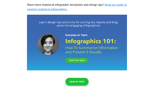
Take a look at this example from Venngage, for instance. Partway through their guide to infographic templates, they promote a masterclass they're hosting on the topic. As you can see, the CTA "Save Your Spot" creates a sense of scarcity, so people will want to act quickly and claim their space before they run out.
Consider how you can incorporate a sense of urgency into the promotion of your sales and offers as well. Amazon does a great job of this.
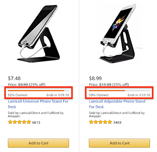
Not only will shoppers be spurred on to make a purchase when they see that the majority of these deals have already been claimed, but the countdown also offers another element of urgency. So, whether someone has been thinking about buying one of these products for a while, or they've just come across one and are tempted to buy, they'll be quite likely to "add to cart" right now so they don't miss out.
Make sure your CTAs stand out
You'll need to use certain design principles that will help your customers to spot your call to action at a glance, such as bold colours, clear fonts, and effective spacing. The look is just as important as the wording.
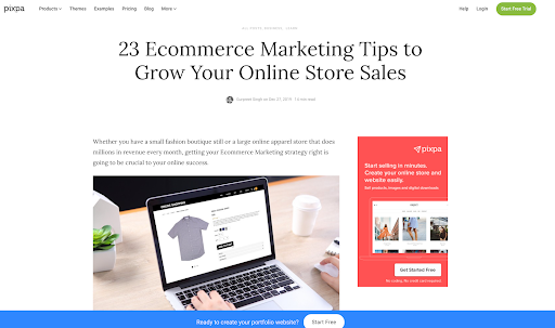
Take a look at Pixpa's guide to eCommerce marketing, for instance, and notice how much the three different CTAs (Start Free Trial, Start Free, and Get Started Now) stand out. No matter where a reader is on the page, they can clearly see a CTA and will be encouraged to click.
Google has great examples of clear CTAs on their AdWords page, too.
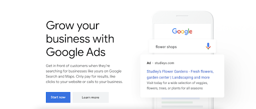
Notice how they have two CTAs here. The bright blue draws the eye to "Start Now," and is likely where they want viewers to immediately go. But, if the audience is not quite ready, there's a button for them to learn more as well.
Use language that provokes an emotional response
You can also try to get an emotional response out of your customers with your calls to action. Similar to creating scarcity, you can play on their fear of missing a deal, and their desire to have new experiences or develop their skills.
Take, for instance, this "Start a project" CTA that you can see above Venveo's guide to marketing to architects. Their target audience consists of building material manufacturers, who will be working on new projects all of the time. So, this call to action button is sure to spark an emotion in the reader and give them a sense of possibility. While the website is talking about a digital marketing project, rather than a building one, they're speaking their audience's language, which is important.

Or consider how AirBnB attracts new hosts. The "Get started" button under their earnings calculator reminds customers that they stand to benefit from signing up to offer their services through AirBnB. After all, who doesn't like making money?

Give people a solid reason to click through
Whether you're trying to get your customers to make a purchase or sign up to your newsletter, they'll always be wondering "what's in it for me?". In your CTAs, you need to answer that question. Are you going to help them save money, teach them a new skill, or make their life easier in some way? Plus, what are you doing differently from your competitors, and why should visitors choose you?
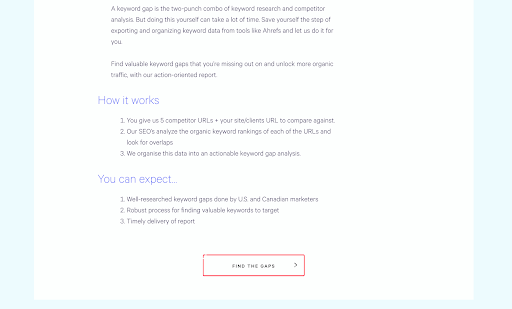
Take a look at this example from the Loganix keyword gap analysis page. We've included a CTA that says "Find the gaps", which suggests that readers' current SEO strategies might not be completely watertight, and makes it very obvious that the solution could be just one click away.
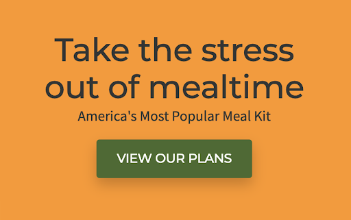
Or, consider HelloFresh's CTAs that you'll find on their homepage. Telling your customers that paying for your products or services will help to lower their stress levels is sure to convince a lot of people to take the leap.
Take advantage of your readers' FOMO
Fear of missing out -- or FOMO -- is a great motivator. So, if you can make prospective customers believe that people just like them are using and loving your services, it's likely you'll be able to convince them to give it a try.
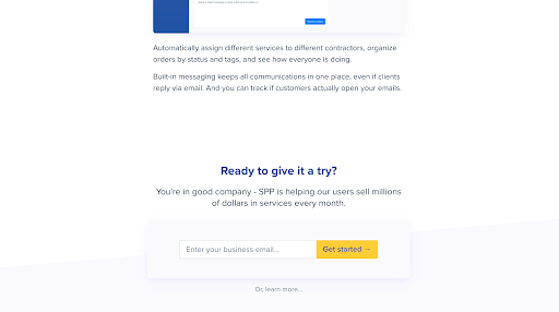
Service Provider Pro does this on their Productized page by highlighting that they're already helping other users to sell millions of dollars' worth of services every month. And who wouldn't want to be a part of that? Including something like this above their "Get started" button is guaranteed to nudge a lot of relevant people in the right direction.
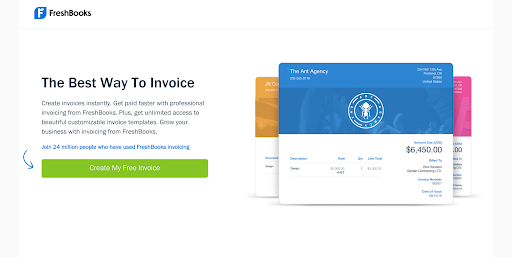
FreshBooks is another company that does this nicely. On their free invoice templates page, they mention that 24 million people have already used their services. This creates a sense of trust and, most importantly, a sense of FOMO that will make a lot of people want to click that "Create my free invoice" button to see what all of the hype is about.
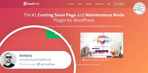
Or, take a look at how SeedProd shows web visitors that they're making sales in real-time. If prospective customers see that a lot of others are making purchases, they'll want to get in on the action. So, using this strategy, combined with strong CTAs, will give your website visitors a feeling of FOMO and make it far more likely that they'll spend money with you.
Inject some personality into your calls to action
Like with every other part of your marketing, you need to make sure your brand's personality is injected into your CTAs to make them as attention-grabbing as possible. If your brand is funny, don't be afraid to add some humor! If your brand has a smart and reserved feel to it, reflect that in your CTAs.
For instance, MindBodyGreen is a mindfulness and lifestyle website. Their CTA mimics a breathing exercise, which is perfect for a company promoting meditation and wellness!

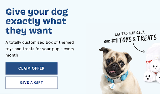
BarkBox, as a company that sells to dog owners, has a brand voice that is happy-go-lucky, upbeat, and fun. That is reflected here in their CTAs. "Give your dog exactly what they want"? Who wouldn't want to sign up!
If you're offering something for free, shout about it
Everyone loves free stuff. So, if you have a freebie, create a CTA to let your customers know. This can work well if you offer the likes of free templates, free trials, free consultations, and more. Plus, offering free resources is a great marketing strategy in general. It helps build customer loyalty and will likely lead to people spending money with you down the line.
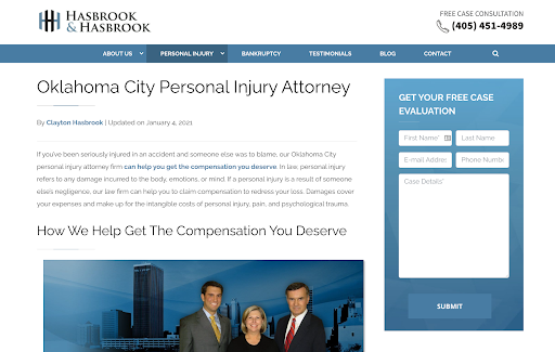
For example, Hasbrook & Hasbrook is a personal injury law firm, which has a form that you can fill out to get a free case evaluation. This is helpful because some people don't always know for sure if they can take legal action in their situation, or if they could even afford to. By offering a free consultation, they can give their customers an idea of what their options are right off the bat. No matter where you are on the service section of their website, there's an easy place to submit your contact information to get a free case evaluation.
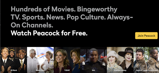
Or, take a look at the homepage for Peacock, NBC's new streaming service. They offer a free version of their platform, and they shout it from the rooftops! With so many different streaming services available now, it's smart to have a free version available so customers can make an informed decision about where they want to spend the most money. And the cost-free element is always made clear wherever you see a CTA on the Peacock website.
Choose the location carefully
Where you put your CTA is just as important as what it says. You want it to be easy for the customer to immediately understand what you're asking them to do.
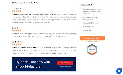
Take a look at this example from SocialPilot. They have included their own service in their round-up of social media analytics tools and added a free trial CTA directly below positive reviews of their platform. It's very obvious what the site wants their visitors to do here and, because people will have just read rave reviews about the service, they'll be far more likely to start their free trial there and then.
Take a look at this example from Express, too. They introduce their new product, provide a compelling review, and then throw in a clear CTA. This method is effective because it's enticing, straightforward, and makes it clear that the next step is looking through their selection of products.

Summary
No matter what kind of business you run, it's vital that you get your CTAs right across the board. By giving your customers clear direction, they'll simply be more likely to engage with your brand. Consider our tips when constructing your CTAs -- play on your customers' emotions, highlight your freebies, inject your brand voice, and lead with strong verbs. If you achieve this, your customers are sure to do just what you want them to.
Your CTAs should now be in tip-top shape. If you need to improve your website's landing pages further, take a look at Adrants' guide to landing page optimization, which has all of the advice you'll need.
This contributed article was written by Adam Steele, Founder and COO at Loganix, an SEO fulfillment partner for agencies and marketers. We build easy to use SEO services that help businesses scale. If you liked this article, please check out our SEO guides and templates on the blog.