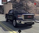
This GMC Website Brings Back Flash in All Its Glory
Remember those slow loading Flash websites that made your computer's fan scream, did nothing for the brand's SEO and made you wait...and wait and wait and wait for portions of the site to load? Gone like a failed dot com, right?
Or so we thought. DIgitasLBi has brought back the web designer's wet dream in its full glory for GMC to tout the brand's 2014 Sierra. Now don't misunderstand us. The site is beautiful, packed with dazzling CGI wizardry and, technically, isn't even Flash. It's HTML5 but it sure behaves like Flash used to.
Maybe we're biased. Maybe we're jaded. Maybe we're just an ass but when we go to a website for a car, we kinda just want to know what it's all about; how it's made, how much horsepower, it's engine displacement, the vehicle's fuel economy. And we want it all in and easy to read, all-test list, not some Hollywood blockbuster style creation that looks awesome when an agency presents it to the client but is more trouble than it's worth for the user.
And, another thing, any site that needs a menu to instruct a visitor how to get around the site immediately loses points.
So why did GMC go and get all fancy pants on us? Buick and GMC Director of Advertising and Promotions Sandra Moore explains, saying,"The Sierra demands a digital experience that demonstrates the substantial, innovative, professional-grade essence that the vehicle itself embodies."
Um, Sandra, it's a pick up truck.
All of that said, DigitalLBi did do something right. In the lower right hand corner of the site, there is a link which reads "Shop the Sierra 1500." Clicking that link serves up -- you guessed it -- an old school website for the vehicle which has all the specs laid out in ---you guessed it -- easy to read list format. If the new site is so awesome, why does the old site still exist? Hmm.


