6 Steps to Make Your Mobile Website Shine
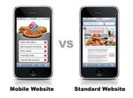
True it's not rocket science, but getting what you need from your mobile website is not as easy as shrinking down your desktop content and moving it around. Not if you want to drive real outcomes, not if you want your mobile site to shine. Here are six steps to getting your mobile site on the road to greatness:
1. Pick An Outcome
Figure out what it is you want your visitor to do, the task they must perform to create what you need. These vary greatly but every nuance falls into five general categories - revenue, data, brand engagement, promotion, or drive traffic. Figure yours out, and stick to it (maybe two).
- Revenue/Commerce
If your company has items or services for sale directly, then your primary goal on-line is to convince the visitor to purchase your goods.
- Data Collection
If your primary goal is to gather information, build a data base of emails, or collect data for direct sales initiatives, then innovative solutions are needed to convince a data collection weary world to give you their information or participate in your survey.
- Enhanced Engagement
If your company wants to immerse visitors in your brand, then a digital experience that encourages interaction and increased time on site is necessary.
- Drive Traffic
If you want to create foot traffic into your brick and mortar location or sort the traffic digitally directing it to other properties, then a compelling digital pathway in impetrative.
- Promotion
If you are championing an idea, product, movement, or philanthropy, then creating engaging ways to inform and garner support and sharing is your digital mission.
2. Build A Path
Once you understand your objective, the outcome you want from your visitors, build a path and they will follow. Create a clear and direct digital linear pathway for your visitors to follow and put what you want them to do at the end. When your path is built with your visitor in mind you will be astounded by the compliance rates. However, if your mobile path way(s) look more like twisty country roads with infinite possibilities, your visitors will get lost in the Tulgey Wood and never find their way to the Queen.
3. Know Your Audience
Look back, you may have missed a very important point that actually deserves an entire article itself - "with your visitor in mind". It is of the utmost importance to understand your audience. Just as you must choose one outcome to be effective, it is imperative that you speak to someone in particular. Not everyone, not even most people, speak to a very specific audience. You've heard the saying, "When you speak to everyone, you speak to no one." Nowhere is this more true than mobile.
4. Less Is More
What's true for salt, make-up and feng shui furniture placement is also true for mobile design, less is more. Don't fall into the trap of trying to fit everything which is on your desktop onto your mobile site. It makes for a cluttered look and lots of scrolling for your visitors - if they don't bounce first. Choose only content that makes sense with your chosen outcome and cut down on your copy.
5. Use Mobile Design Elements
Elements which are fantastic on desktop do not always translate to mobile. Create new or redesign elements specifically for your mobile site, to work well with mobile sized screens. Three quick examples, of which there are many, would be:
- Simplify and flatten - The nuances of intricately detailed logos, icons, and design features are lost on mobile and can look wonky (yes it's a real word and perfect for this purpose).
- Symbols not words - To keep your site from looking cluttered, use conventional mobile symbols rather than words for taps to call, connect socially or find the menu.
- Customization creates space - Customized social icons can help create a cohesive look and gives the site a less cluttered look.
6. Freshen Up Often
Just as horses can smell fear and your mother knew you had not cleaned your room just by looking at your face, mobile visitors can spot an old site within seconds. Freshen up your content often and plan on a redesign at least once a year to stay current.
This contributed article was written by James Ramsey, CEO of Fiddlefly, a digital creative agency.


