Hard lemonade beverage-maker VEX has a new ad that mashes Hostel up with horny fruit and a blender.
Developed by GJP Advertising, the ad commits a sin typical of spirits that think highly of themselves: it's way too long. Note Smirnoff and Tanqueray.
On another tangent, don't you kind of want to get drunk and hack at fruit now?
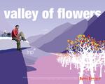
Motorcycle mark Royal Enfield put together a set of prints that, we think, are meant to showcase all the sights you could see from your wizzy wee bike. It's eye-catching and all but somehow negates all the mama's-boy condemnation they so pithily highlighted here.
Or maybe we're reading this all wrong and the concept is all about the big hot masculine motorcyclist penetrating the frilly feminine universe.
See variations here and here.
The prints were developed by Delhi-based Creative Independant 'A,' the same guys who brought us the umbilical cord video we linked above.
For L'Odeur, an edible perfume, Lululemon put together this ad that can't seem to decide whether it's Calvin Klein or SNL.
We weren't the only ones who cringed. The PR people didn't seem keen on it either. And we can see why. It's a little ... well, gross.
To be fair, the ending was kind of funny.
This is a tough one. We were fully loaded to tear Lenore Skenazy's smile off her face for an article she just wrote in Advertising Age condemning publications that accept escort service ads that straddle the legal/illegal line but this isn't a black and white issue so we can't. On one hand, if these ads weren't accepted, the businesses behind them would exist anyway but would likely be even less upstanding (a bad thing) then they already are because, let's face it, sex is a powerful need and one that will never go away. On the other hand, if publications do accept the ads then, perhaps, the businesses are in the public eye a bit more and under its scrutiny (a good thing) for their debatable practices and, one would hope, more receptive to maintaining a positive image.
In either case, the girls that work for these companies are recruited under nefarious (another bad thing) circumstances and forced to perform sex when they otherwise might choose not to. Might public vigilance do more to help here than to ignore it completely? It's a conundrum.
more »
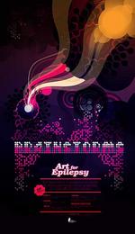
For the Epilepsy Foundation of Minnesota, agency Carmichael Lynch Thorburn, Minneapolis put together this poster as part of an installment series for the foundation's annual art contest.
"An epileptic seizure has been described as a brainstorm, a source of immense creative energy," explained Bill Thornburn of Carmichael Lynch, bless his heart.
The artwork may very well trigger said source. Cocaine, 'shrooms and an episode of Pokemon have also been said to catalyze brainstorms.
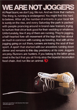
We're usually big typography fans, but, as AdCritic so eloquently points out, this Pearl Izumi ad is bordering on Pearl S. Buck territory.
And not all that well, either. The elitist mini-rant against jogging is cumbersome and a pain in the ass to read. Oh yeah, and way to alienate all of Evian-sipping, yoga-posing jogger-kind. Care to turn off the sprinters and trotters next? We're pretty sure they don't need tennis shoes.
For more runner's manifesto (11 pages worth, in fact), hit the We Are Not Joggers website.
While Candystand never built the carwash game we so generously recommended, we have to say they've been on top of things since the day they decided to push brands via advergames (it's a tough commitment to make).
In time for Wimbledon they serve us up some Match Point, a tennis game that, for its simplicity, is good fun to play.
Users can choose between a male and female character. Two clicks make a serve, and the ball is automatically hustled across the net when the player hovers close to it.
Gameplay is characteristically lag-free and we're working our way up from our first embarrassing love set. Booooo.
Interestingly, we couldn't quite remember what candy Match Point was pushing afterward, so we had to go back and check. Ohhh. Orbit White. The brand with the tennis-player-looking chick.
We get it.
In one of the better makeovers of the horrific-looking MySpace, Juxt has created a Cherry Coke MySpace Page Design contest that places the winning design on the MySpace homepage. As part of the contest, there's all sorts of Flashtastic goodies for people to embed within their own sites, screensavers, wallpapers and all the rest of the usual stuff.
Unfortunately, as with most Flash creation, the browser Back button is rendered useless causing one to continuously back off the promotional page by mistake. Would it really be so hard for Flash to enable or for designers to make possible the use of the browser back button within a Flash page? Or to prevent the entire Flashurbation from also rendering useless the right click menu? Flash can make beautiful things but it also has a nasty tendency to fuck with established web navigation methods.
In a new historical examination of Frank, Furback" Sack, the inventor of the TuftBeGone body hair removal device, Philips Norelco Bodygroom takes a look back at cultural influences which resulted in the the launch of its own Shaveeverywhere.com phenomenon.
Tribal DDB rep Steve Nesle tells us, "The mockumentary is based on the early history of 'manscaping,' as modeled by some furry 1950s Coney Island guys. Narrated by 'Follicle' Phil Fontana, it tells the story of a character named Sack, who invented an unfortunate device known as the Tuft B-Gone. Hairy guys sprinted through the machine, and 'after the scabs fell off,' Phil says, 'we'd grab a broad and a cold beer and call it a day.'"
We applaud Tribal DDB New York on this one. We actually watched it until the very end and even enjoyed it.
The uniquely strong, yet skittishly odd powers of the short, plaid, pleated skirt have been put to use by Coors Light Canada and Maxim for the Coors Light Maxim Golf Experience, an event which promises "the ultimate threesome." Now, before your minds race to that particularly nasty place, we're talking about golf threesomes here not that other fantasy that visits the male mind every, oh, two minutes.
Thanks a lot Coors Light. Now every time we approach the tee, we'll be wishing the three people standing alongside were actually Coors Light Maxim Golf Experience girl wearing the uniquely powerful short, plaid, pleated skirt. That or nasty imagery of our golf buddies in the get up. Neither of which will help our golf game very much.

|


