Our first reaction to this Turkish CNN ad by DDB&Co., Istanbul, was "Hey, they're staring at us." Our second reaction was, "...Hey, that's mean." (See variations uno and dos.)
Consequent two-second bummed feeling aside, we thought the in-the-box effect was mighty clever. But one could probably argue CNN more distracts than informs, because while the watchers idly admire us looking doe-eyed and confused, their houses are being robbed/hit by helicopters/scorched.
Slogan: "Be the first to know." Right, so you don't find out during 15 minutes of consequent lame, post-disaster.
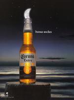
This simple piece by Corona is a nice demonstration of why the nation's favourite beer import should be seen and not heard.
And per AdCritic, which dropped the ad into our laps, it's a nice way of illustrating why its dependency on the lime should be considered a luxury, not a euphemism for its otherwise-ick factor.
It kind of brought this to mind though, which is totally not Corona's fault.
We're taken by the infectious pulse of this Spanish Nike ad by Villarosas and production team Agosto. Dubbed Momentum, it showcases an underground battle between famous sports stars, flanked by gypsy drummers.
The audience, which ranges in flavor from urban grit to the polished elite, share a proud-faced intensity that pretty much embodies the emotional Nike ethos.
The press release calls "Momentum" a recognition to "the optimum moment that Spanish sport enjoys." Nice way to put it.
Translation of the closing challenge: "Are you brave enough to be the next?"
For its new geo-specific campaign "You Rule," meant to push its no-commitment cell phone service, Virgin Mobile made a big oops in the Big Apple, installing neighborhood-specific ads in the wrong neighborhoods.
This wouldn't be a huge issue if not for the fact that some wrongly-placed ads are actually trashing the neighborhoods they've found themselves in.
To note, an unspecified number of Upper West Side posters have been placed on the Upper East Side. And they say really clever things like, "...because up here it's not cool to be tied down and uptight. If you want to live like that, move to Greenwich, or at least across the park."
more »
Thursday night at its 86th Annual Awards Gala, the Art Directors Club awarded Goodby, Silverstein & Partners its Hybrid Gold for the agency's work on the California Fluid Milk Processing "Milk Aliens" campaign.
The ADC's Hybrid category awards integrated visual communications workwhich "transcends conventional uses of media." Extending its 'Got Milk?' work, the agency created a fictional world in which California cows were being abducted by aliens and taken to a distance planet, whose residents were in dire need of their "white wonder tonic." We think the work is deserving of this notoriety.
Remember Dr. Mario? Okay. Candystand's new Awesome Blossom is like that, except with flowers instead of pills. (Come to think of it, how did Dr. Mario ever get past the PC police?)
The blossom explosion is for LifeSavers. We could use some, considering our blood-sugar levels are low from concentrating on winning back flower petals for the last three hours. (We're overachievers.)
This has been circulating the 'net for awhile, but the information it conveys is so life-changing it merits a mention nonetheless.
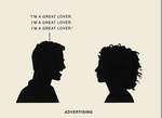
Ever wonder what the difference is between marketing, public relations, advertising and branding? You probably have good textbook examples and some similar spoofs, but like anything else, the best way to learn is with an example involving sex. (Unless the topic you're learning is sex itself, in which case the best example involves Barbies or birds and bees.)
A reader points us to this series developed by Neutron, LLC.
The best thing about it is next time you're faced with any of the illustrated situations you'll know exactly what's going on. And knowing is half the battle. (That's a cheap meme.)
Is it just us or does the visual in this Chinese open manhole awareness campaign connote something relating to an entirely different sort of man hole? Apparently, the Chinese like to steal manhole covers. Why we know not but it seems the plight is so severe, an ad campaign is needed to urge caution to those who find themselves near manholes of a certain size. Not that caution should be thrown to the wind when entering much smaller versions of the man hole.
AdFreak has encapsulated the hilarious exchange between a man who owns a spa and a woman who dislike the billboard he's using to promote the spa. It's like a Battle of the Sexes Bitch Fight and all because the board happens to shows the image of a good looking woman to illustrate what the spa can do your your body. Taking no shit and refusing to remove the board, the spa owners delivers the final blow, saying, "My next billboard is going to be of a 300-pound woman and it will say, 'Could you help me please?' Then everyone would be after me saying, 'My son is traumatized because you showed me a fat woman.'"
We like to look at beautiful people because we want to be beautiful. It's motivational. We like to look at fat and ugly people because it makes us feel better not being as fat or as ugly. What good would a board showing a average, every day person accomplish? Exactly. Absolutely nothing. And marketers don't like what nothing gets them. Extremes work. Average doesn't.
In a continuing effort to promote its My Pet Fat weight loss endeavors, the company is kicking off its first annual MyPetFat One Ton Tour during which the organization will make appearances across the country and award 2,000 sweepstakes winner each a one pound of the famed MyPetFat. If you're looking for an intriguingly different way to lose weight, MyPetFat is certainly something to check out.

|


