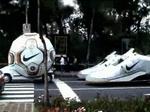
There's good guerrilla marketing and then there's brilliant guerrilla marketing. This recent work from JWT Mexico for Nike is the latter. The agency built three vehicles. Two in the shape of a pair of Nike sneakers and one the shape of a soccer (football) ball. They then drove the two sneaker mobiles behind the soccer ball mobile as if a soccer player were running after the ball. Definitely a head turner. And they didn't even have to resort to sex. See more images here.
Bucky Turco tells us fashion brand 55DSL is looking to recruit two people to travel the world, photograph an film their experiences and blog about it. It's an actual paid gig on one, if done well. will certainly create a following and hence, awareness for the brand. It's a nice adoption of and twist on the social media space and one that may permeate the brand throughout the space.
Guys, and we do mean guys, this is painful. Very painful. But, very funny as well. To promote the Swedish teen film, originally called Hip Hip Hora, a movie that follows a 13 year old girl to a party where she does the usual teen things like get drunk and get hit on by older, 14-year-old boys, a microsite, under the new name of the film, The Ketchup Effect, was launched which contains a video caused us to mention the word "pain." It's not exactly the kind of teaser you see emanating from the U.S. which, of course, is why it's so good. Give the teaser a look.
While we have no idea why olive oil needs to be so well protected (apparently, it's sacred in the Mediterranean), Oliveira da Serra Olive Oil thinks theirs does and had McCann Erickson created this billboard showing the product protected by laser beams.
To promote the twentieth Melbourne International Comedy Festival, Grey Melbourne has created a commercial that truly drives home the point about laughing so hard it hurts. Be careful where you sit. See the spot here.
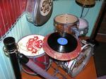
In an effort to lend some cool factor to MSN Music, The Wexley School for Girls and General Public have, in partnership with the House of Blues, created a branded experience for venue's MSN Music Nights. Elements include a special drink, temp tattoos, drink glasses, projections, in-house tv films, branded instrument installations, bathroom mirror stencils, t-shirts, bar shirts, collectible download cards, posters and silk screened drum heads. The work looks great and appears to blend nicely with the House of Blues decor. See two more images here and here and a video here.
With all the ridiculous, over reaction the Australia's "Where the bloody hell are you?" tourism commercial, it was only a matter of time before someone created a spoof and here we have it courtesy of Adland. It's not really all that funny but, then again, the complaint was pretty lame too. Anyway, give it a watch here.
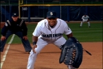
It's really sad that America's supposed favorite pass time has to advertise to get Americans to do what is supposed to be their favorite thing, but that's what it's come down to and this campaign for the Seattle Mariners is the latest entrant. The campaign consists of six spots (1, 2, 3, 4, 5, 6) which run the gamut from quirky to funny. They're filled with both general baseball themes as well as local Mariners themes such as the weird ritual Mariners right fielder Ichiro Suzuki goes through at the plate before each pitch. Another spot speaks to the semi-recent "talk to the glove" behavior players practice when in conference. All in all, the campaign does a nice job tying together baseball-isms and adding some amusement to the sport.
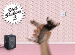
AdFreak thinks it's ho-hum and perhaps an overuse of the company's apparent theme song, Groove Armada's I See You Baby, Shakin' That Ass used in ads and pissing off parents since 2003, but we love it. Perhaps it's the chance to grab some ass. Perhaps it's the infectious song. We don't know. We don't care. After all, it's just a fun little ad to introduce Renault's new 2006 Megane.
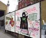
Street art site Wooster Collective has photographed a German Adidas outdoor poster campaign which consisted of the brand's logo on a white background with a hint of graffiti added. The brand hoped the public would take the hint and add to the boards. They did. While an early outdoor graffiti campaign for Sony's PSP consisted of completed graffiti placed on boards and was viewed as a lame co-op of the medium, the Adidas provides the hook to draw the public in to complete the job. Wooster Collective likes it. We do too. There's more here.

|
|


