NYC's Tourism Department Could Use a Little Magic
NYC & Company, which serves as New York's marketing and tourism organization, has launched a component at NYC Visit to help tourists feel more local. For the most part the site is a gigantic press release and if it possesses the rhyme and reason its raving PR people claimed, we're not seeing it.
Anyway, the new tourism effort for the Big Apple kicks off with a series of print ads and a TV spot, all of which are posted at the tourism site.
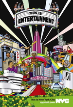
The print ads are explosions of ... just ... stuff and they all make stark statements: This is Entertainment, This is Fashion, This is Food, This is Shopping, and This is Just Another Day.
For the most part you get a Saks Ad Meets Highlights for Kids feeling.
We're not crazy about it. But hey, maybe the ads are amazing when they're three feet long and accosting you from the side of a building.


Comments
When something sucks, just say "this sucks." I know you can do it.
This sucks.
Wow, that was strangely liberating.
It's actually genius, but I don't think you guys comprehended it.
Actually, every image in their is intricately related with a storyline particular to NYC, as it is in the TV.
A little too Peter Max for me. Do any of you even remember Peter Max?
A little too Peter Max for me. Do any of you even remember Peter Max?
forget the print ads...the "NYC" logo SUCKS more. Has anyone seen how crappy they look on a NYC cab? It looks like my kids cut out the logotype by hand and spray painted it on the side doors.
Post a comment