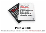
Helvetica Isn't Just a Font; It's a Font Worthy of Awe
Okay. Paying homage to a font is either acknowledging an undervalued aspect of the cultural exchange, or else very clever fucking marketing. But how many typefaces do you personally know that has its own documentary and a show at the MoMa?
Yes. We saw the latter with our own eyes. Gawk at the marvel that is the Chicago Public Library ad. Note the rakishness with which American Apparel robs Helvetica of its innocence. Observe with what candor and personality it reports the names of the Beatles.
How can one disarming typeface be so multi-faceted? We thought it was perfection in simplicity, but it might be its 80 faces.
If you are a sucker (or a decadent postmodernist or maybe just a big font-fan) of exceptional proportions, nail a double-sided Helvetica notebook. But why stop there? Helvetica would be an awesome name for your firstborn. We're sure he (or she) wouldn't hate you at all when time came to do the resume rounds or apply for college.


Comments
The naming of the child, Helvetica, has been done. So has Garamond.
The Helvetica that is being celebrated is a typeface not a font -related first to printmaking not computers.
I learned two new things in less than twenty seconds. Awesome.
Fine for headlines, signage, outdoor.
But don't set a book in it, which has been done to ill effect. Looked great, but you couldn't read it for more than five or six pages without squinting and wiping your eyes.
The perfect type for books is the one The Library of America uses. Their books are set in "10 point Linotron Galliard, a face designed for photocomposition by Matthew Carter and based on the sixteenth century face Granjon."
Post a comment