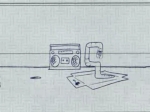
We all know VISA's launched a huge, new campaign with the new tagline, which we like very much, "Life Takes VISA." We all know there's tons of TV spots supporting this campaign but one, which we saw a couple nights ago, just seemed to stand out from the crown. It's called Worm/Recycling and sort of makes you wonder what it is at first as it begins with line drawings of a worm breakdancing to electronica before it becomes obvious it's a commercial for the VISA check card.
The commercial was created by TBWA\Chiat\Day and the nifty special effects work was done by Brickyard VFX which did the special effects on the Comcast Slowskys ad.
We were optimistic, though we're not sure why, the the McDonald's McMornings might be something special but the first thing we were greeted with was The Excuse Generator 3000, one of those lame, so five years ago, excuse letter generators for people without enough spine to stand up for themselves when their boss asks them why they were late to work. Of course that could all be due to some ingenious use of cookies automatically landing anyone coming to the site after, say, after 9A in a given time zone on that page.
more »
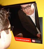
Well, yes, the truth is sometimes hard to take but a good newspaper is always up to the task. To make sure everyone knows this, German newspaper Bild, during the Art Director's Club awards show in Berlin, placed properly angled mirrors above men's toilets which read, "Nothing's harder than the truth." Now, there you have it. This might be the first time a newspaper has tied its hard hitting news approach to an actual hard on. German ad agency Jung von Matt Hamburg came up with the idea. See more here at Adverblog.
Sometimes the simplest ideas are the best. Street corner collissions always make for good entertainment. See more here.
Boozhy points to a new campaign from Brazil for Forum Jeans which is letting its feelings towards the country's government be known in the form of ads that depict models beating the crap out of government officials. We could probably use some of that type advertising in America too. Diesel?
To help promote its free music site/show, Stageside, Coca-Cola has signed a deal with Billboard R&B fave Ne-Yo to be the first feature artist on the the show. Subsequent episodes will feature other artists along with live concert footage and interviews. Each show will be subtlety branded by Coke. The segment with Ne-Yo is interesting enough but whether or not it gets peope to buy rather than file share his music is another story. Still, it's a good way for Coke to get its name in front of a hard to reach audience.
As if Citibank didn't already have enough problems with security breaches, it's now also suffering from contextual corrigendum (go ahead, look it up. We had to) and appears to be offering Brian, a visitor to a MySpace group about fibromyalgia, chronic pain and fatigue a credit card in the form on an ad that reads, "Chronic Feetigue." In reaction to seeing this, check out the suggestions Brian sent Consumerist for future contextual corrigendums such as AIDS - Annual Interest Depression Syndrome. Gotta love contextual advertising.
To both promote their community and to make members happy they joined in the first place, social site Tagworld has launched a program whereby members can apply to have their Tagworld site featured on an outdoor billboard the company has bought to promote its service. Here's one lucky Tagworld member that was pretty excited his site was chosen to be featured.
Commenting on GM's $10 billion loss and its subsequent employee layoffs and buyouts, Beyond Madison Avenue, while feeling GM worker's pain, tells them they have it pretty good compared to the rest of us, certainly those of us in the ad industry where a layoff consists of a couple weeks severance and an empty promise of a referral. Beyond Madison Avenue says GM workers should take the money and move on, go back to school, switch industries and be happy they have it better than us. Michael Moore would, no doubt, see it very differently.
Yesterday, we told you we really liked the Dodge Caliber print ad that had the car photocopying its ass and today we have two of the television commercials from the campaign. In a spot called Moon Dog, following the campaign's positioning that the car isn't for sissies and has a smart alwcky attitude, a dog in the backseat, while passing other dogs in other car's backseats...well...just watch the spot.
The second spot, called Too Tough, features a fairy who tries to turn everything in the city into some rendition of sugar plums and Queer Eye For The Straight Guy. She succeeds until she meets the tough little Caliber. Both spots do a good job saying, OK, this car ain't no lame ass little Toyota Carolla - this is kick ass American steel. Well, tiny, shin-kicking Tonka Truck tough American Steel at least. The campaign was created by BBDO Detroit.

|
|


