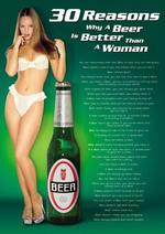
One Club Wants Your Creative, Beer Better Than Woman
- The One Club has announced its Call for Entries for the One Show 2007, the premiere international awards show recognizing the year's best creative advertising. The deadline for entry is January 31, 2007.
- Here's some less-than-kind Christmas buttons from Lowe Roche in Toronto.
- The iTunes PC Guy has a book.
- Thirty Reasons Why A Beer Is Better Than A Woman. If we you read the thing, we'd share it with you.
- Conde Nast gets it MySpace on with Flip.


Comments
Steve, I'n confused... Again. Is this an ad for beer, women, or a fucking eye test outfit... What the fuck is it... Where did you find it... As you've put it in with the One Show call for entries, is it another of those fake ads that run in Archive for tattoo parlors in BoratLand?
I'm confused, I need a beer, or a woman, or a giant woman standing next to a midget beer bottle, or a midget woman standing next to a giant beer bottle... No fuck it, I need a drink. That always works.
Cheers/Confused George
Who was the team who did this ad?
Dear Adrants,
Our Church class has been talking about inappropriate advertising and the way women are portrayed. As I was browsing upon the internet, I found an ad stated �30 Reasons Why a Beer is Better than a Women.� I was appalled. This was a picture of an almost naked woman leaning against a beer can. First, I was surprised at how the women was dressed in lingerie, second, how she had her finger in her mouth, and lastly, how she was being compared to a bottle of beer. This shows how women are portrayed in your eyes. The reason that you had to have a woman in lingerie was completely unnecessary and over sexualized for this ad. Also, how you had her pose with her finger in her mouth shows how unvocal she is. I think it�s sad that you are comparing a human being to a can of beer. All-around, this ad was disgusting. As a teenager, I believe that it was not necessary for you to show an almost naked woman leaning against a beer can. I understand that you wanted to get the viewers attention, but they are certainly other ways to do that. I just believe the way you choose was utterly gross and unappealing. I hope that you reconsider what you are processing for your advertising and consider that all types are people will view it.
Sincerely,
Frannie Fuxa
Frannie,
Your opinion is welcomed. But Adrants is a news publication that writes about advertising. We don't make ads and we didn't make this ad.