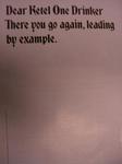
Ketel One Deprecates Clientele, One Full Page Ad at a Time
In a campaign that's been running for quite some time, a tongue-in-cheek series of ad campaigns by Ketel One does away with the hot chicks and the cool-looking dewy bottles of vodka. Instead, they're buying out whole billboards and pages in magazines to deliver what's typically a one- or two-sentence statement with no calls to action or attempts to glamourize their product. In fact, the ads are downright insulting. Our personal favorite is the one that says "There you go again, leading by example." This one is pretty funny too but apparently some people don't seem to think the campaign's that great.
That's okay. The people who matter know it's "drawing board," not "drawing bar." Now we're going to raid the fridge and lead by example. - Contributed by Angela Natividad


Comments
Why not be self-deprecating? People will talk about these ads...even if they are pissed off...and then people start looking for the ads and telling other people and the next thing you know, people start drinking this stuff!
The link to the guy who hated the ad was hilarious. Everybody knows that to sell vodka you have to tell people it tastes good and issue a call to action. Maybe he would have preferred my slogan: Kettle One tastes freaking awesome. Chug a bottle right now!
Hey Steve
I just did a post on AdScam about the bozo who doesn't like the Ketel campaign. Guess what... He works for a "Political Advertising Agency!" That explains everything!
Cheers/George
I can only imagine that Eric's approach to advertising and the selling process is about as persuasive as a sledgehammer. Once I've gotten it between the eyes, I doubt I'd want to pursue a relationship with the sponsor.
Hey,
Thanks for the kind words, but as I wrote on the comments, if it it selling vodka more power to them.
Damn, the one day I make AdRants I was too busy to read my RSS feeds.
PardonMyFrench,
Eric
That dude's facial hair needs to go back to the drawing board.
See, the clean design is great and much better than that sleazy Camel or Miller girl type bullshit, good for the New Yorker and whatnot (like the Glenfiddich commercial with New Yorker cartoons). However, what it says both forms makes very little sense, is therefore sort of creepy (I wish I could use stronger words, the ad campaign itself annoys me), and forms an irritating, inexplicable fragmented sentence. It is like an inside joke of some kind. It would be much better if it took the Geico route and actually said something understated AND witty.