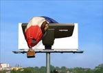
Miele Outdoor Board Looks Photoshopped
Every ad blog today is loving this Mile vacuum cleaner billboard that illustrates the powerful suckage of Miele vacuums with the image of the vacuum cleaner pulling a hot air balloon out of the sky. It's a great looking billboard and a nice concept except we're not sure it ever physically appeared on a billboard. Look closely. The whole thing looks very Photoshopped. Anyone care to comment?


Comments
It's so hard to tell what's real and what's not these days. In any case, this concept is cool and has legs. They could position the vacuum facing down and "suck up" a car, a semi, or trees, etc. Or position the vacuum sideways, bend the billboard pole so the board touches the side of a nearby building (making it appear the vacuum has so much suction, it pulled the board over into the building's wall).
Yeah, I agree. Everything is just too clean looking, too sharp, too crips. Perhaps a spec for the client that made it's way out of the shop.
Yeah, I agree. Everything is just too clean looking, too sharp, too crisp. Perhaps a spec for the client that made it's way out of the shop.
are you kidding me? That's definately chopped up. Look at the people, the shitty dropshadow, etc..
nice concept though. definately either a mock-up or a designer with some extra free time.
Yep, that is pshop, no question. Looks like a spec comp to me as well.
its student work from, and it looks like crap
Miami Ad School
www.miamiadschool.com
its student work from, and it looks like crap
Miami Ad School
www.miamiadschool.com
its student work from, and it looks like crap
Miami Ad School
www.miamiadschool.com
The passengers are laughing. Yep, really amusing when you've crash-landed a balloon.
yeah, this page officially lists it as a concept from miami ad school.
http://www.adrants.com/2006/05/miele-outdoor-board-looks-photoshopped.php#comments
It would be pretty hard to have an extension from the bottom of the billboard. It would have to extend outwards beyond the platform... I don't think it is even possible.
Maybe, anon, but I'm pretty sure I've seen "bottom extensions" before (and not just on J-Lo).
In any case, you could definitely have prop items on the ground below the billboard, positioned so they looked like they were being sucked up (a car or truck standing on end, trees being pulled toward the board, etc.)
No, I think real balloon, real vacuum
Yeah, it's student work. I'm the student. Feel free to shoot me an e-mail at jonkubik@mac.com for questions, concerns, and real ad on ad action.
Looks like it was a lot of hot air.
Quick visual puns are not great ads. Only cheap and fast parlor tricks. Thank you and good night.
Not Marketing 101 or Art 101, likely DECA stundents with ten minutes to come up with an idea.