6 Ways to Effectively Use Visuals on Your Website
The right visuals can have a huge impact on how much people enjoy browsing your website. The perfect imagery can spark emotion, build a connection, tell people more about your company, and ultimately lead to conversions.
In this article, we're going to outline how you can effectively use visuals on your website. Let's dive in
Use photos of your ideal customers to show your products are for them
On your website, feature people who look like your target audience! This can help you make more sales, as your website viewers will know for sure that your products are for them.
A lot of businesses resort to using stock imagery, which can work in a pinch, but keep in mind that it's important for prospective customers to see "real people" as opposed to aspirational models. Even the fashion industry, which is notorious for using "picture-perfect" individuals, is shifting more towards using images that feature real people and promote body-positivity. So, think about what your ideal customers look like and try to feature models that represent them.
You can also repurpose user-generated content from your customers. This will humanize your business and show that people love your products. Dig through your social media mentions or hashtags -- if you see some great images, reach out and see if you can get permission to use them on your website.
For instance, take a look at how Baby Riddle, an infant clothing retailer, incorporates user-generated content into their homepage. They have a carousel of images showing babies in their clothing, with an attached review and rating. This type of content will help to get parents and parents-to-be excited about what their baby will look like in Baby Riddle pieces, which might just be enough to convince them to buy some. As a bonus, the included reviews tell customers that the clothing is of a very high quality.
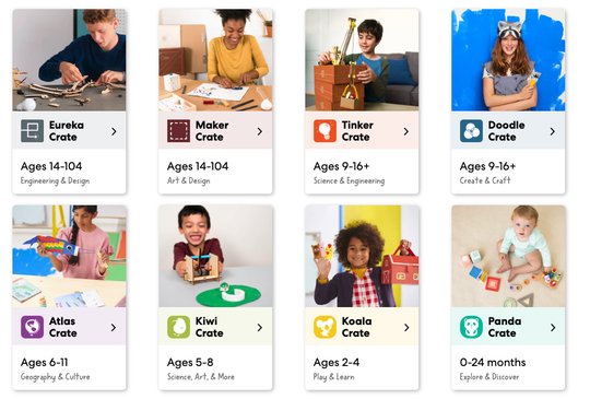
KiwiCo, a STEM craft subscription service for kids, also showcases their ideal customers on their homepage where they outline the different crate options. They show kids of all ages enjoying and playing with their products; this is a really effective way to get potential customers excited about the subscriptions on offer and imagine themselves using them.
Use imagery that will evoke an emotional response
If you can evoke a strong emotional response from your customers, they'll be much more likely to shop with you. You can show people having fun using your products, joyfully being helped by your employees, or sad because they have a problem you can solve, for instance.
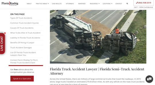
For instance, Florin Roebig, a law firm based out of Florida, aims to provoke somewhat of a negative emotion with their web page that focuses on their Florida truck accident lawyer services.
They've used an image of a truck that's flipped over on its side to show the sad reality of what can happen on the road. This type of accident can happen to any driver, and the imagery will trigger prospective clients to imagine the kinds of damage and injuries that can be caused in such an accident. It could also make website visitors feel quite stressed but, luckily, Florin Roebig is right there to take their worries away and handle their case.
While you might be hesitant to evoke negative emotions in your customers, this can actually be a very powerful tactic if you provide products or services that can address a serious problem.
Use imagery to show how your products or services work
People like making informed purchases so, if you can show how well your products or services work through your imagery, you can increase your chances of making a sale!
The right product photography can show off your products, or you can use GIFs and infographics to show how your services or programs work. Publishing photos that show your products being used can also be a great tactic, as it shows potential customers what to expect.
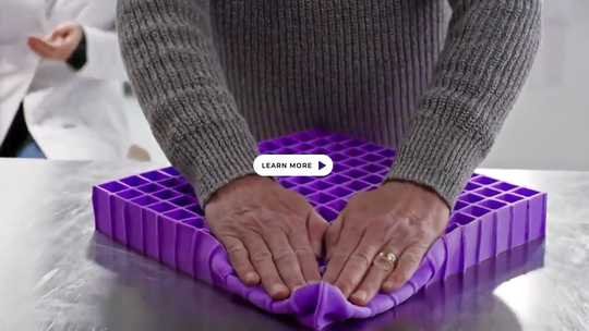
Take a look at how Purple does this on their product page. Because their mattresses are different to traditional spring or memory foam options, it's helpful for the viewer to see how they work. The imagery on this page highlights how the Purple GelFlex Grid provides no pressure support and keeps the sleeper cool. This is incredibly effective imagery that is sure to help the company make some extra sales.
If you would like more advice on how to create and curate fantastic imagery of your products, Adrants has a great guide to the role photography plays in your marketing efforts. It's well worth a read if you need some help in this area.
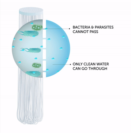
Similarly, take a look at how LifeStraw, a company that makes and sells portable straw filters that let you drink water from anywhere, uses imagery to show how the straw works. It's admittedly a strange concept; some of their imagery shows a man drinking water straight from a river, after all. But the diagram on their product page shows how their filter works and why it's safe. This is helpful for any curious customer who wouldn't want to just take what they say at face value. The educational aspect here helps encourage sales, and it wouldn't be as effective without the visuals.
Create videos your audience will find engaging
Did you know that 85% of internet users in the United States watch online video content on their devices at least once a month (Oberlo)? If you use engaging video content on your website, not only will people want to watch it, but it can help humanize your business, build a relationship with the viewer, and ultimately lead to more sales. Think behind-the-scenes content, video testimonials from clients, or explainer videos showing how your products work to start.
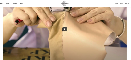
Take a look at how Vintage Foundry Co., a shoe retailer, uses video to show how they hand make their shoes. This super-satisfying video, located on their about page, humanizes their business and shows that the workers put a lot of care and attention into every product they make.
This type of content also shows why it's often a great idea to buy from smaller retailers -- it's obvious that the craftspeople love what they do, and customers will be rewarded with beautifully-made shoes if they shop here. This video makes that very clear.
Use graphics to illustrate instructions
Whether you're telling someone how to order from you, how to use your products, how your services work, or how to get in touch, graphics can make the instructions a lot more engaging and easy to follow. And, getting your design principles right can boost your conversions.
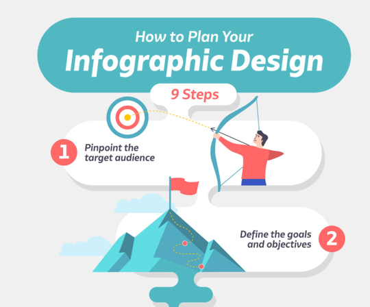
Take a look at this example from Visme on how to make an infographic. It's colorful, charming, and outlines how you can plan out your infographics step-by-step. Think about how much more effective this is than putting the instructions into paragraphs of text. There are nine steps to Visme's process but, with fun graphics and images, they make this task seem simple and exciting.
Similarly, ASPCA Pet Health Insurance has a step-by-step graphic that outlines how to brush a dog's teeth. A lot of owners have no idea how to do this to begin with, making this an effective topic for an infographic. They start by outlining facts about dog tooth brushing, why you should do it, and how often it needs to be done. Then they break down the process step-by-step. Not only is the infographic informative and helpful, but it shows that it's not as difficult as one would think, which encourages the viewer to brush their pup's teeth more frequently.
Use infographics to break down facts and figures
Fun fact: visuals increase learning and retention by 78% (Visme)! So, infographics are great for incorporating into your content, or even your service pages, as they can help you present facts and figures in an easily digestible way. Think about how many infographics you've seen shared on social media in the last year or so. People share them because they're particularly engaging and informative.
Additionally, infographics are great for building your backlink profile. When you create this type of original content effectively, other high-quality websites will want to share it and link back to your business. When this happens, Google takes it as a vote of confidence in your website authority and will give you a boost in the search engine rankings. This can help you attract more people, engage website visitors, and make more sales.
Here are a few tips to help get you started making great infographics:
- Keep them simple. Remember that they're supposed to break down information to make it visually appealing and engaging!
- Keep them focused on a single topic.
- Balance your written and visual information.
- Use enough white space to make it visually appealing and easy to read.
- Use an engaging headline.
- Check and double-check all of your sources!
If you would like more help with this, make sure you check out Venngage's guide to creating accessible infographics. It will walk you through the entire process, and you can also access plenty of templates that will make the job even easier for you.
Summary
Visual content is one of the most important marketing tools in 2021. People want to feel engaged when browsing the internet or online shopping, and properly using visual content is one of the most effective ways you can ensure this. Take these tips on board and it won't be long before you're attracting more website visitors and making a lot more sales.
This guest post was written by Aaron Haynes, CEO of Loganix, an SEO fulfillment partner that supports marketing agencies and professionals. The company specializes in helping businesses to improve their online visibility and ultimately make more sales. The Loganix blog has a lot more information and advice, so make sure you check it out if you found this article helpful.


