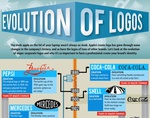
See the Amazing Transformation of These Big Brand Logos [Infographic]
Ah, yes. The logo. That emblem which represents the essence of a brand in a way that communicates its purpose in mere seconds. Or at least that is the hope. Over the years, brands have evolved their logos as both the times and the brand, itself have changed.
Taking a 100+ year look, this infographic from Graphic Design Degree Hub examines the transformation of logos from Pepsi, Coke, Shell, Mercedes, Kodak, IBM, Chevrolet, BP, UPS, Ford, Xerox, Canon, Walmart, Apple, Microsoft and others.
Some early logos from Kodak, IBM and UPS look nothing like their current iterations.
Also explored are logo screw up like the London 2012 Olympics and the Arlington Pediatric Center, both of which connoted something completely different from their intended goal.


