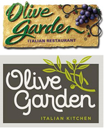
Here's What's Wrong With Olive Garden's New Logo
It's funny how a logo change can incite more online hyperactivity than, oh, Russia invading Ukraine or the crisis in Syria. Actually, it isn't funny. It's just plain sad but that's what we've turned into; a country that bitches about inane, meaningless bullshit rather than important world events.
But since we're not CNN and our mission is to report on all things marketing and advertising, it's our duty to cover the hubbub that surrounds Olive Garden's new logo.
To say the least, the new logo has not been well-received. While the new logo now actually has an olive branch in it instead of a -- WTF -- grape vine, it's, shall we say, lacking meat.
By lacking meat, we mean there's no substance to the new logo. The previous logo, tacky as it was, at least had some substance to it, some texture. Some depth. OK, yea, now design is all about flat but it shouldn't be all about 5th grade art class either.
In an effort to turn around declining visits, down 13% in December, and plunging sales, down 5.4%, the chain is grasping at straws (olives?) to turn things around. The new logo, in the words of Darden Restaurants executives is to create a "brand renaissance."
More like a funeral march.
Much like the Gap logo change debacle four years ago which caused the brand to revert to a previous logo, Olive Garden likely should have left well enough alone. The original logo might have sucked but no one cared.
Perhaps heeding the "if it ain't broken, don't fix it" mantra would have been the right decision for Olive Garden. At least that way, people could have gone on ignoring the brand much like they do every other brand that just stays its course.


