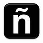
Icon Offers Graceful Entry to Spanish Language Section of Websites

More and more sites are offering their content in Spanish and other languages. Attempting to bring some guidelines and iconography to how the link is made to Spanish content, one agency has come up with what it thinks is a good solution. Working with their client the University of Texas, Cultural Strategies developed an icon that incorporates the enie, the symbol placed over the letter N in most Spanish words.
Of the development, Cultural Strategies CEO Juan Torne wrote, "We have been working on a way to clearly, but un-intrusively, provide access to our client's online Spanish content. The "En Español" button or hyperlink is simply boring (and it disenfranchises a percentage of the site's visitors), the Flag - be it from Spain or Mexico - even though helpful, to a certain degree leaves out people from other nationalities/heritages."
So he came up with the enie icon. We think it works. What do you think?

