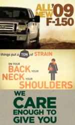
Ford, Motrin, Starbucks Separated at Birth?

Adrants reader Christina Mejia found three commercial which looks strikingly similar. The first is the famed Motrin ad. The other two come from Ford and Starbucks.
It certainly does look like there were similar creative thoughts floating around during the creation of these commercials. Watch and let us know what you think.


Comments
Good eye Christina!
I suspect that the progressive text concept came out of some study that showed that people are more likely to engage the text if it comes up word after word. I found myself more engaged.
That being said - the Ford and Motrin commecials are WAY too similar.
Easy. All of the designers got the Veer catalog on the same day when that font was their monthly special.
You're right, they're all cut from the same font--but then I think they all look like Matt Smithson's work for Girl Effect and Nike--but then, I'm biased.
Yes this is also extremely similar to http://www.girleffect.org/ which I think came out first. Hard to say if these are coincidental 'trends' or just blatant copy cat ideas.
MK12 was doing this style a couple years ago.
http://www.mk12.com/videos/2007/amc_montage_07.mov
it's kinda played out at this point, but it's still effective:
Nothing new here. This style was used in a lot of print in the 90's. As for the fonts, yeah they're all serifs, but the Bucks is rolling strong with Gotham � one used with Coke Zero and Obama.
Another great discussion on the topic:
http://paulisakson.typepad.com/planning/2008/11/new-f-150-advertising-thoughts.html
This has been a YouTube trend for at least a year and a half. Notables:
Marcellus Wallace (nsfw):
marcellus http://www.youtube.com/watch?v=Gj13ugh5FYw
Wedding Crashers: http://www.youtube.com/watch?v=u7WQGrZUdb0&feature=related
Fight Club
http://www.youtube.com/watch?v=fbMa4MGFCOg&feature=related
Type treatments aside, what these ads have in common comes down to xeroxing the brief.
That is too funny, I just noticed the same thing the other day and mentioned how popular that type treatment is getting. Those were the exact same 3 that I've seen. It's been done a million times but do you really need to type everything the AVO is saying?
I noticed the same thing earlier this week and posted a collection of other video clips done in the exact same style: http://www.socialmediaworx.com/2008/design-trends-in-online-video/
The Motrin ad was made by TAXI, and the Ford ad was done by Team Detroit (JWT specifically I believe) so it's not a case of the same shop just repurposing their ideas, but it is noticeably similar. Even the font colors match, which means that either a study came out that said that people love brown and yellow and both agencies went with it, or they both managed to watch similar YouTube typography vids at around the same time, but either way, it does make you wonder.
Way ahead of you.. and there are much much more videos that are unequally as as unoriginal. http://stackingchairs.blogspot.com/2008/11/effect-of-girl-effect.html
The first time I saw kinetic typography like that was a youtube user's workup of a Pulp Fiction scene (ages ago). http://www.youtube.com/watch?v=cqc4FqvXlKs
As to whether there's anything unoriginal going on here... Online innovates, and a few years later traditional advertising clues in and picks it up. It's becoming standard practice.
Budgets people. Animation is far cheaper than shoots. Talk to any director these days. Jobs are tough to find.
When I saw them I just assumed that MK12 did all of them. But, I have no idea if that's correct or not.