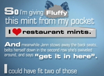
Lots of Words, and Something About a Pony.
The other day I was complaining -- or was it more like bitching? -- about how all car ads seem pretty much the same. (If not "the same," then "zealously derivative.") Then Organic busts out with this really weird ad for the Chrysler Town & Country.
It's all words. The narrator's telling this bizarre story, then the words appear in front of you, so you get this tiring but riveting experience of seeing and hearing crunchy nouns like "pocket pony" and "crabapples" at the same time. (Don't ask, just watch.)
The method got me leaning forward and scrutinizing every last moment of the ad while Organic -- those saucy minxes -- exposed me to images of the Town & Country. It was sort of like those random penis shots in Fight Club, except less subtle.
The spot concludes with "The adventures continue," suggesting we'll be seeing more of the same. Meanwhile, you can see this spot during HD reruns of Lost or other shows downloaded on ABC.com.
Topic: Brands, Campaigns, Commercials, Online, Strange


Comments
It's horrible! Goes to show how little people know about the pioneers of this animation tactic. Organic has simply ripped it off, no need to give them credit other than for butchering what was a well-executed animation by MK12 Studios www.mk12.com
How can you think this is revolutionary by any means? This 'great idea with words' has been used everywhere in print and online ever since it became popular about 4 years ago. It kind of sucks to see how marketing people don't do their research, and how large companies like Organic can't come up with anything original.
Way to go.
Wow. Someone's feeling a little cranky today.
I thought the ad was cute, engaging and worked hard to get the car's features/benefits in and make it sound like it might even be hip. Maybe not revolutionary (which wasn't actually said), but definitely weird.
I also bet someone could find a tactic like this used before 4 years ago. But that might send some of your readers over the edge.
I actually agree with Felix. Here's another example of this type of animation, done ten times better also outlining features and benefits of this program; how original:
http://www.youtube.com/watch?v=HKVRj5E59So
p.s. Ads aren't meant to be 'cute' anyone in the Creative Industry hates hearing that... unless they're trying to sell fluffy bunnies
It is an interesting change for a car ad, but I agree with above that MK12 and others have done this type of treatment better.