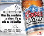
Coors Could Use a Little Help with that Zany 'Interactive' Concept
Somebody didn't think this one through.
This banner ad for Coors Light first attracted me with its weird copy: "GRAB A COLD ONE. When the mountains turn blue, it's as cold as the Rockies."
I was like, what?! And then I noticed some other text: "COLD ACTIVATED BOTTLE."
"Awesome!" I said. "I can frost this Coors!" So I started clicking all over the ad to make with the frosting.
But the ad was not, in fact, frost-friendly. Instead it brought me to Coors Light's Cold Activated Bottle subsite. I said, "Whatev, this could still be cool," so I started clicking all over that.
And guess what? That wasn't interactive either. Instead, my eager clickage brought me to CoorsLight.com -- where I sat face-to-face with an AGE VERIFICATION SCREEN.
So finally I said fuck it, and now I'm here, complaining about it. Coors, why don't you give Play a call and ask them -- well, beg them -- for some interactive assistance. You know Play. They did that semi-interesting beer SCUBA thing for Foster's.


Comments
My favorite part of this post is how much you love the interactive games on banner ads. I'm a sucker for killing the buzzing fly, picking which celebrity did what and figuring out where the ball went.
I think Coors should hire you as a consultant.
We made a wakeboarding game for Coors in Canada once. It was WICKED and you could jump over a float plane. I just needed to add that to be part of the conversation.
What is interactive?
Agreeably the coors website is absolutely duff, unlike this fosters one which (inner geek talking) was very fucking interesting
An incredibly crappy beer has an incredibly crappy website. Whodathunkit.