Aww, LaBov Thinks You're Creative and Super-Special

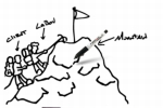
You know how the Leo Burnett website does that cute (but sort of messy) thing with the pencil? Labov & Beyond must've seen it and gone, "Hey, we should turn that whole 'scribble' concept into the core model of our site redesign."
Because that's exactly what it did.
The idea is to encourage a "blank canvas" mindset, and the hope is that people will illustrate their opinions about content (even LaBov's content) by taking advantage of this whiteboard that appears on every page on the site.
The redesign was done in-house and includes a page where you can send your whiteboard "masterpiece" directly to LaBov (we haven't yet found this page, actually. But if you're raring to demonstrate your own ingenuity, you can always screenshot your incoherent scribble and email it to whoever's listed under "Contact Us").
"We designed a site that allows its audience to have fun while at the same time digging deep and answering important questions about what they're looking for in an agency," says co-creative director Chris Swymeler.
We actually have no idea how this whiteboard thing encourages users to dig deep and answer important questions. If nothing else, it irritated us. You know why? Because we're not right-handed.
And even if we were, have you ever tried showcasing your creativity with a mouse? It's fucking impossible!


Comments
...which proves that advertising is the most ethical business in the world. Why not recycle old ideas instead of letting them rot?
As if Leo Burnett was the first to do this technique. They weren't. It's a super old, super hackneyed idea. The flash guy they hired just did it exceptionally well.
Angela,
The page that allows you to draw labov a picture can easily be found under the contact section. A method I have never seen used by an agency, have you?
OK, got to stand up for my peeps here. It will no doubt fall on deaf, jaded and highly cynical ears, but the site is not a riff on the Leo Burnett thing. At all. It's really not. Seriously. Quit laughing. We really mean it.
Part of what you said is true, however: We do think you're creative and super special in your own unique way! Don't let anyone tell you otherwise.
(And I'll pass the comment about the site being un-left-hand-friendly to our Flash folks.)
Double-posting doesn't help my cause, does it? A thousand pardons...
un-left-hand-friendly? ever heard of design for the masses? Statistics prove most people are right handed.
I say it's about time you left-handers learn to use your right hand like good red-blooded Americans and stop complaining...
interesting. labov/beyond has copied leo burnett on the website. not the first time. looks like the initials of their names (L/B) is something else they copied. when you can't do something good yourself, go copy one of the best in the business. who the hell are they anyway? actually, this is the most press they probably have ever gotten.
Who designs the Adrant site? I want to hire them for some freelance.
The site is currently not working, the "draw" option on the Contact Us page pops up to a copy of the home page. There are also some other weird quirk such as when you click on "Our Leadership" and then on Cathy Schannen, you will find if you believe the website she is bald and has nice facial hair! Overall I find the site to lack creativity, it seems the overall concept must have been driven by someone who lacks interactive experience, vision, and creativity (just my opinion).
There is a consistent theme of arrogance as well. I define arrogance, as it applies to this, as touting thyself without proper reasoning, facts, or even a hint of a reason as to WHY you are just so darn cool.
Has anyone seen www.labovideafactory.com, the site has a completely blank front page that lacks content. Viewing the sites history shows more of the same detailed above. This factory site seems to focus on criticising others in the industry including companies and other agencies, wow holy bad PR Batman! I guess the point would be "they are bad, so we are good". Wonderful reasoning!