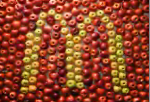
McDs Gets All Stop Motion. We Remain Unconvinced

We hardly recognize the McDonalds we've come to know so well in this stop motion ad by DDB, Chicago and production company Vitamin.
Stop motion is, like, the new sex (Lux best demonstrates: 1, 2). Gotta say, the method that helps make soap sexy can also do wonders with McD's.
The only question is, can the crisp and health-savvy ad get rid of the perpetual moisture that seems to plague the restaurant's floor? Or the square-shaped eggs in the breakfast sandwiches that betray utter non-freshness? Or the unhappy-looking, sickly-colored cheese? Or the flat and unimpressive non-meat-tasting patties?
Like hook-ups on MySpace, McDs runs the risk of traumatizing the ad-charmed with its actual appearance.


Comments
Dontcha know that if you eat a McDonald's burger upside down that it tastes way better? Fact.
Extra mile: protein-style
I think this is a more accurate McDonalds commercial...
http://www.youtube.com/watch?v=vaS1xQvQEKg
I think this is a more accurate McDonalds commercial...
http://www.youtube.com/watch?v=vaS1xQvQEKg
When they are illustrating the word "What" it looks like "Shat" before the W has been finished.
When they are illustrating the word "What" it looks like "Shat" before the W has been finished.
When they are illustrating the word "What" it looks like "Shat" before the W has been finished.
This is a crazy McDonald's site
http://shrek.mcdonalds.com